
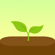
Grow together, in Parallel
A space where one friend forgets and other can see the missed task then can check up on it
Project specs
Parallel - A Task and Routine with Friends alongside also plants

Some of my friends were at my place, they saw one of the house plant is dried up ( Because i forgot to water it ).We discussed about how we have to take care plants and also we had issue with our daily routine how we can benefit from checking on each other and our plants.
In that time period i was looking for a problem statement for my UX case study, after having conversation with them then this app got its beginning.
Role
UX designer
Duration
4 months
Tasks
UX design
Competitive analysis
Secondary research
Tools
figma
figJam
Project Type
Concept Case Study
Context
Imagine you have all managing done with reminders but you snoozed and forgot
A space where one friend forgets and other can see the missed task then can check up on it
Problem statement
No other alternative
Many users have task apps and scheduling apps, but they come with a non easy way of sharing with chosen friends, there is no encouragement that can follow on decided upon task
Why this matters
- Shared goals improve consistency
- Emotional reinforcement matters
- Common plant-care mistakes
Subject
Constraints
- No real user interviews
- Limited project timeline
- No user testing
Subject
Assumptions
- Social accountability improves Task and Routine completion
- Encouragement works better if some one sharing the same goal
- Forgetting plant care due to busy routines
- Preference for simple and lightweight routine tracking and sharing
Research
Competitive Analysis
Forest

Habitica
TickTick
Fabulous
Planta
pictureThis
Observation
- Focus on individual productivity
- Can feel stressful with feature heavy
- Social accountability is less to no
- Plant growing motivation is highly engaging
Design gaps
- Introduce collaborative accountability
- Keep interactions lightweight and simple
- Meaningful friend follow up systems
- Quick add plant setup
- Add plant growth logs and progress visuals
- Integrate plant care with routines
Research
Review mining
What user want
- Simplicity and low cognitive load
- Supportive motivation
- Social accountability
- Calm and clean interfaces
Pain points
- Overcomplicated systems
- Stressful productivity pressure
- Rigid scheduling systems
- Shallow long-term retention
- Cluttered UI and feature overload
User profile
Aged between (20-35) and shared users
Aged between 20-35
- Millennials & Gen Z
- Interested in productivity and wellness
- Emotionally connected to plants and calming activities
- Prefer simple and visually engaging experiences
- Social active
Shared users
- Simple routine management
- Accountability without pressure
- Community connection and support
Goal
Lightweight UX process and Accountability system
In point addressing design gaps and building system to help with managing task and routine and plant care, with system which is lightweight simple and easy to use without gamification
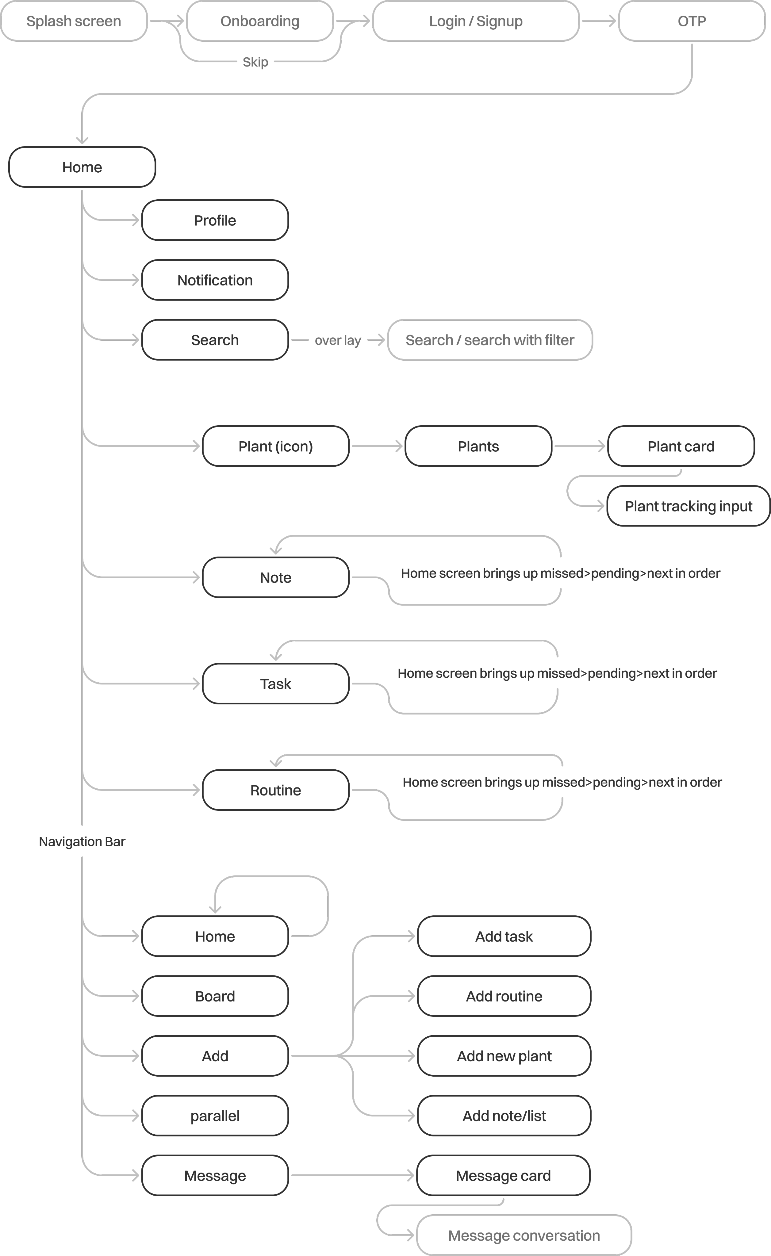
Use flow
The User flow is quite extensive, so highlighted the necessary steps that have taken in this case.
Brainstorming & ideation
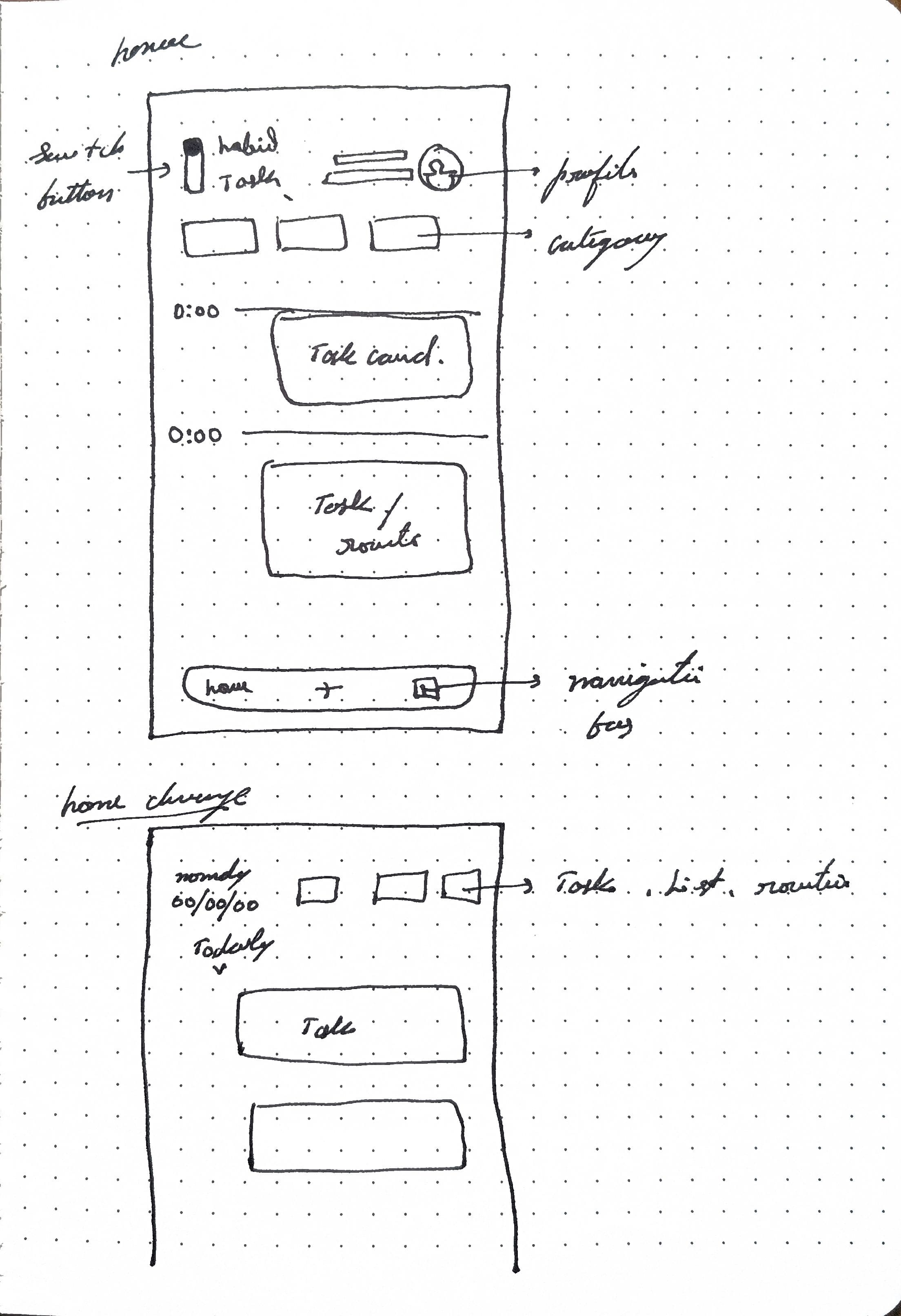
Wireframe sketch
Trying to fit all the info in one screen, with functional buttons with limited button clickable space with visual info, was learning that took place with iterations that followed
After few ideations
Started designing screens
Final iteration
Wireframe sketch
Making space important elements and removing non-essential
Iterations
Screen designs
After starting screen designing it was to reunderstanding about
- Clickable space and spacing
- Proximity content
- Visual spacing and hierarchy
- screen flow
too chaotic
Needs rearranging
Colour and visual spacing
Need core aesthetic change because
- Colour visual fatigue
- Spacing proximity
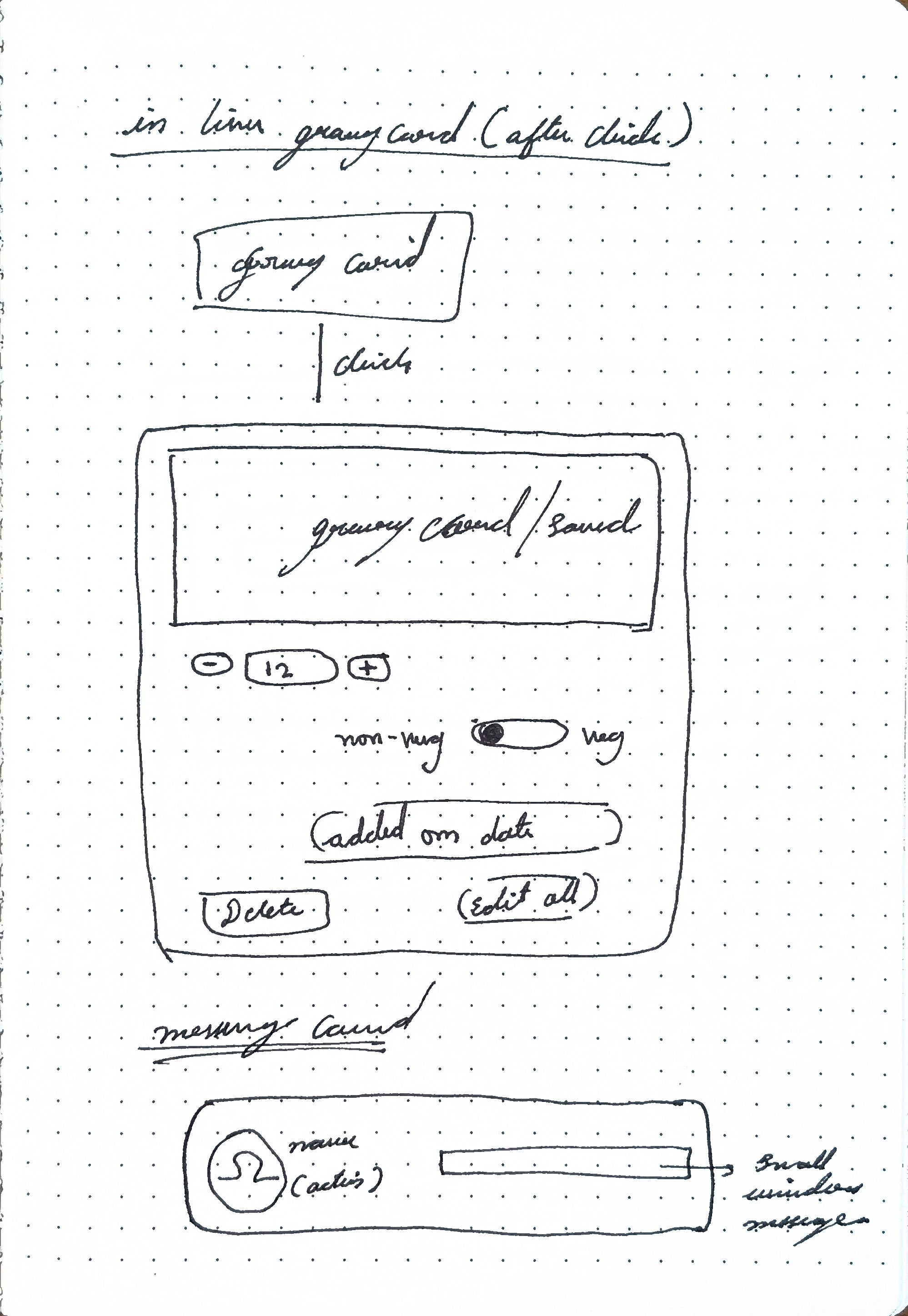
Card refinement
Need cards elements clickable space and key visuals
Final iteration
Wireframe sketch
Making space for important elements and removing non-essential
Iterations
Screen designs
After starting screen designing it was learning about information visual
- Clickable space and spacing
- Proximity content
- Visual spacing and hierarchy
- screen flow
Arrangement
These are the initial screens, To see the visual language
After this went back to wire frame sketching to proceed with remaining screens
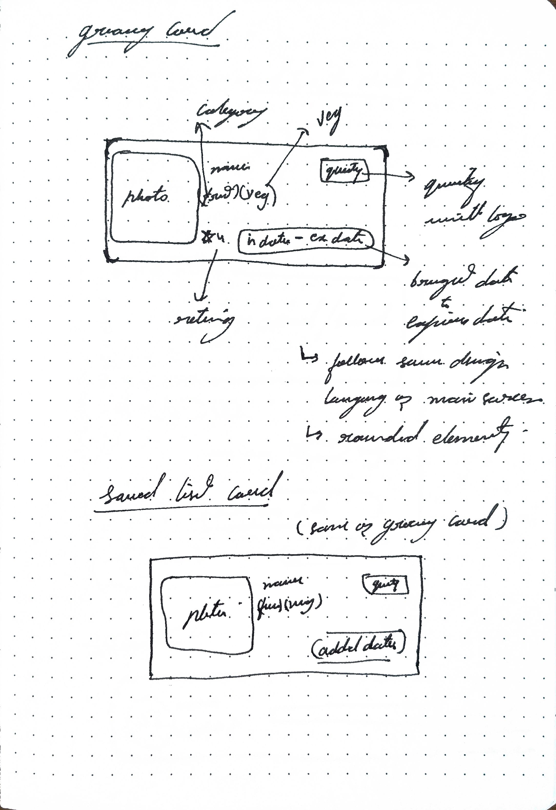
Card info
Took considerable amount of rethinking about visual information presentation
Colour and visual spacing and Card refinement
Need change because
- Colour visual fatigue
- Spacing proximity is major issue
- Need cards elements clickable space and key visuals
Iterations
Final design
Key design decisions
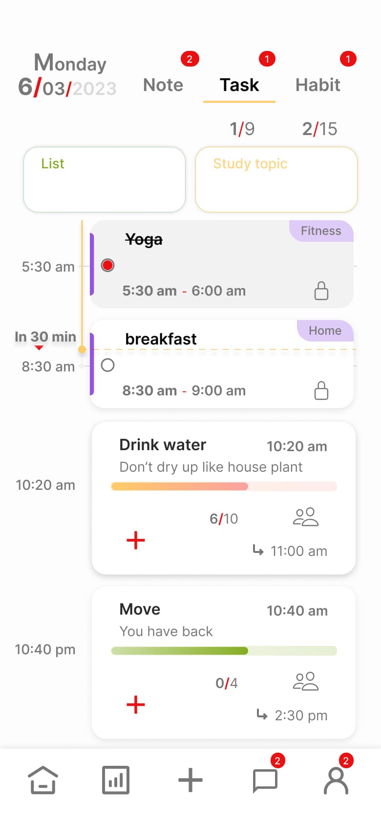
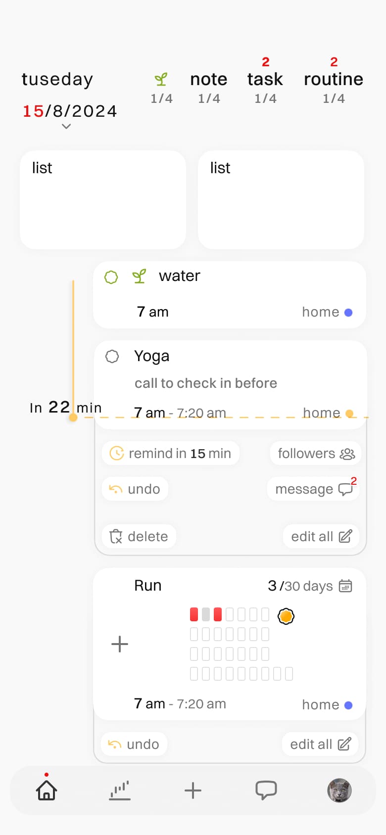
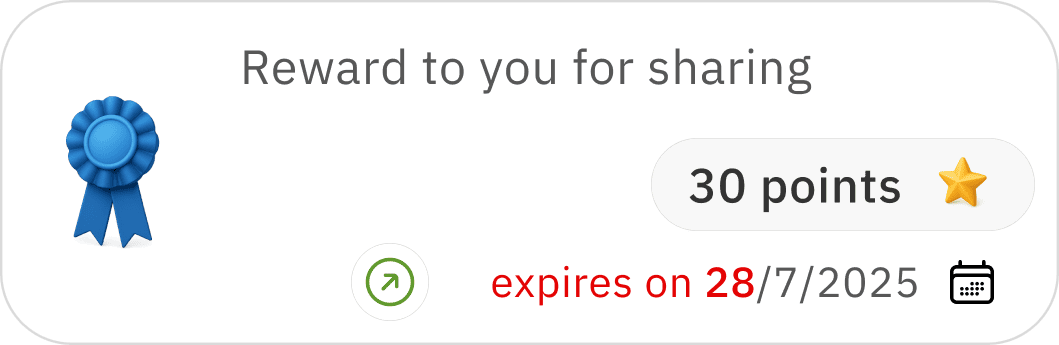
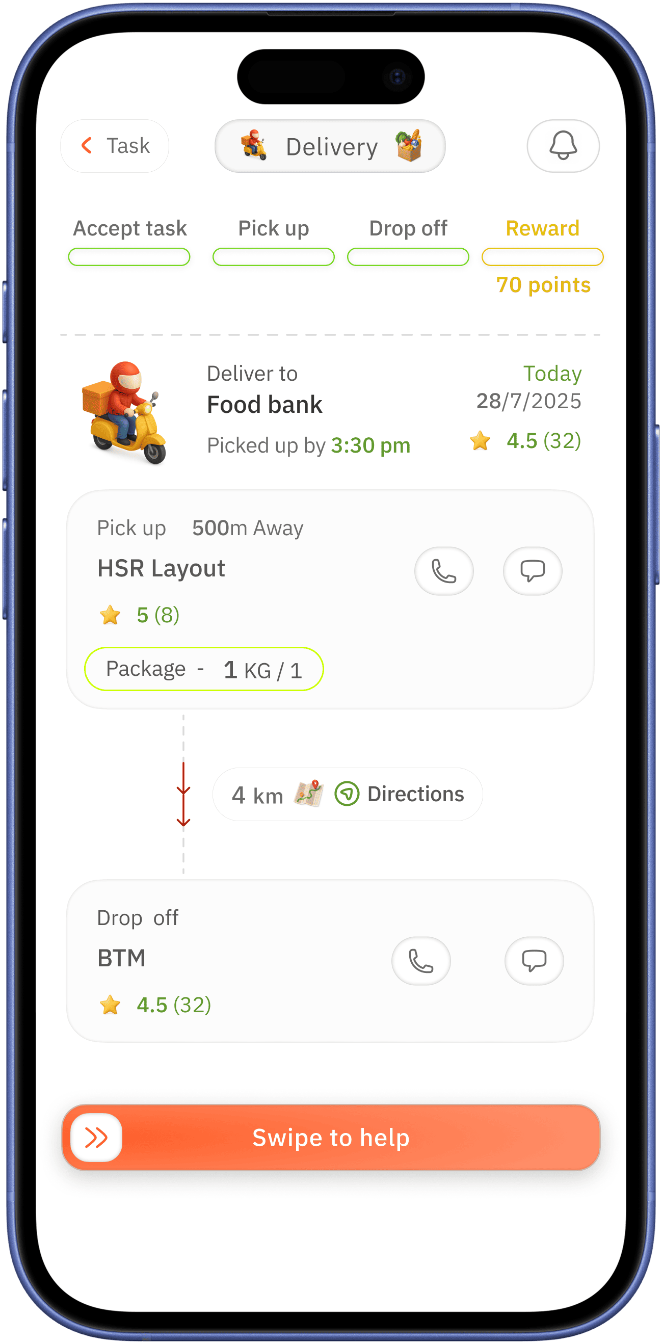
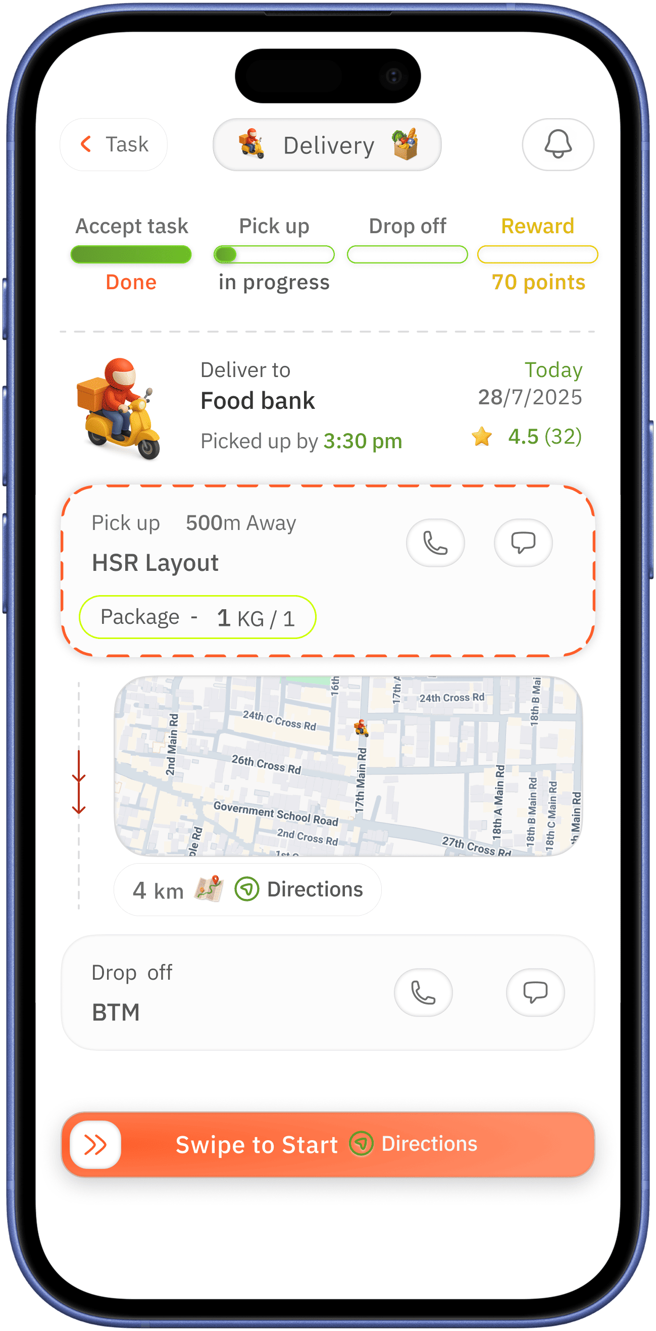
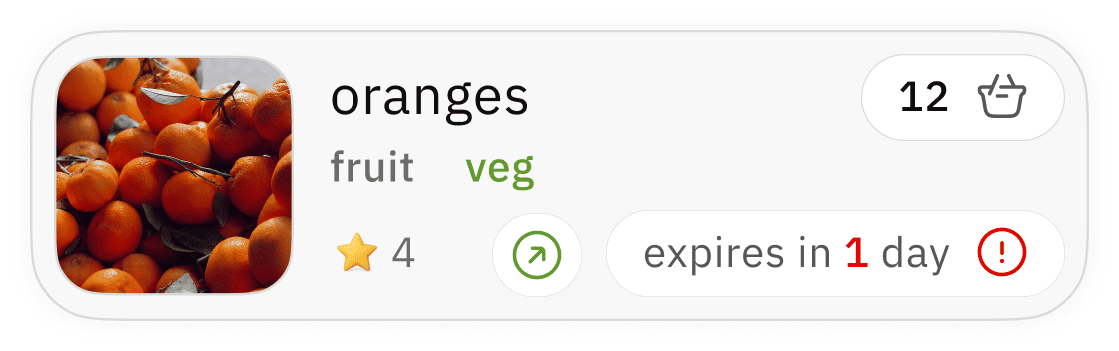
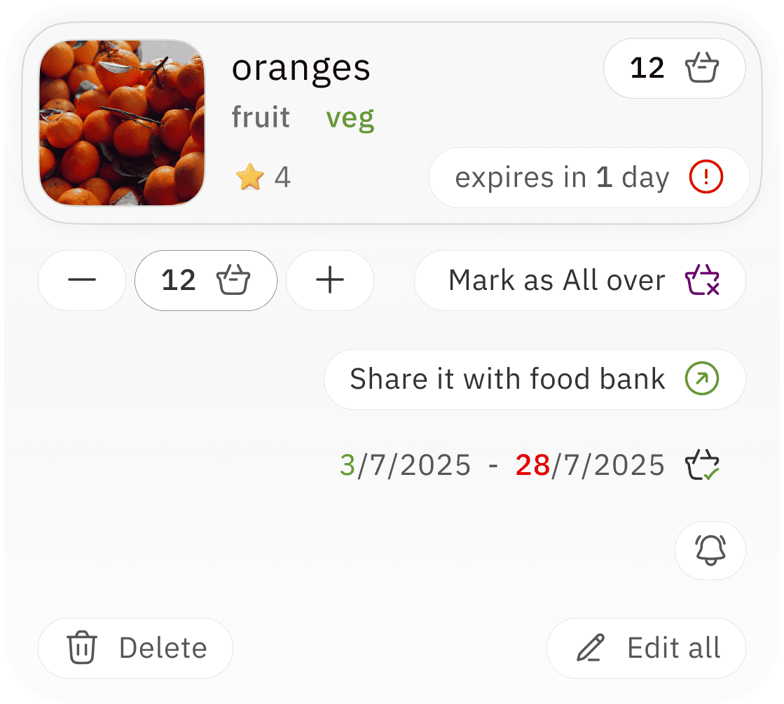
indication of pending task with red colour for alertness
clear indication of done task with colour check mark
easily accessible and in glance note and list
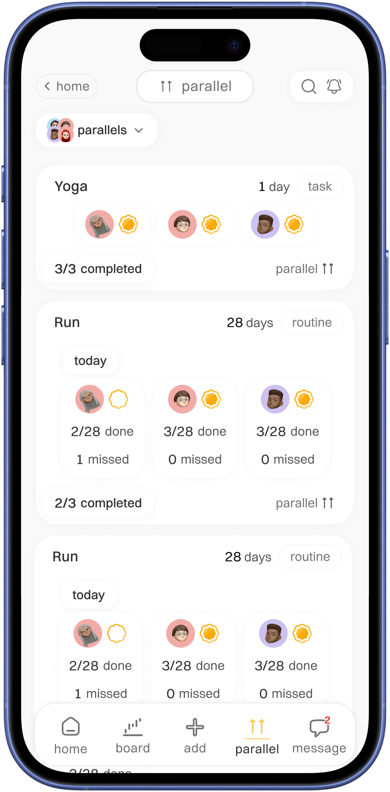
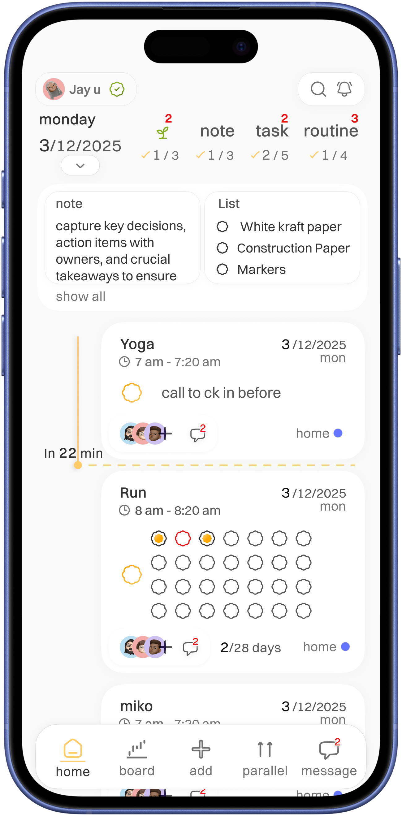
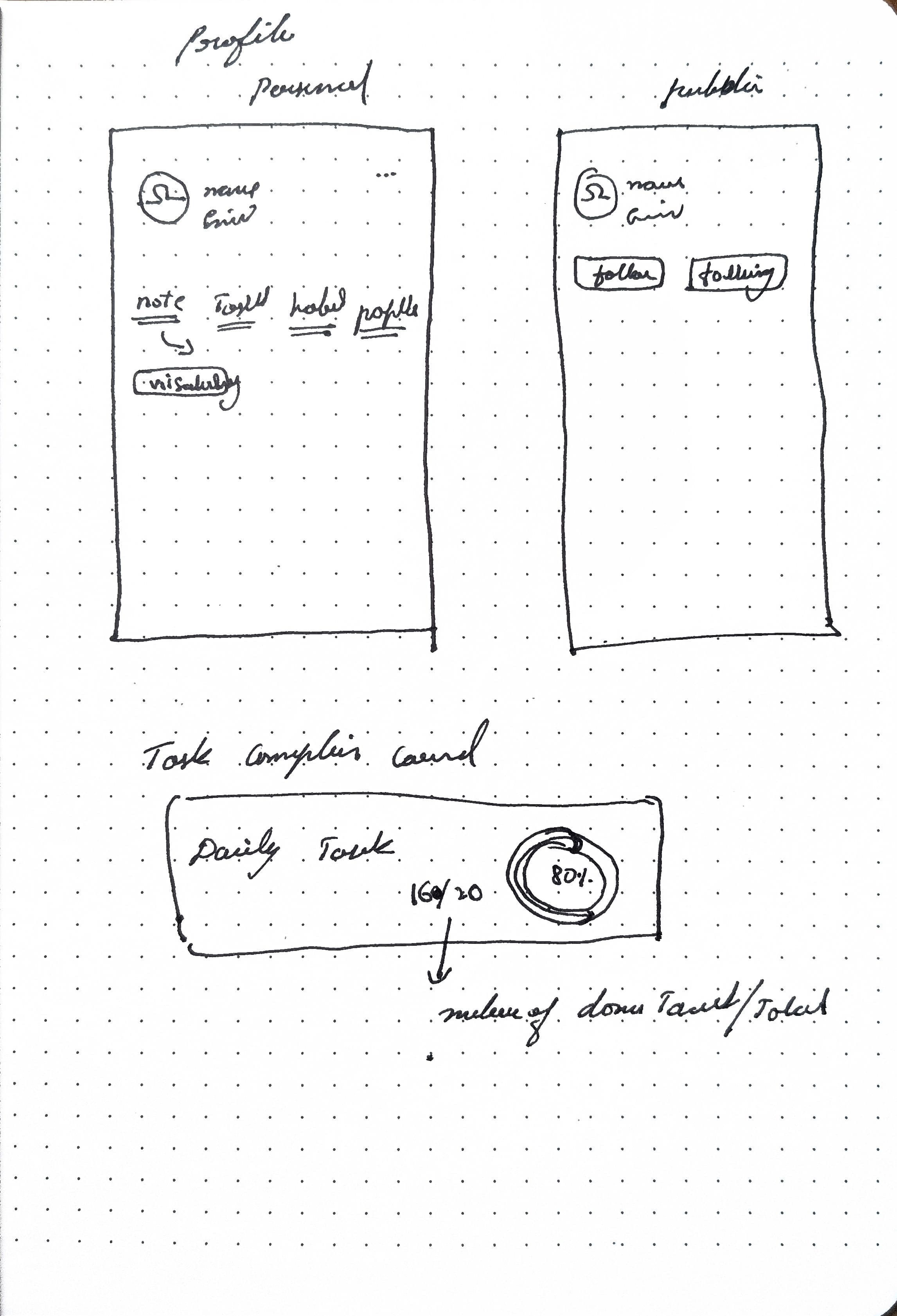
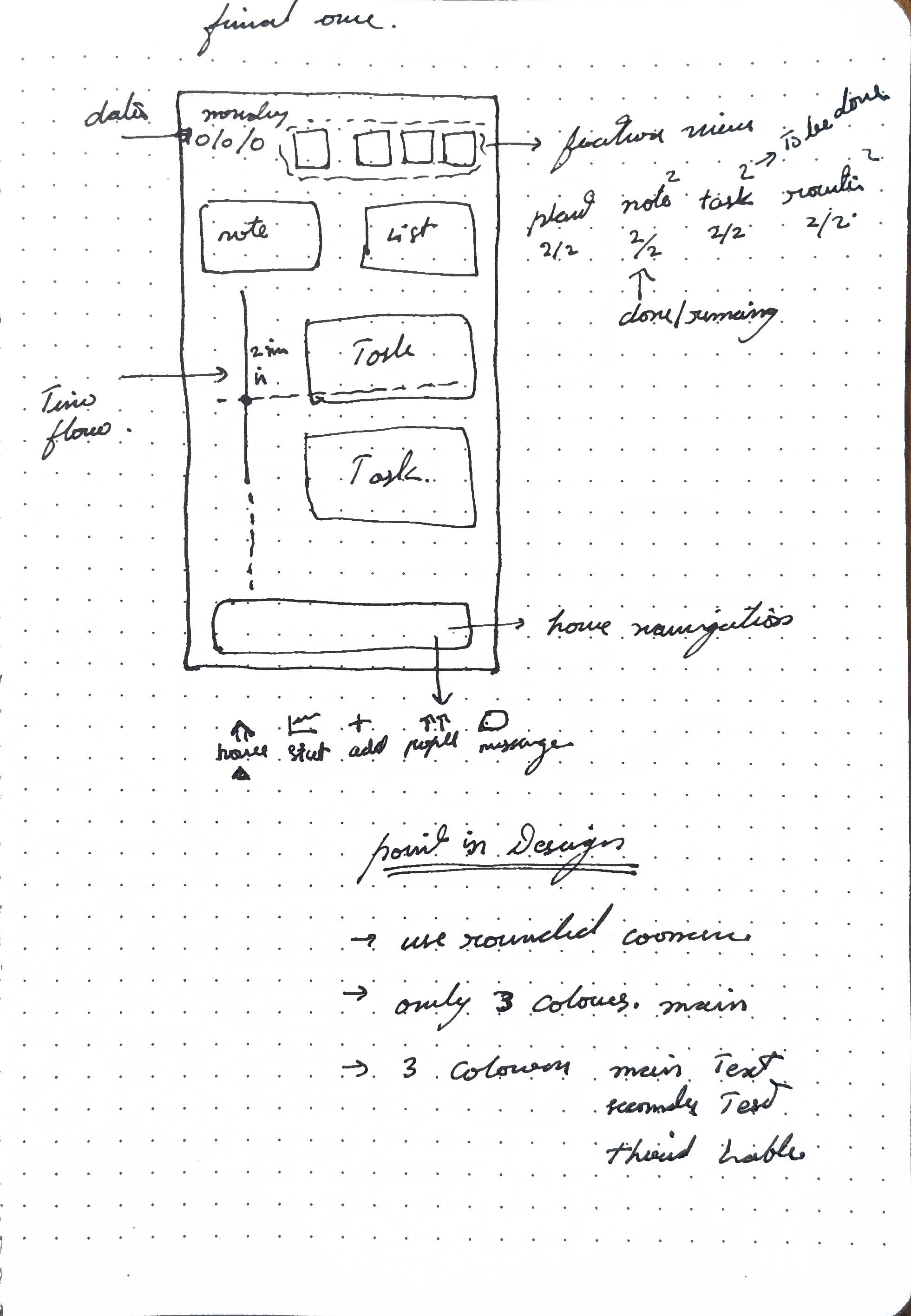
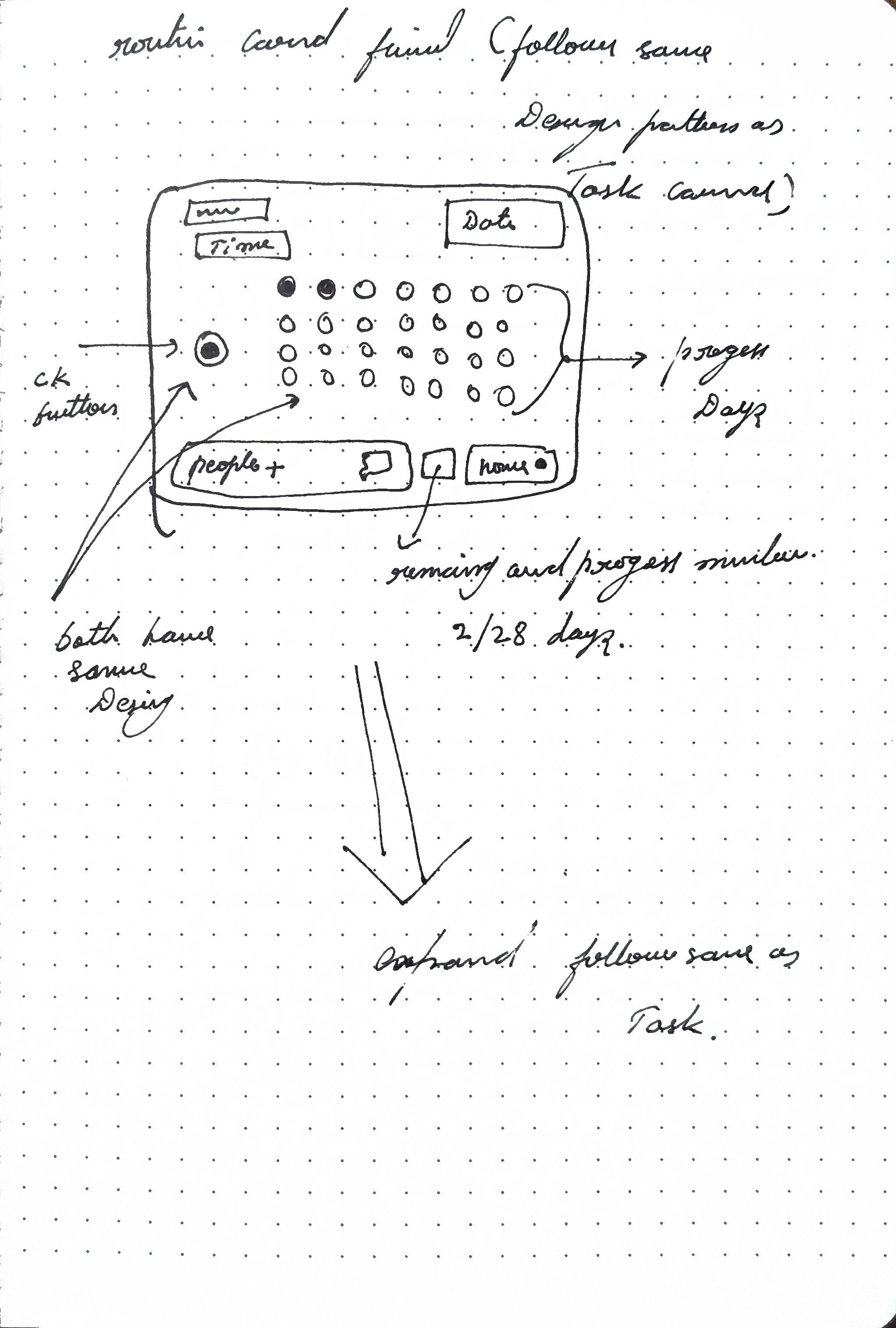
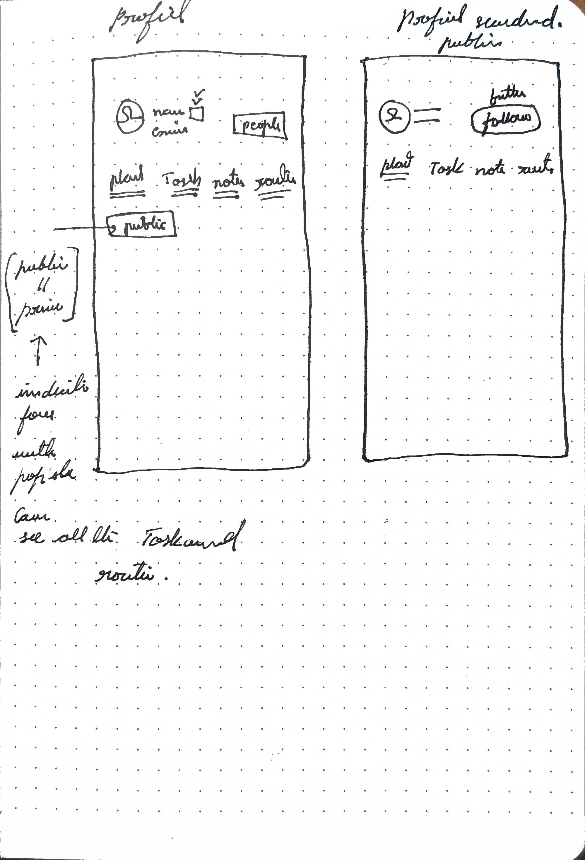
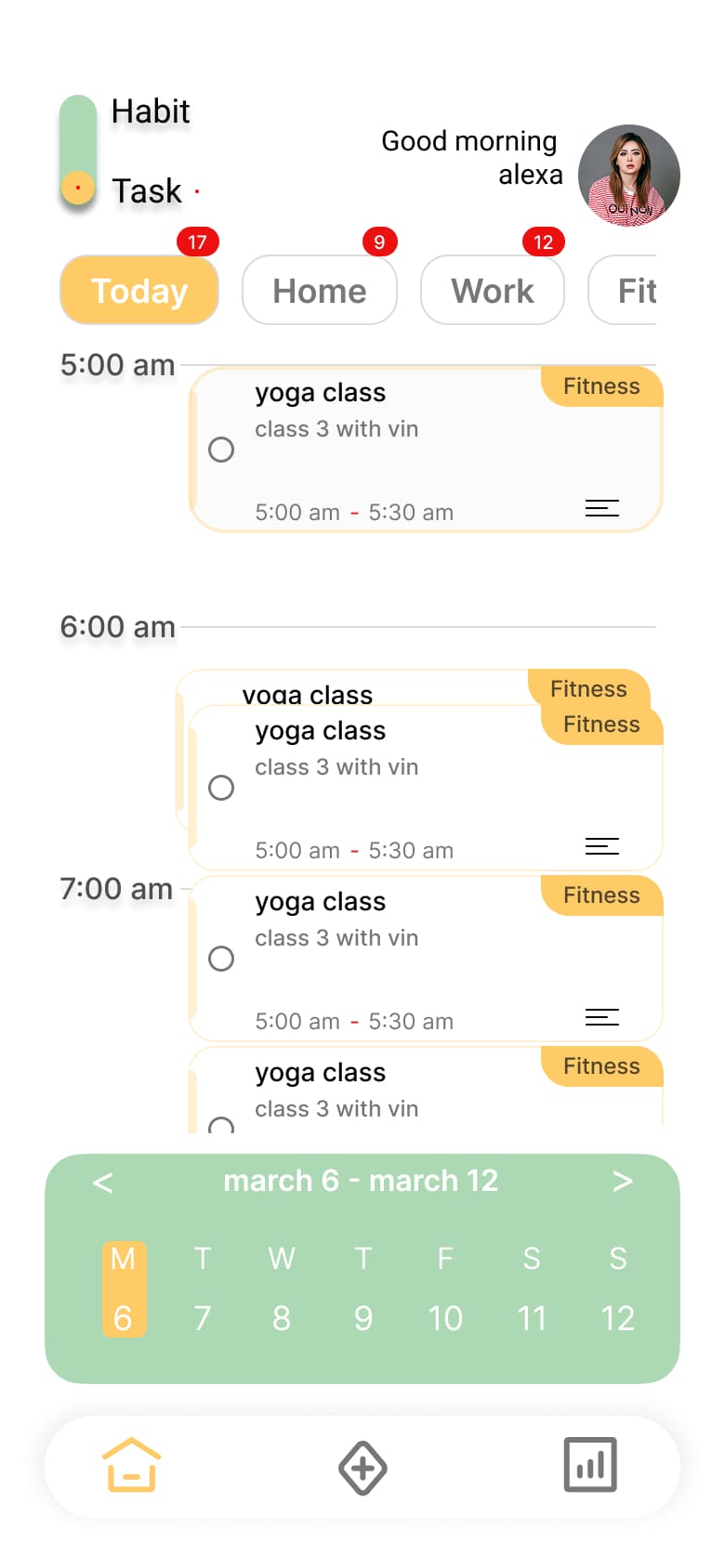
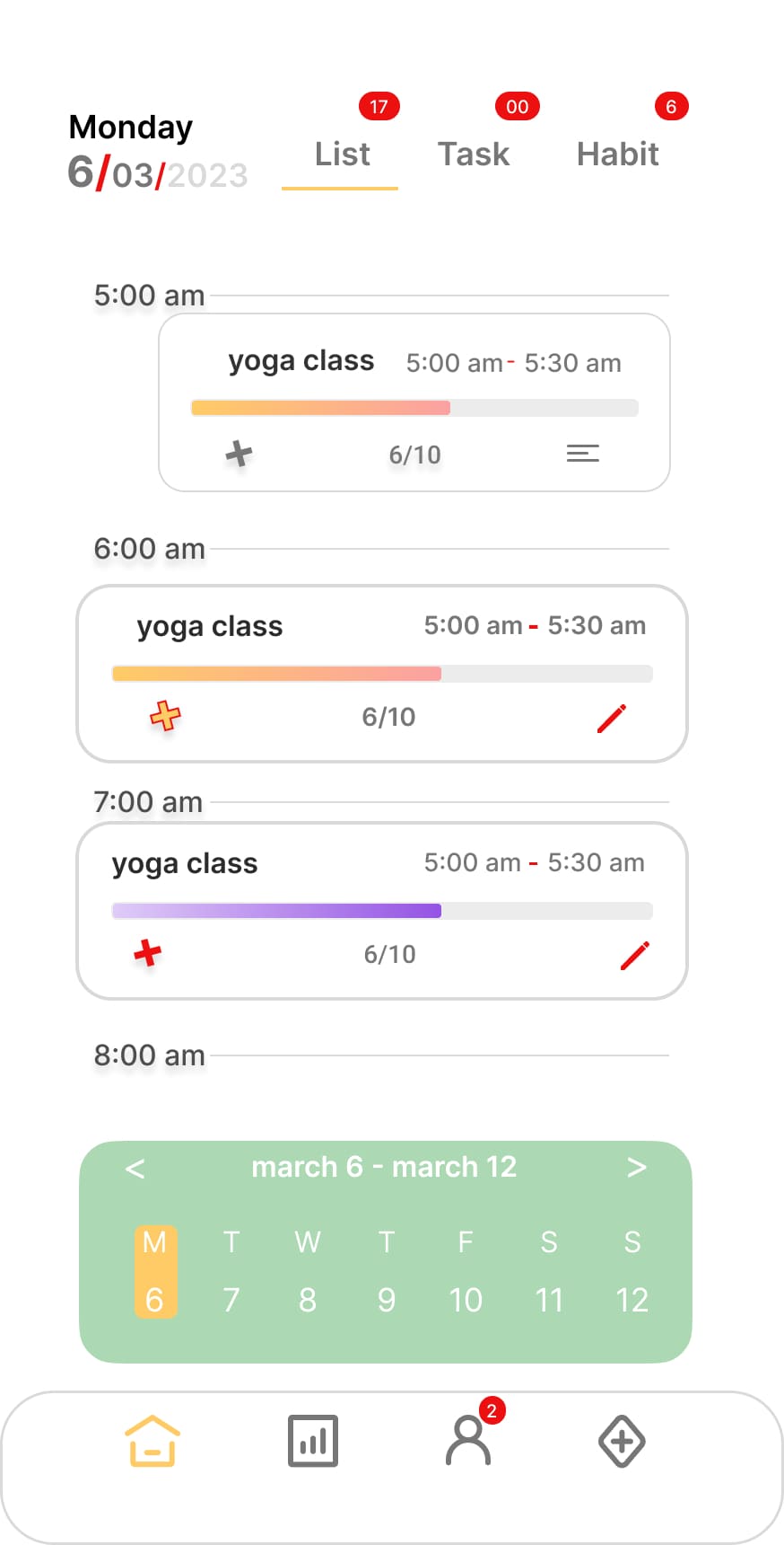
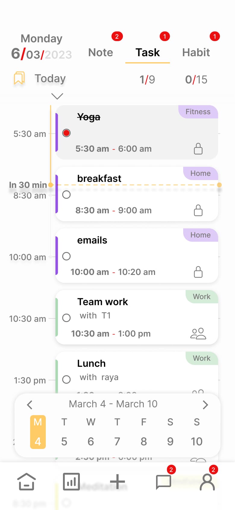
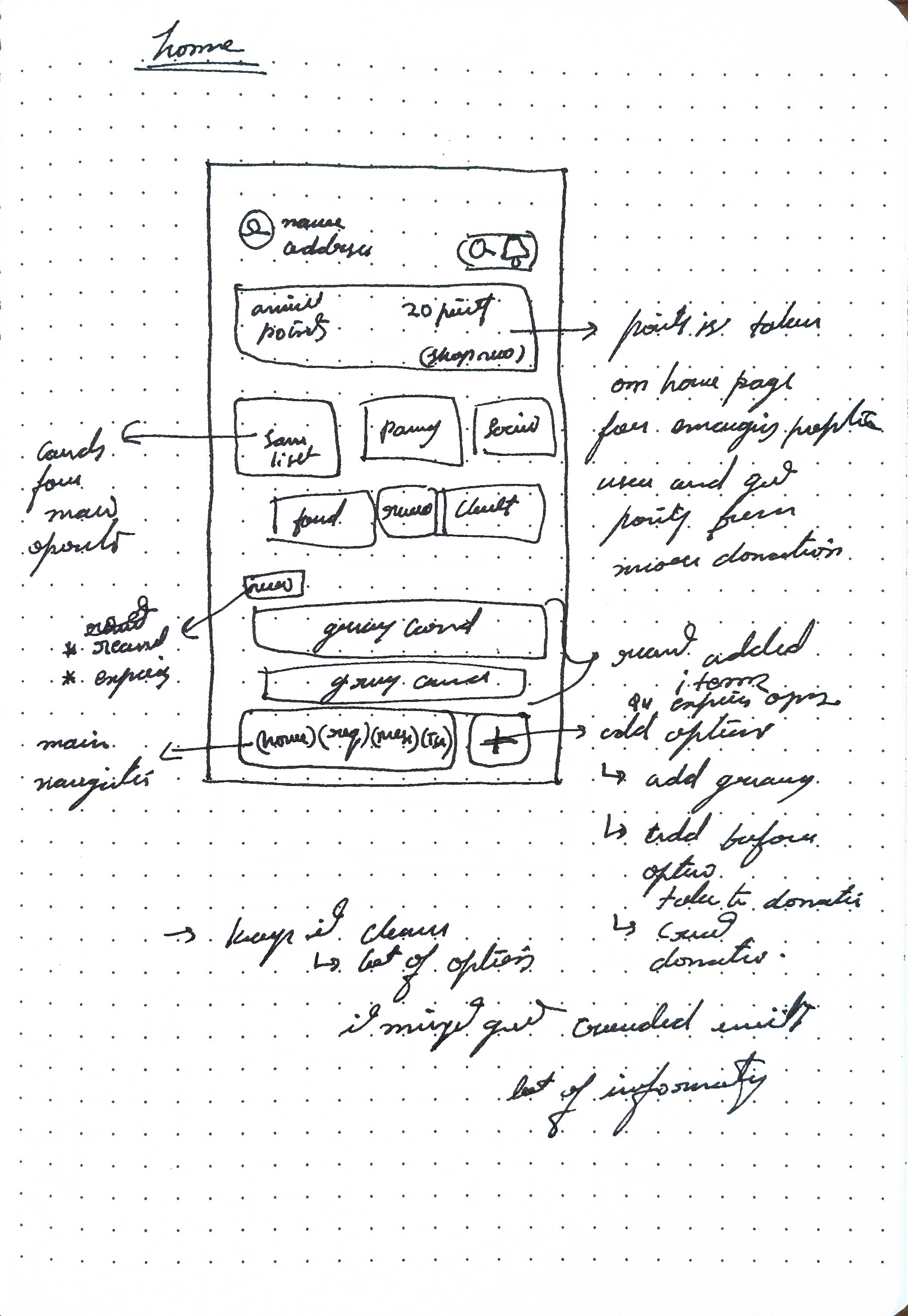
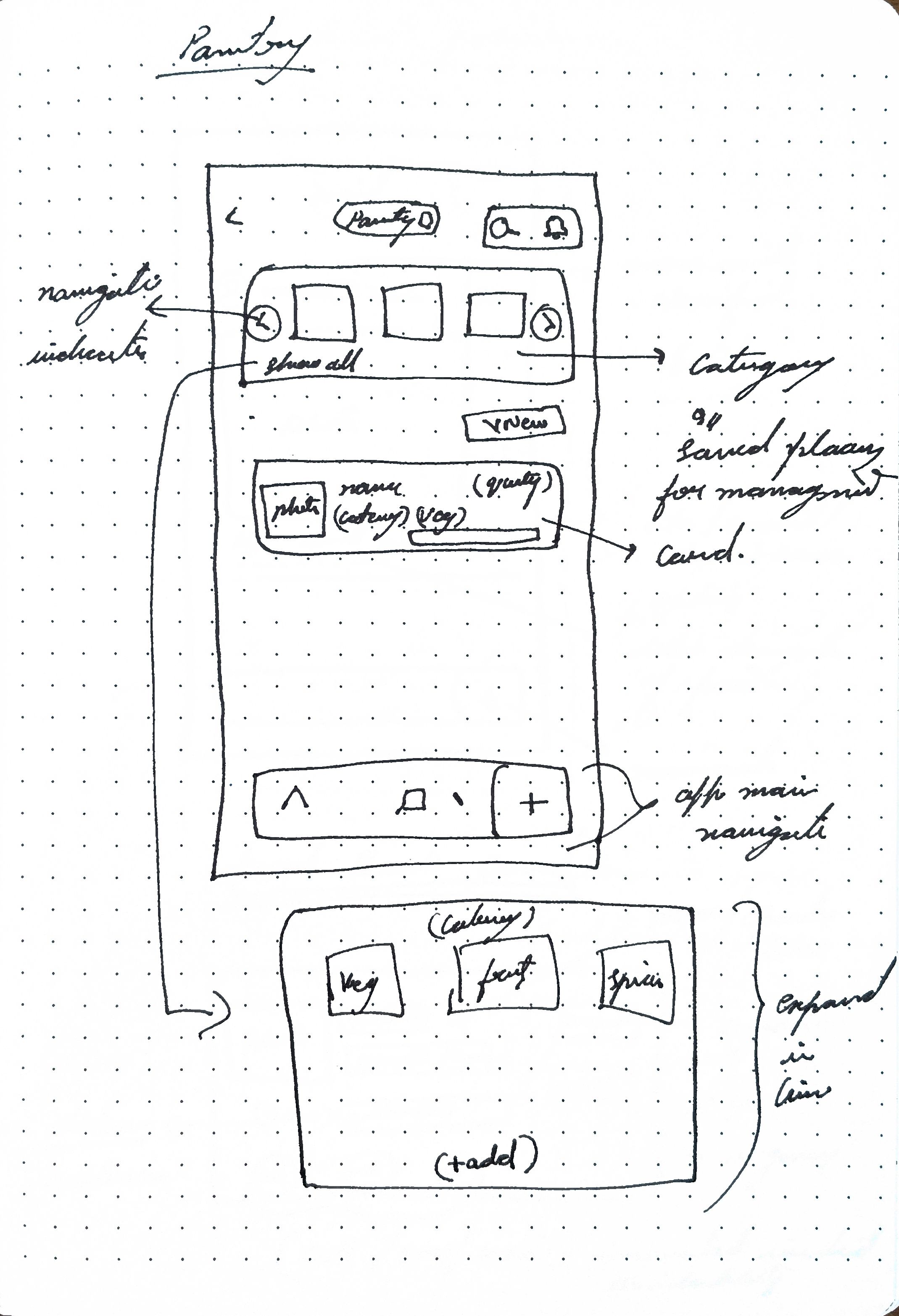
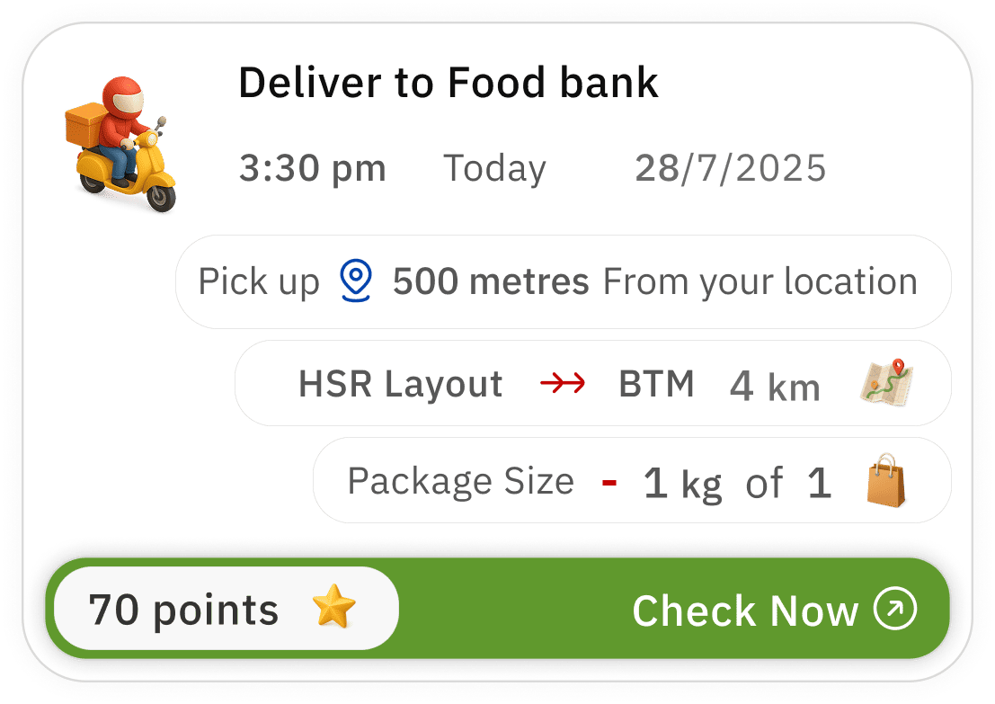
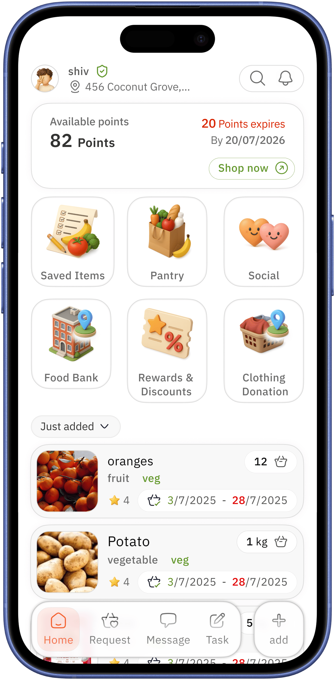
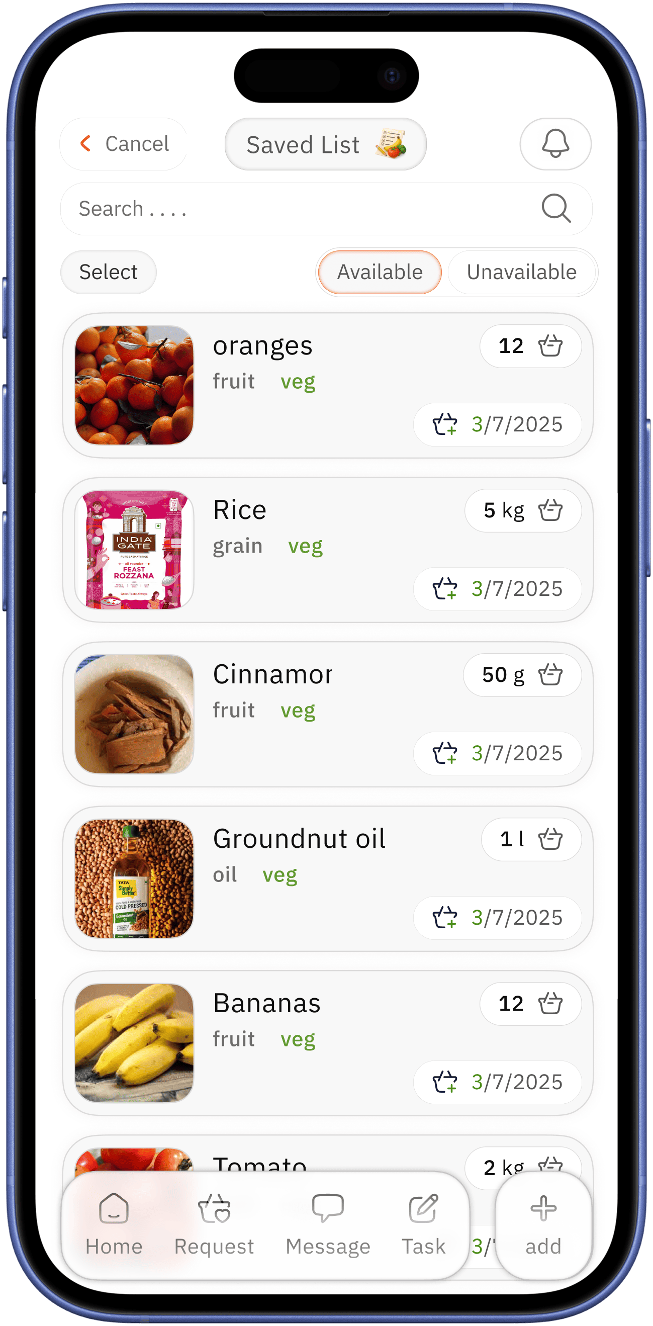
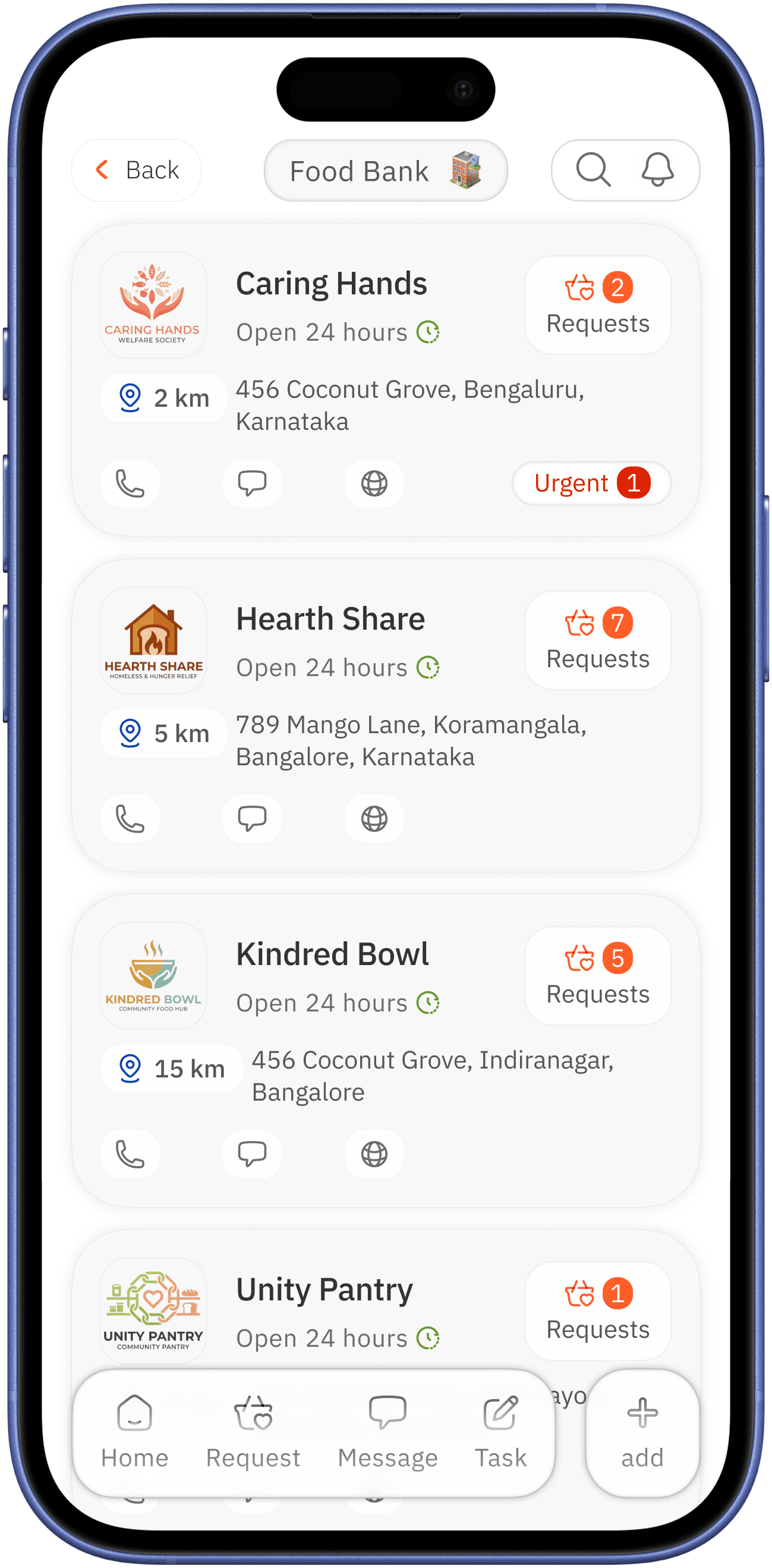
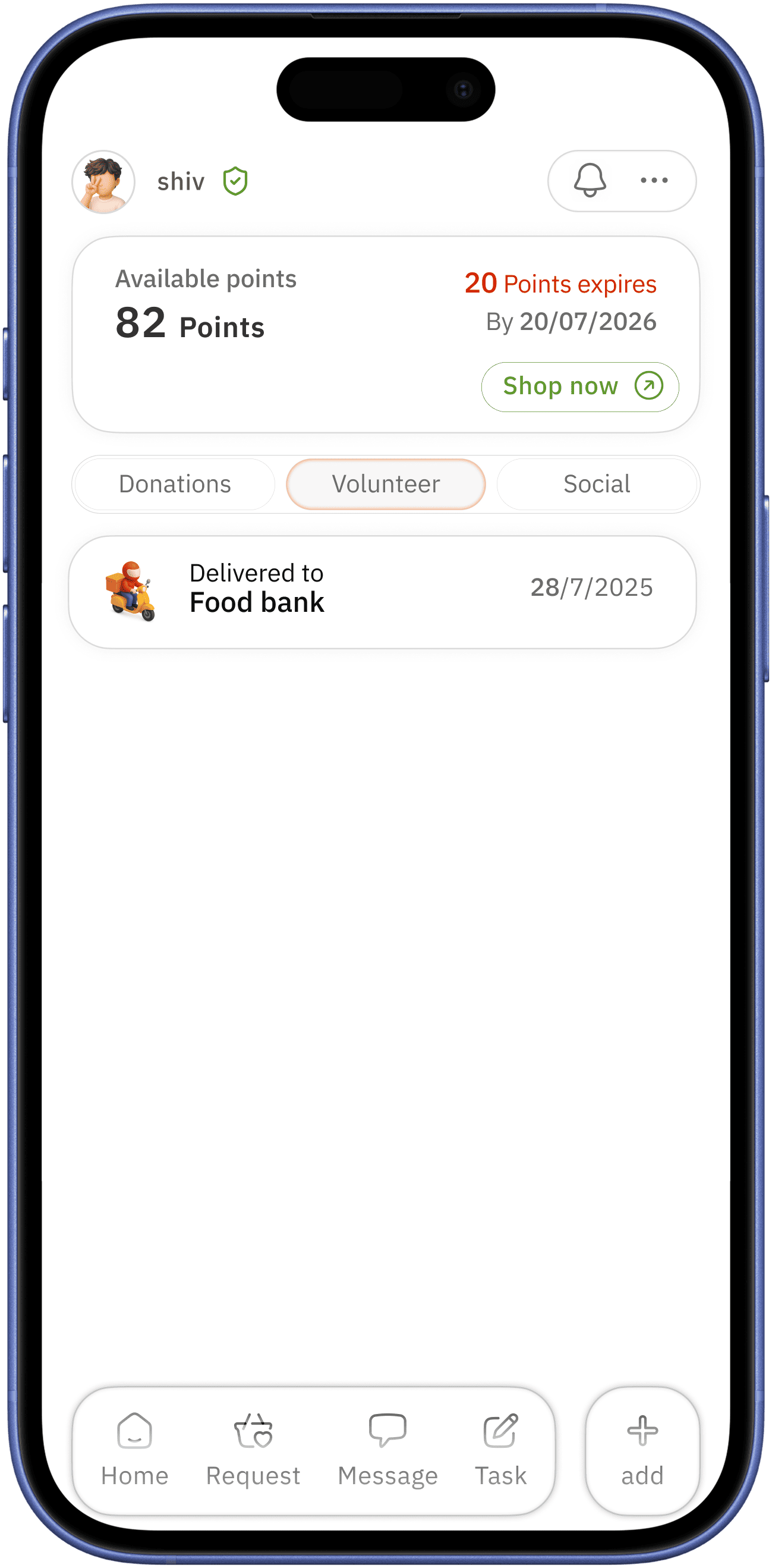
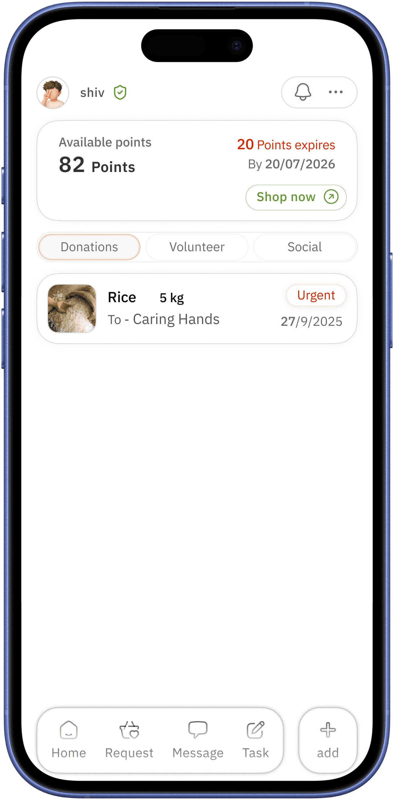
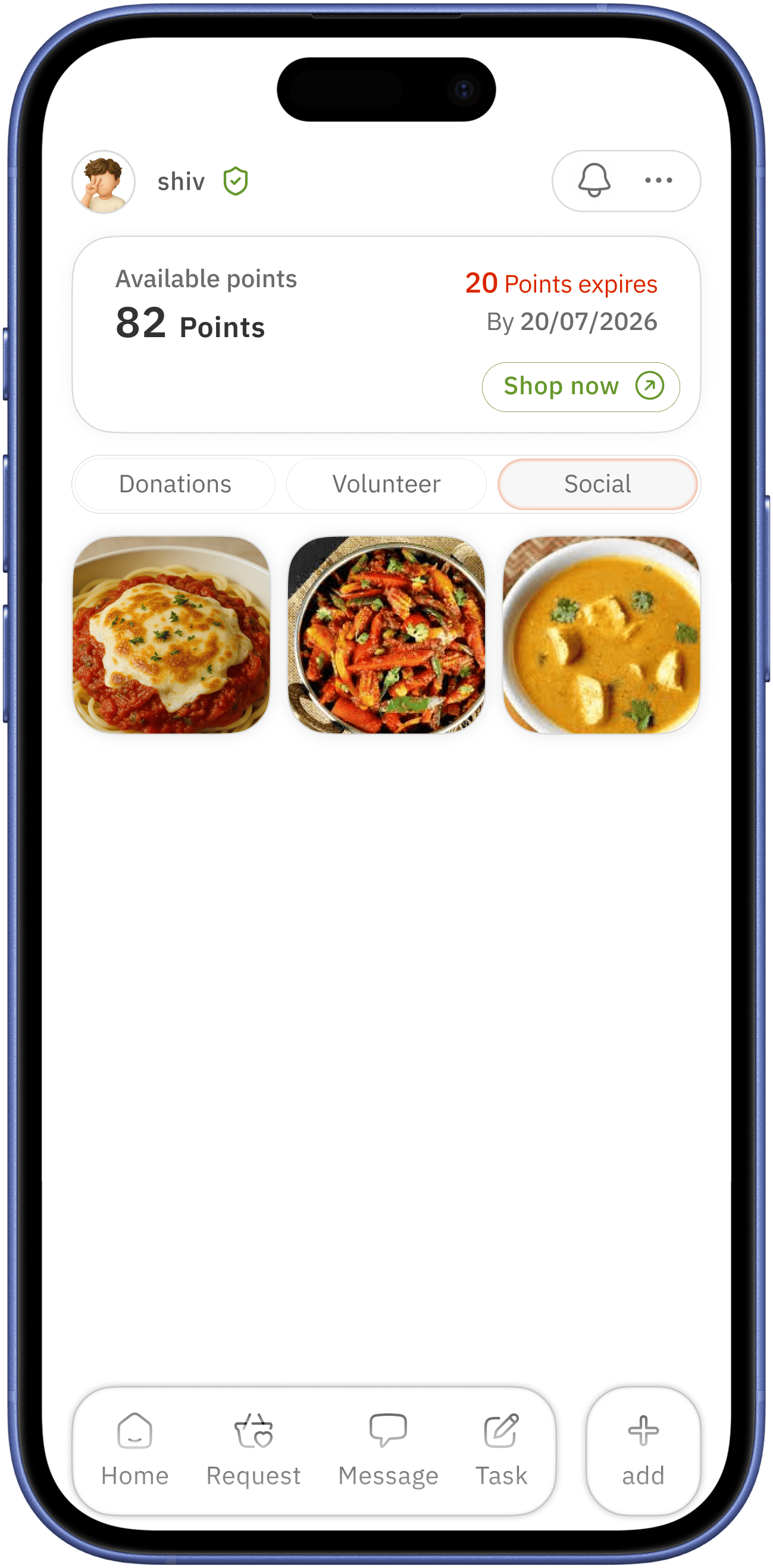
home screen
easily accessible simple home navigation with active colour indication
in-view time for upcoming task for better alertness
current day with down chevron for for more specific day brows


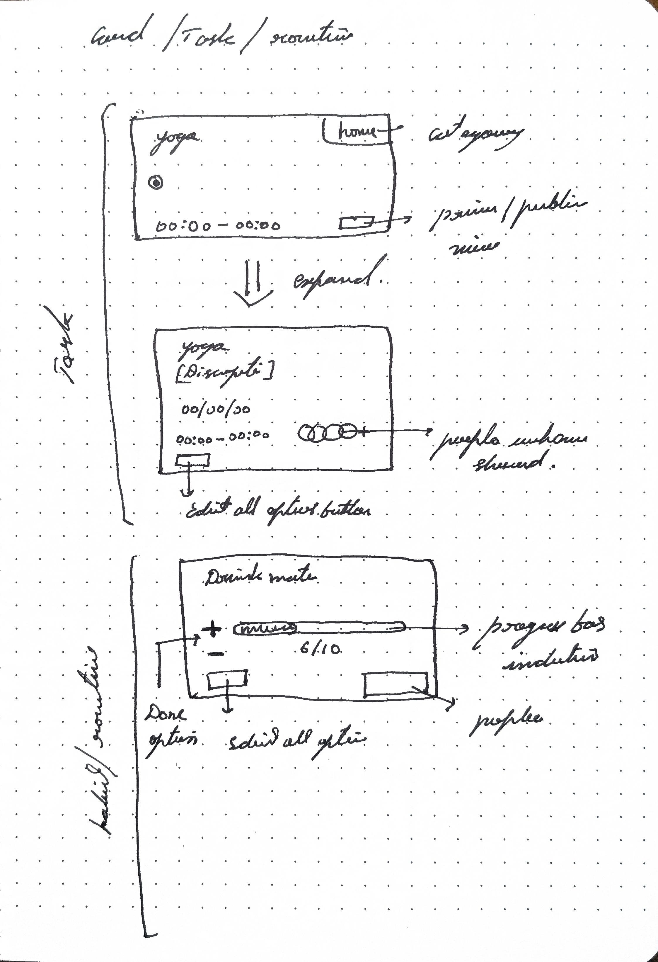
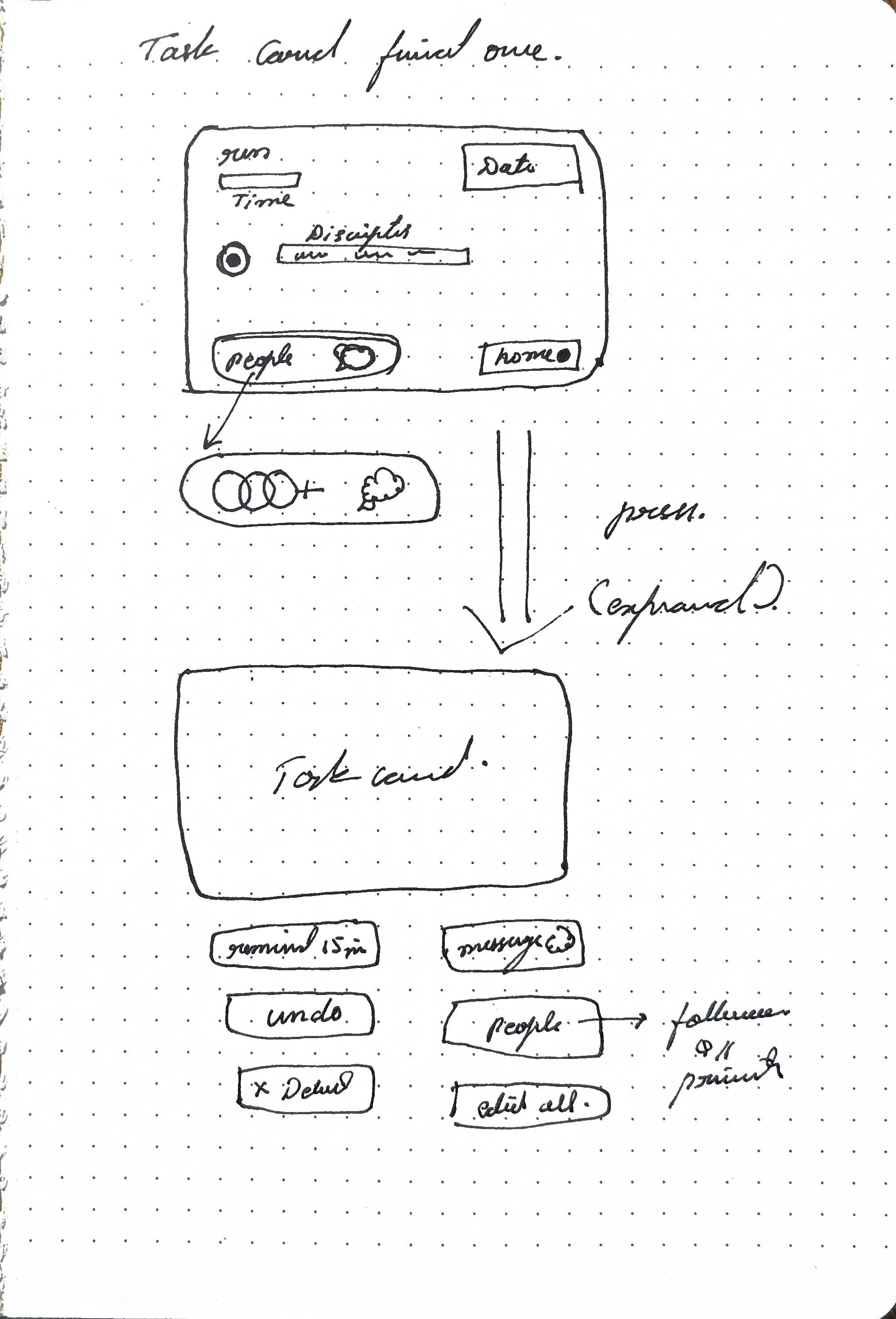
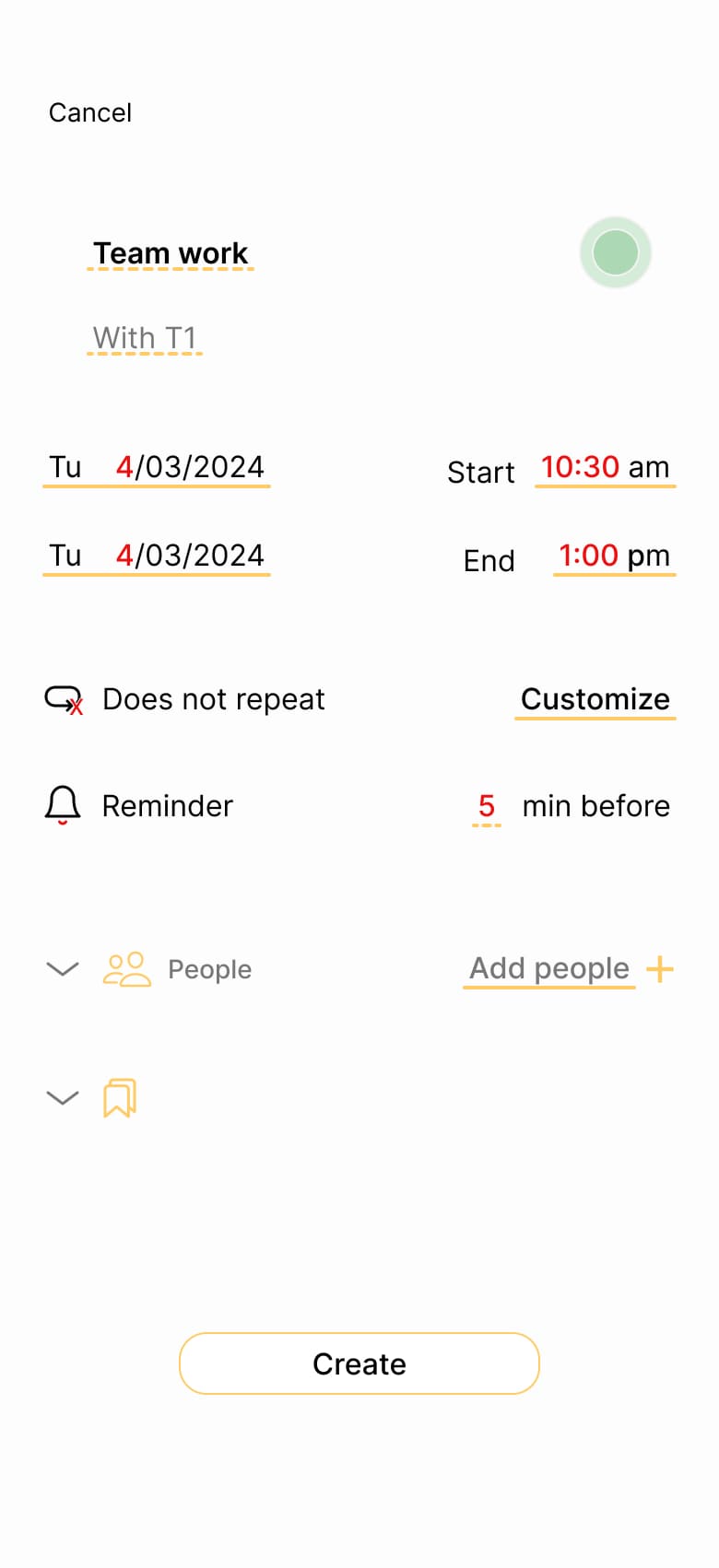
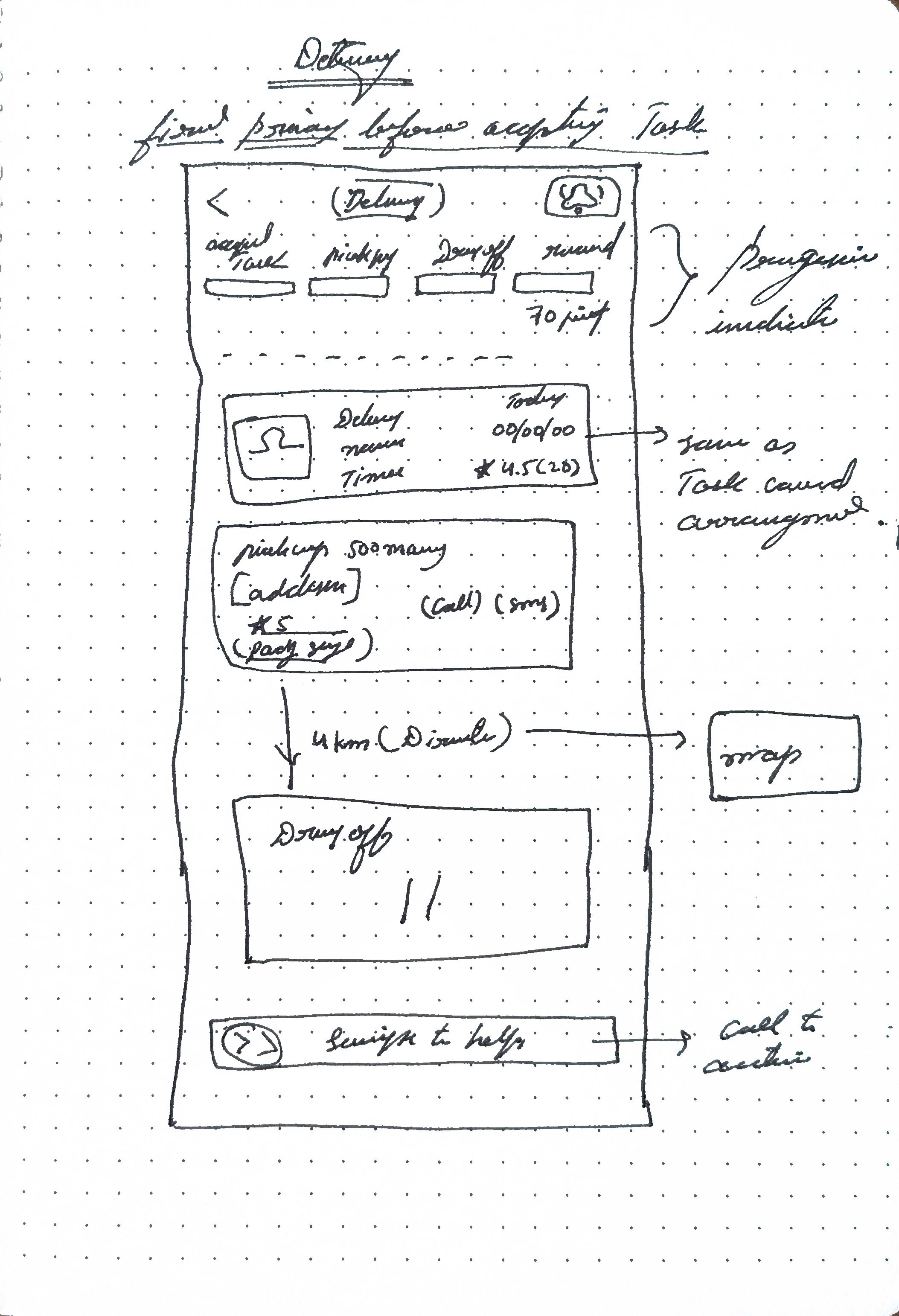
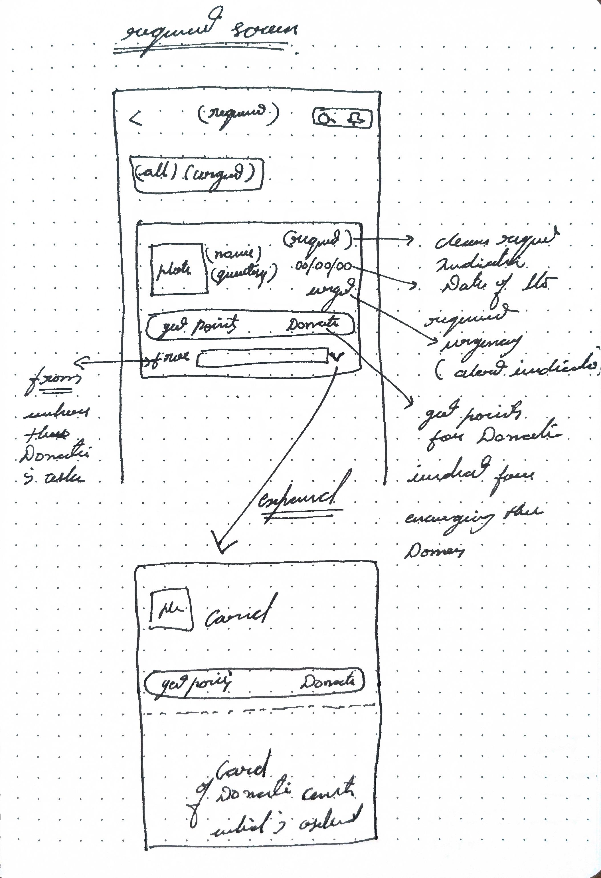
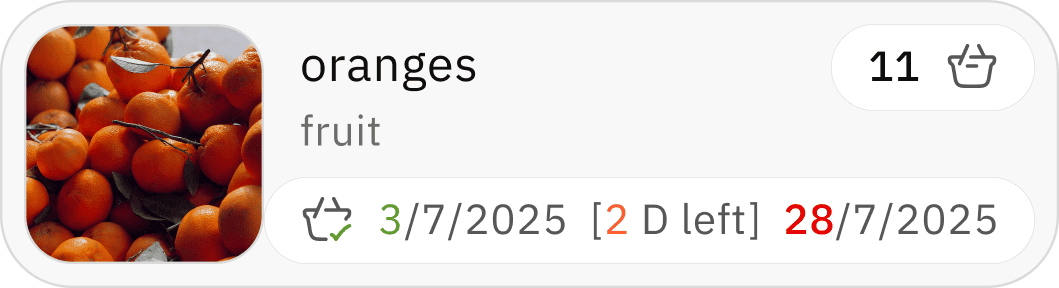
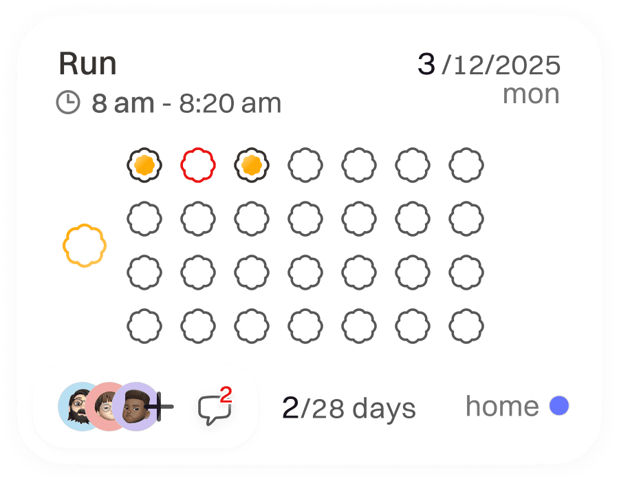
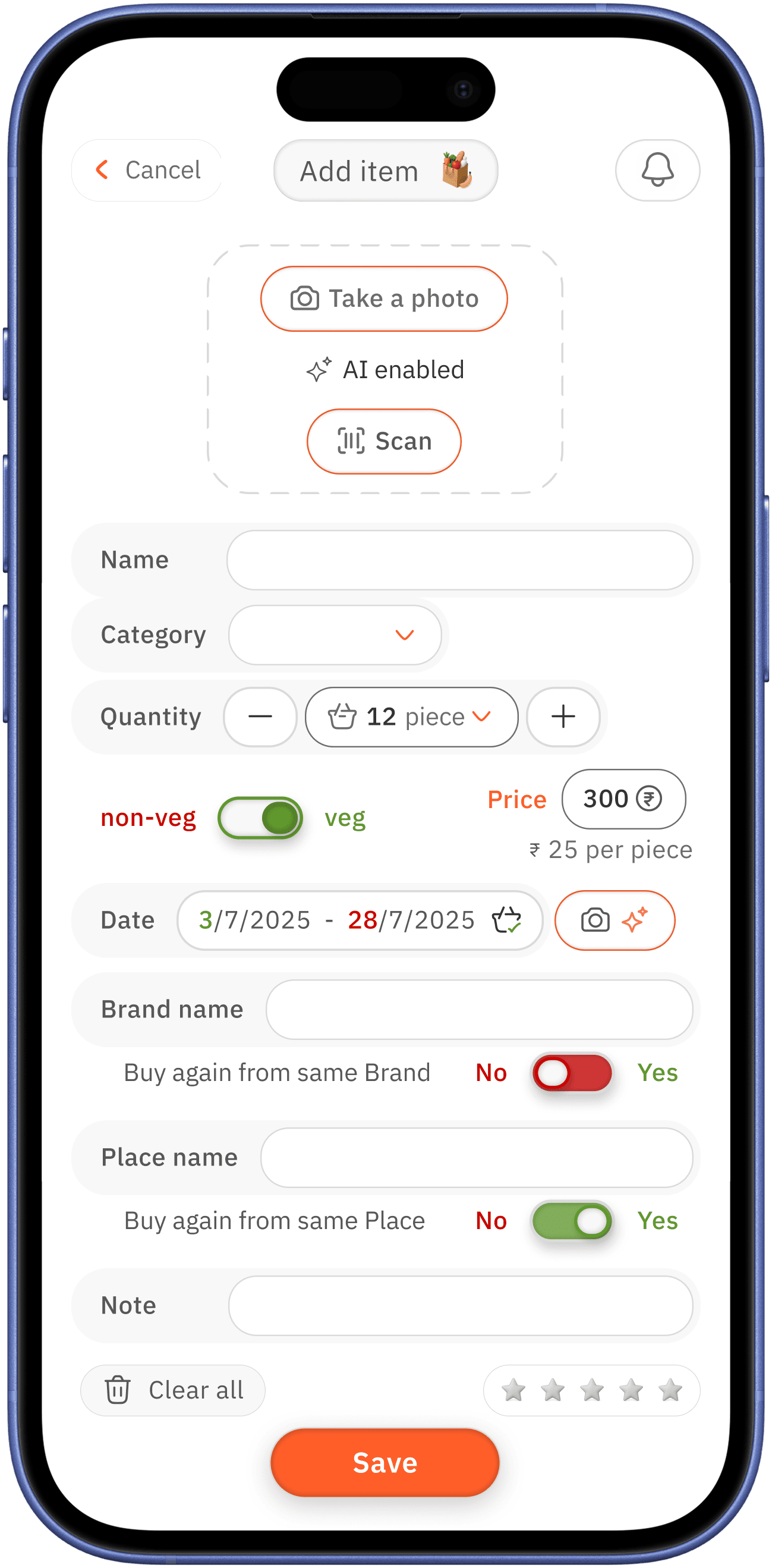
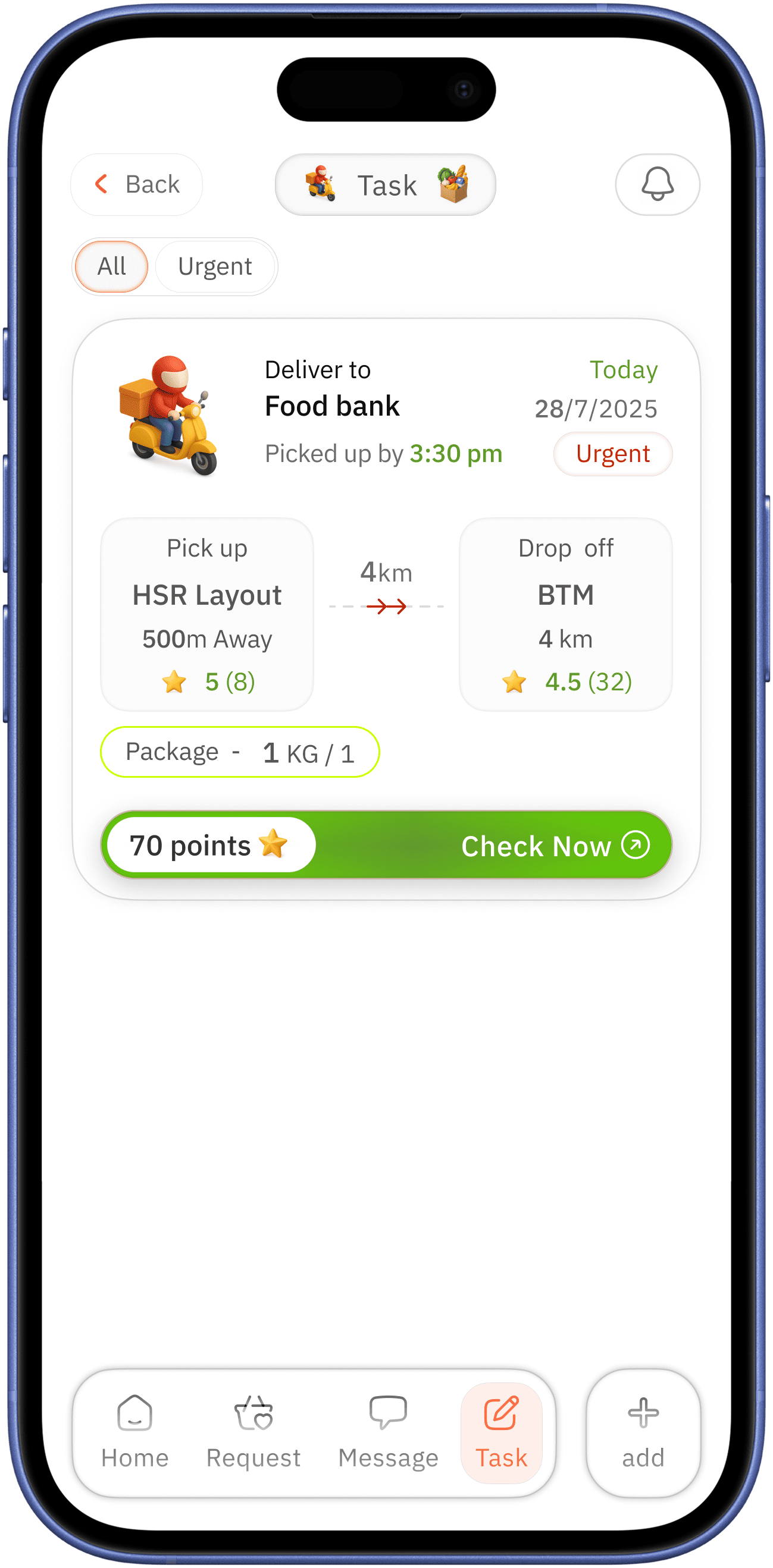
task card
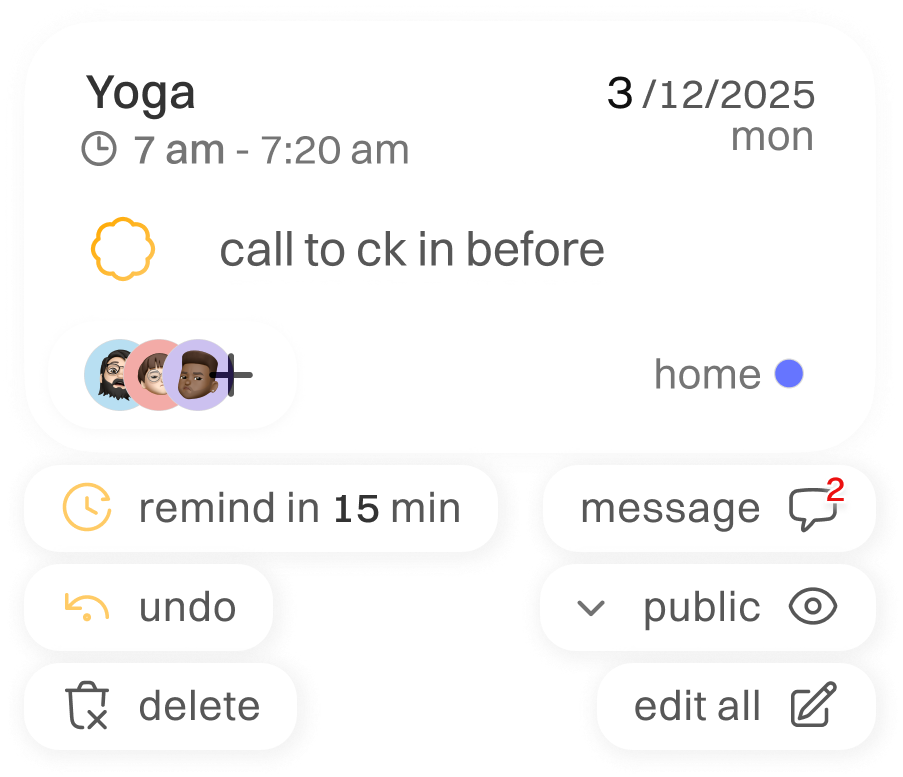
task title with time indication for better proximity,
in association of task with time
task title with time indication for better proximity,
in association of task with time

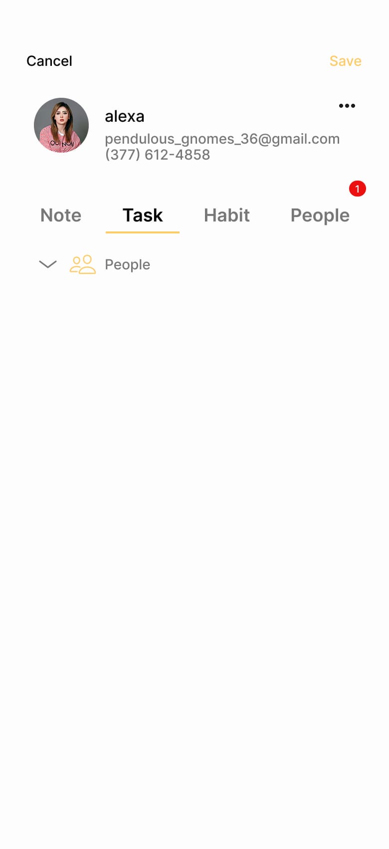
checkbox is paired with task description for second time verification before clicking it as done

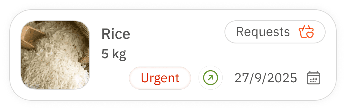
clear indication of task shared people and message for task call to action

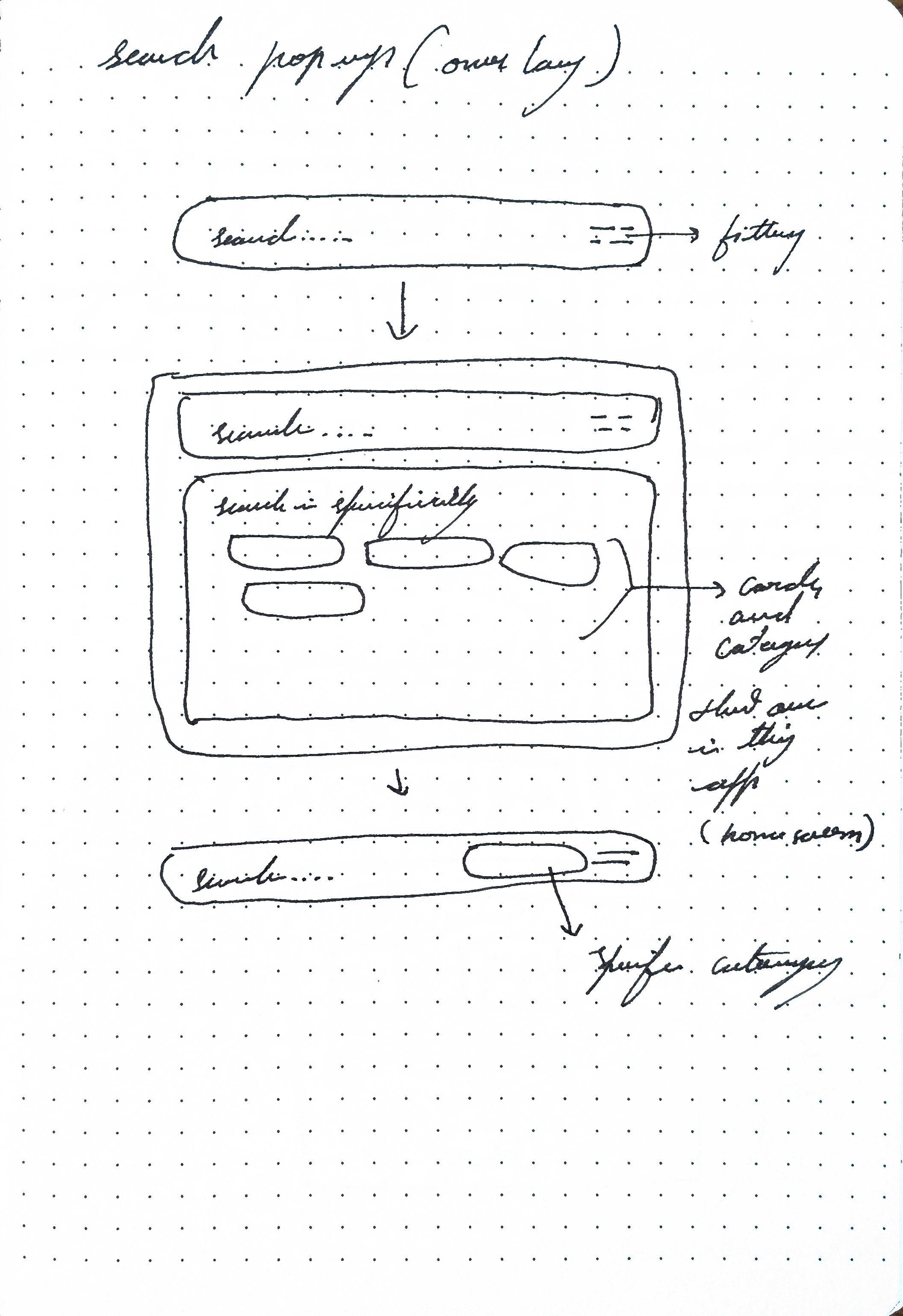
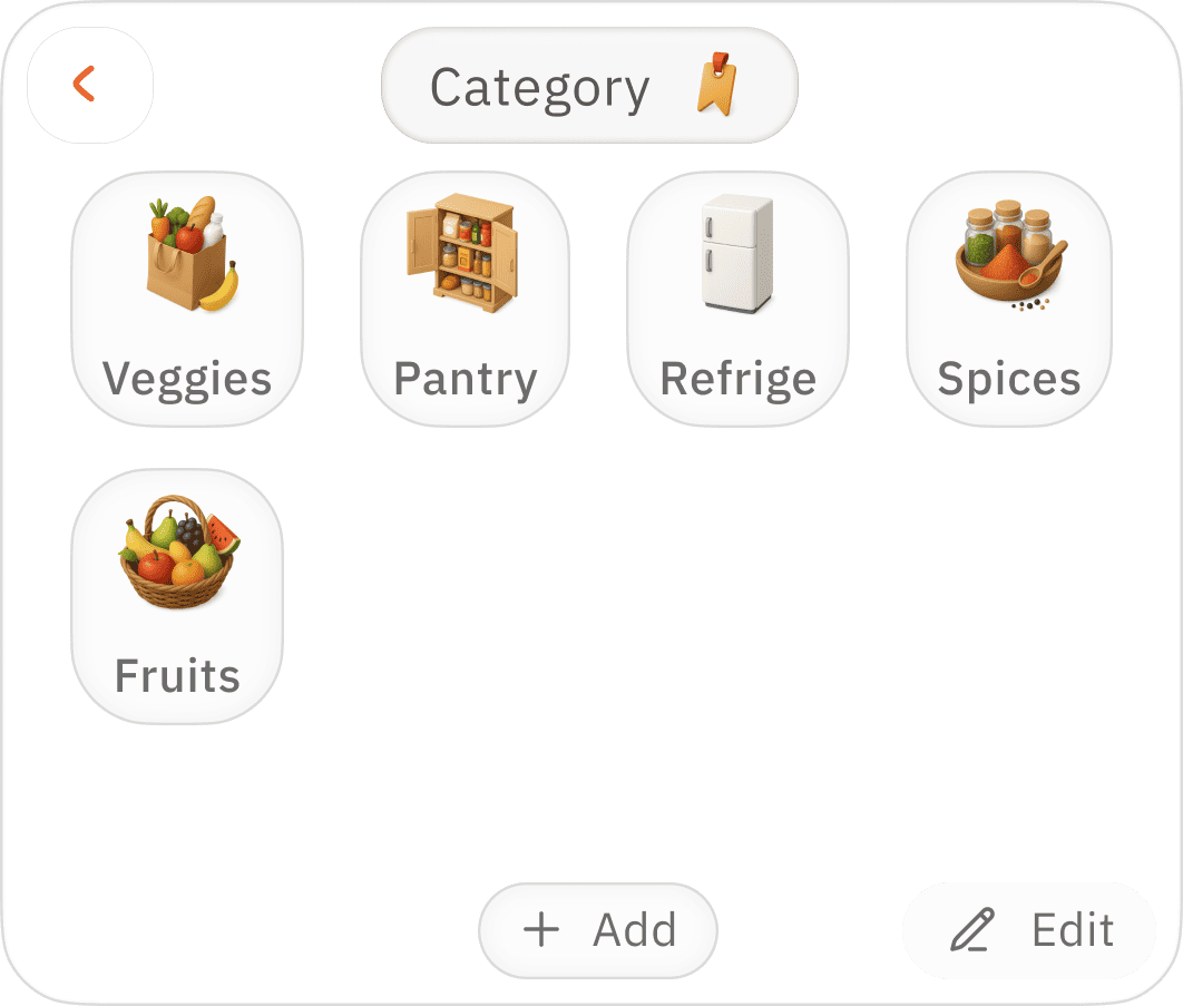
for better categorisation of task place
easy quick change option


expand for quick options
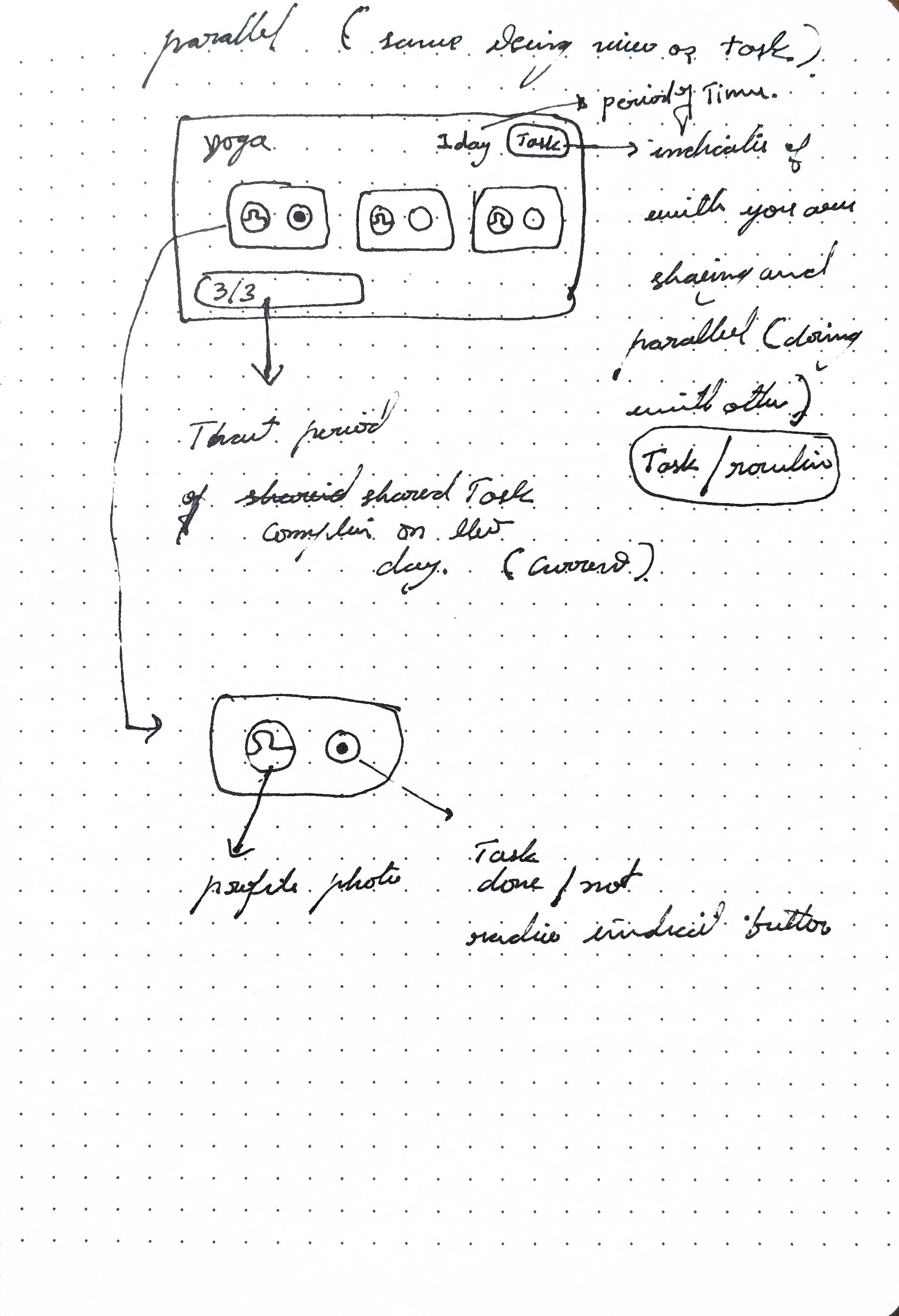
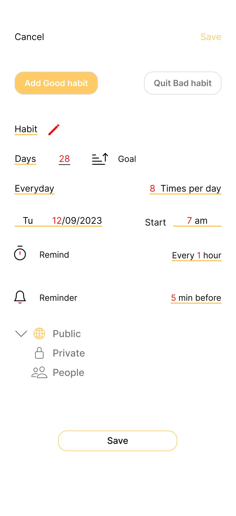
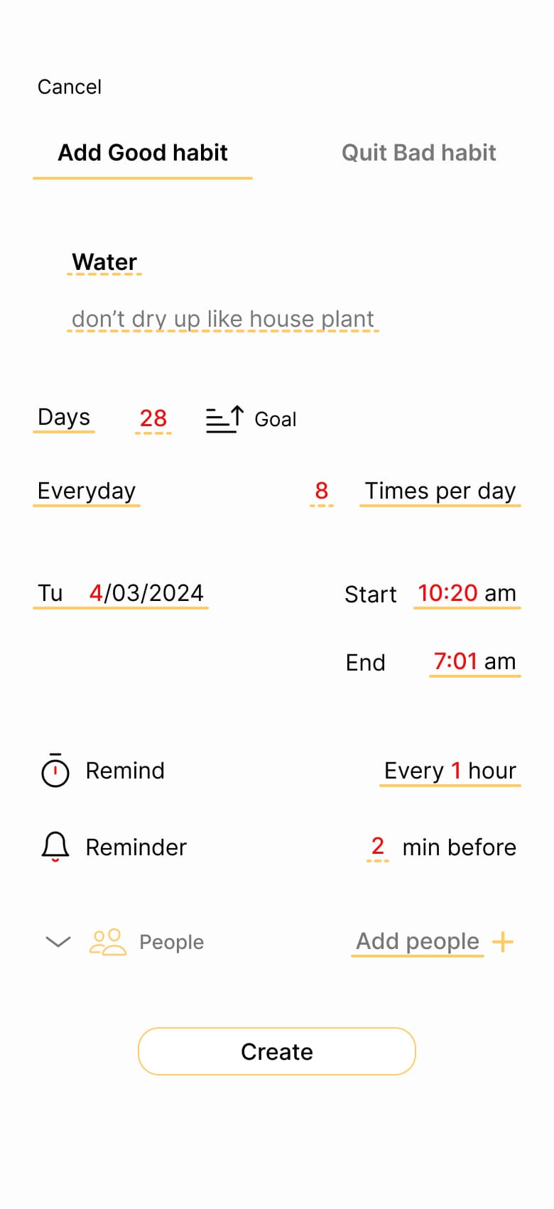
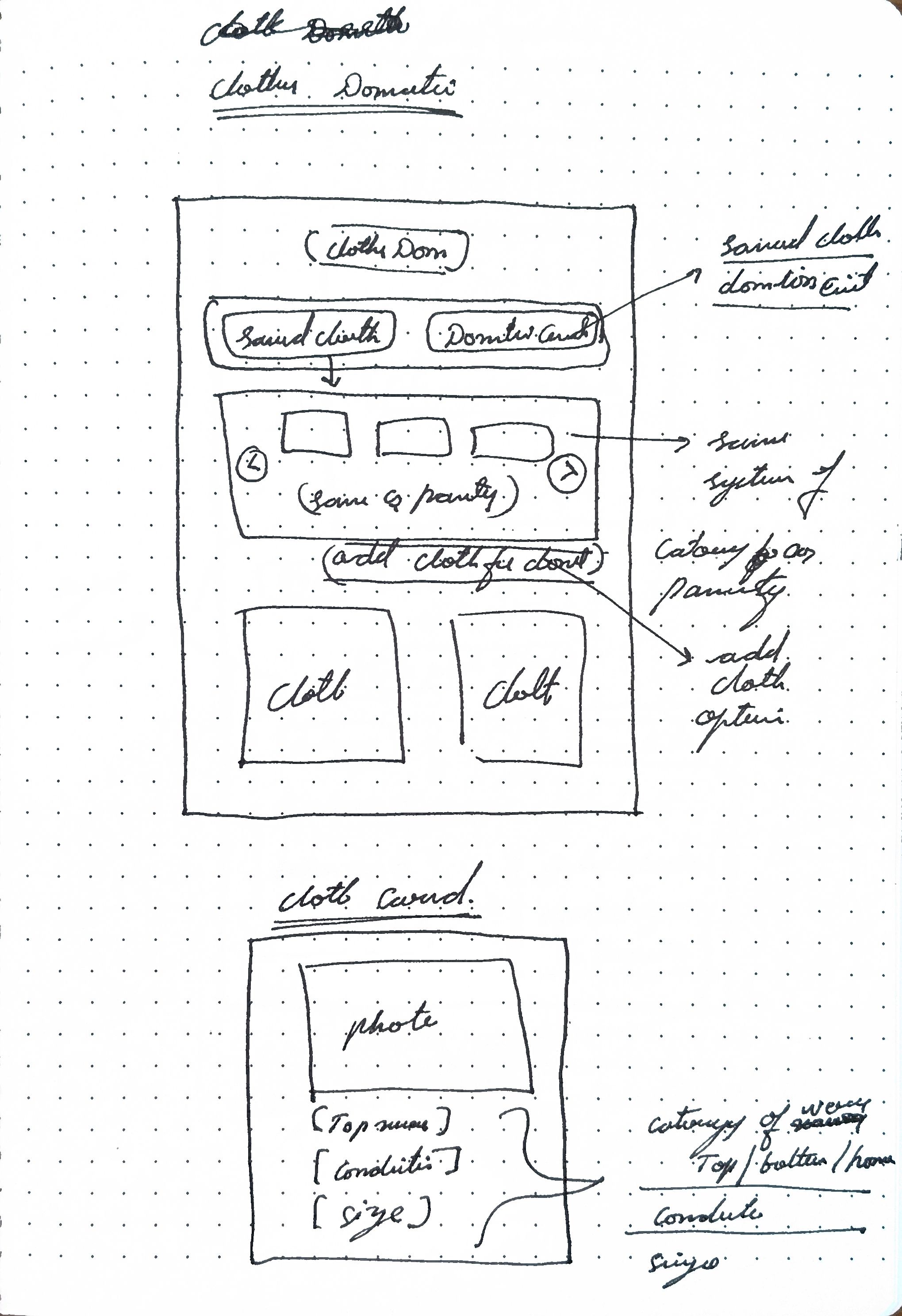
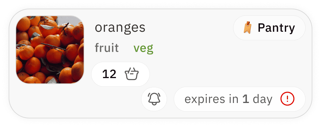
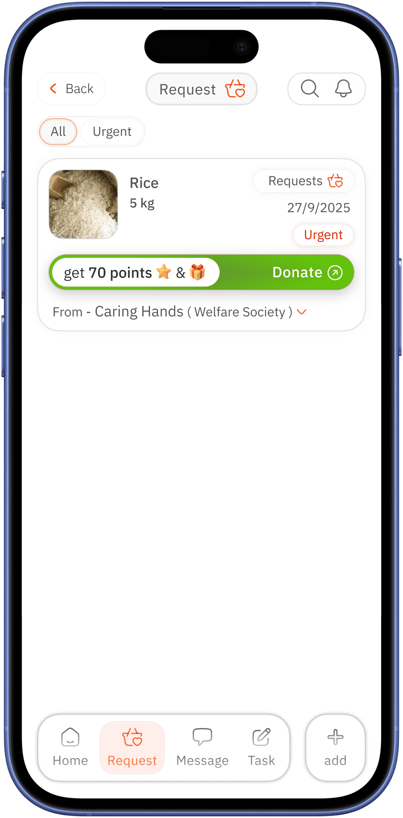
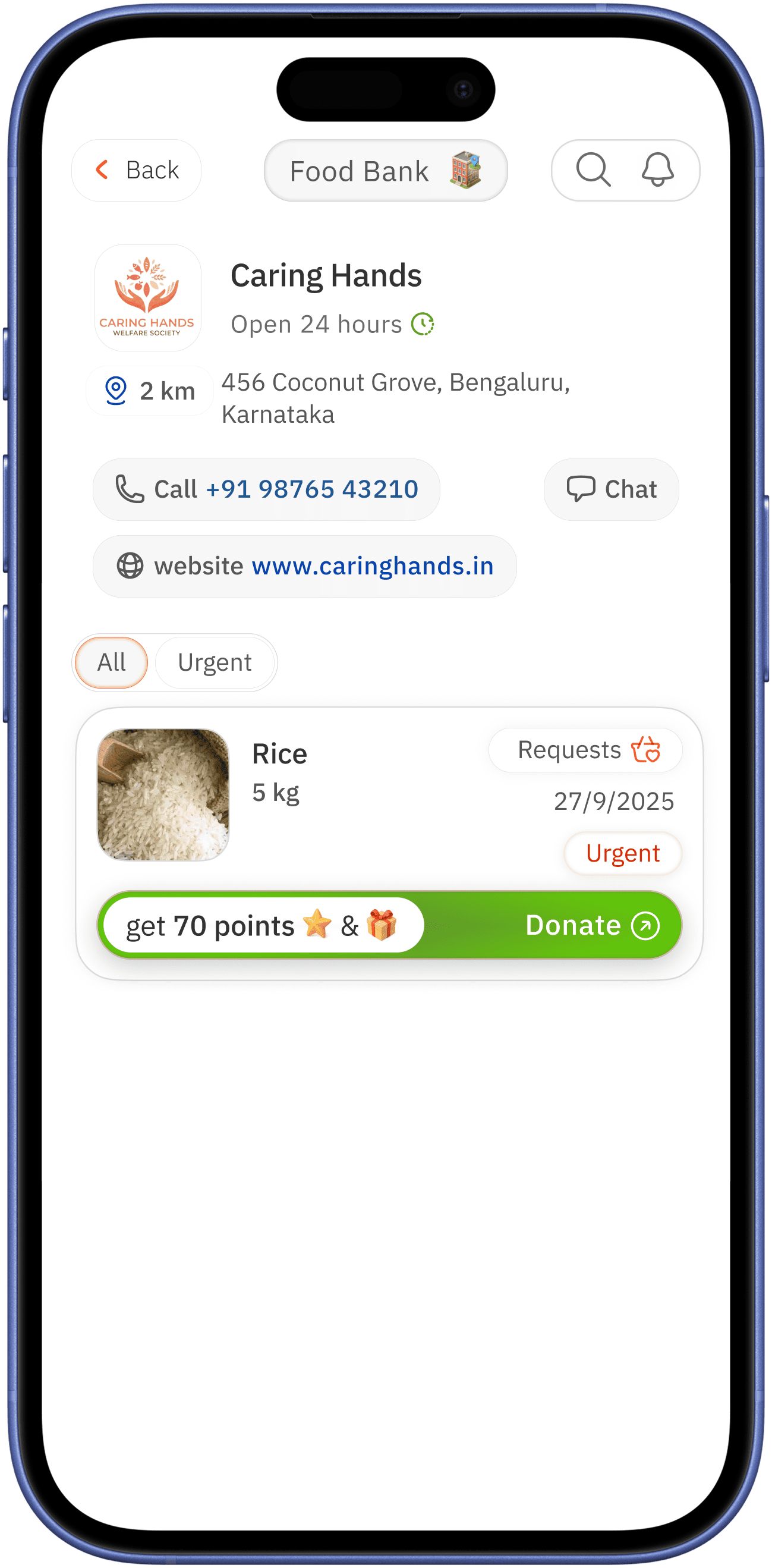
habit card
completed habit shows with main app colour / missed one with red for more attention

other elements of a card follow same design reasoning as other cards
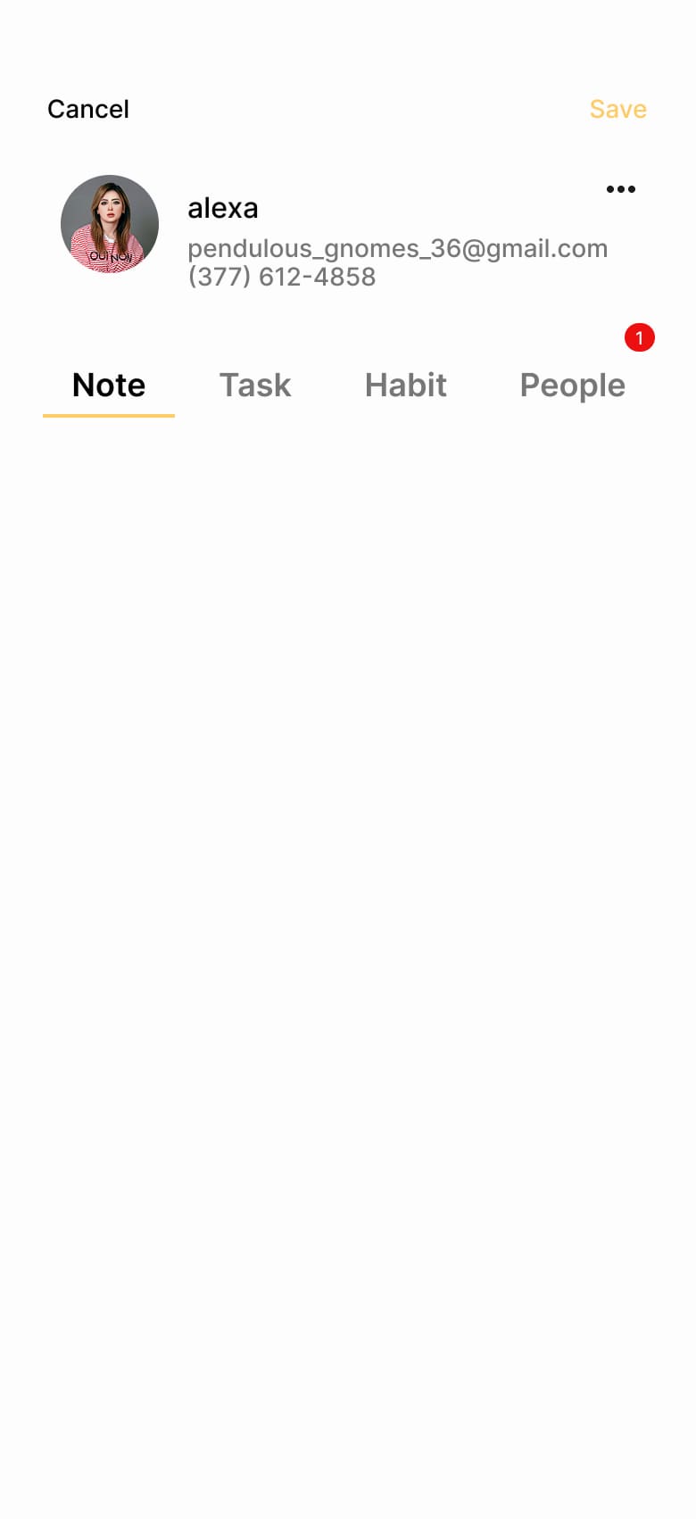
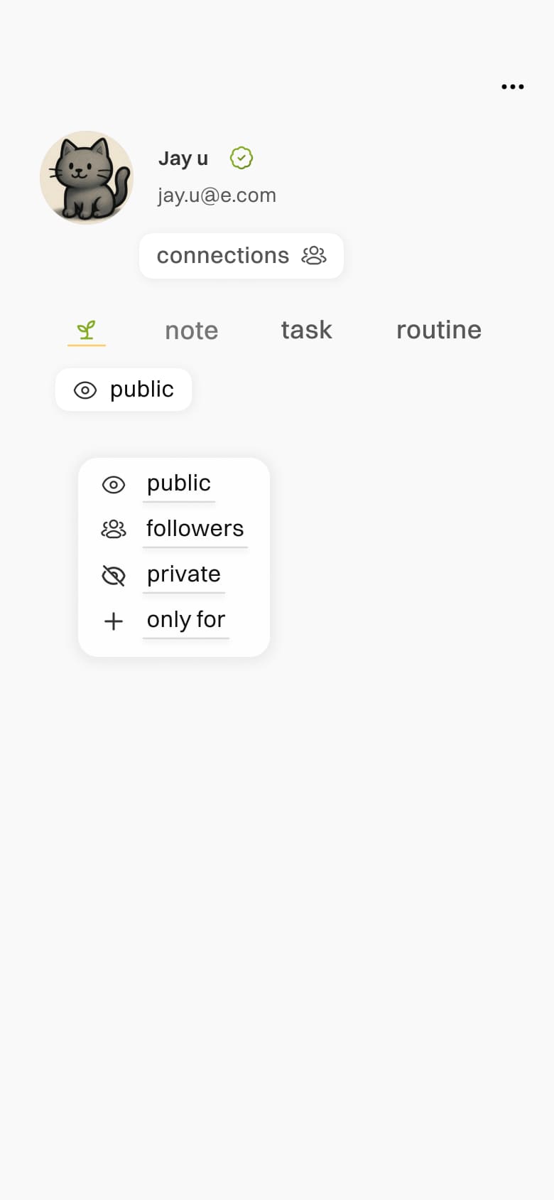
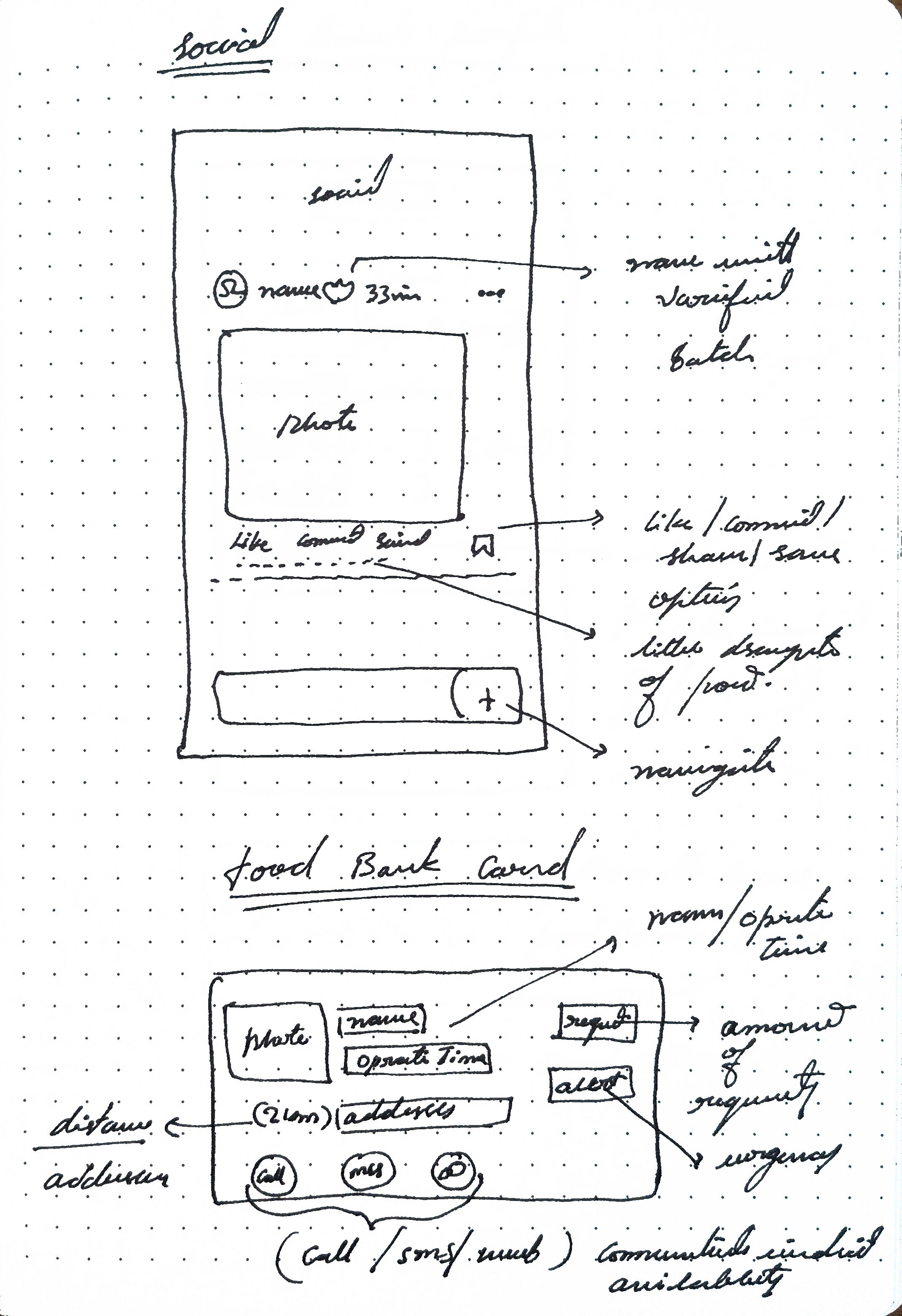
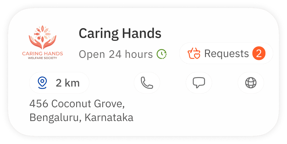
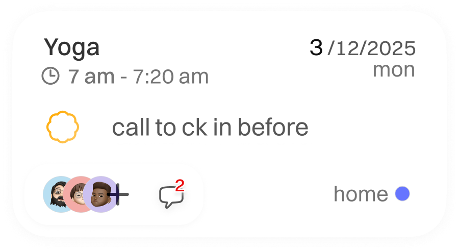
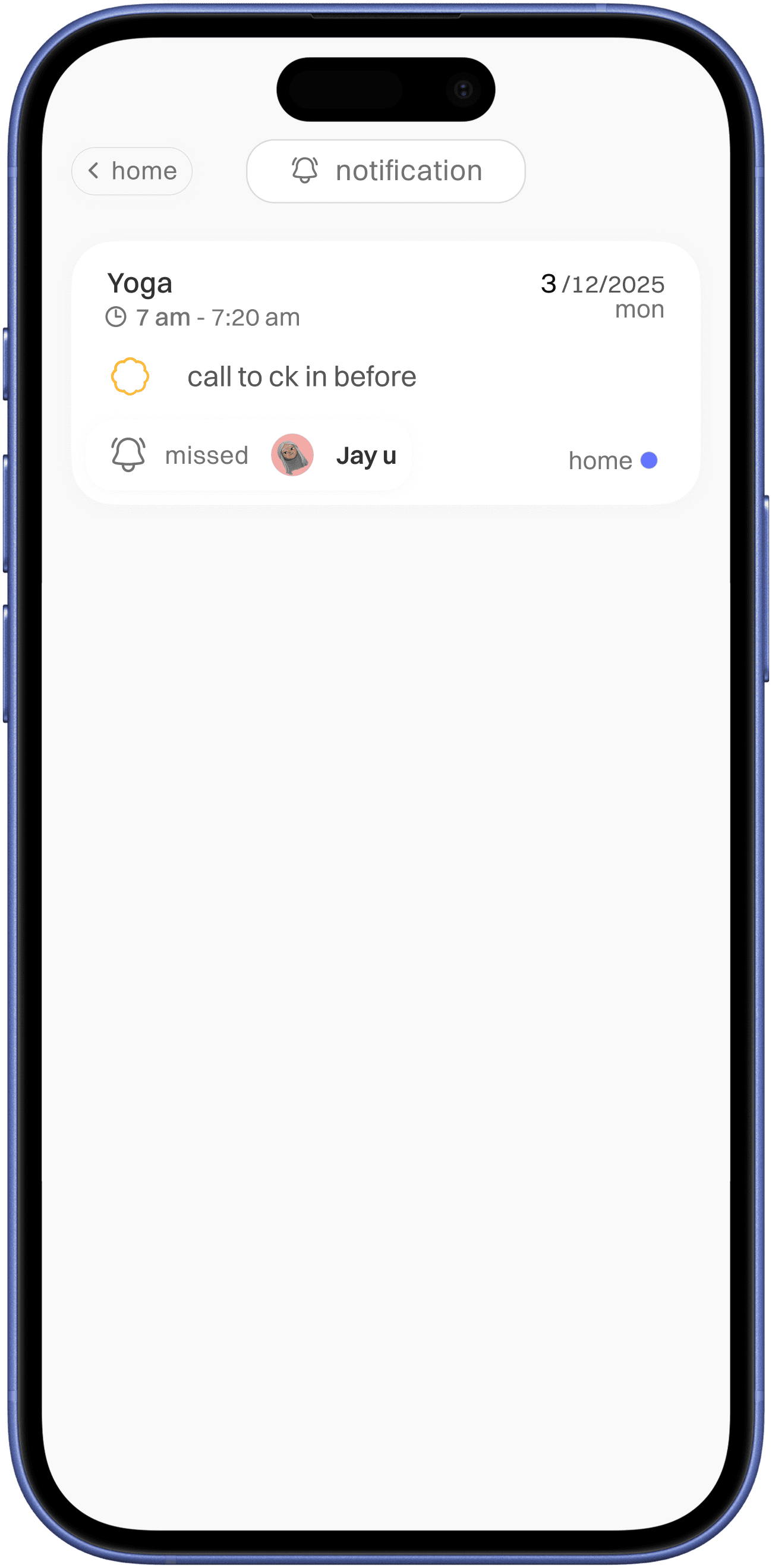
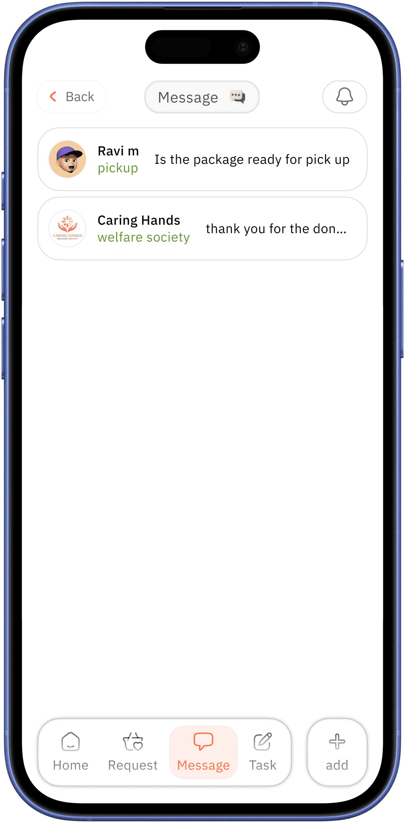
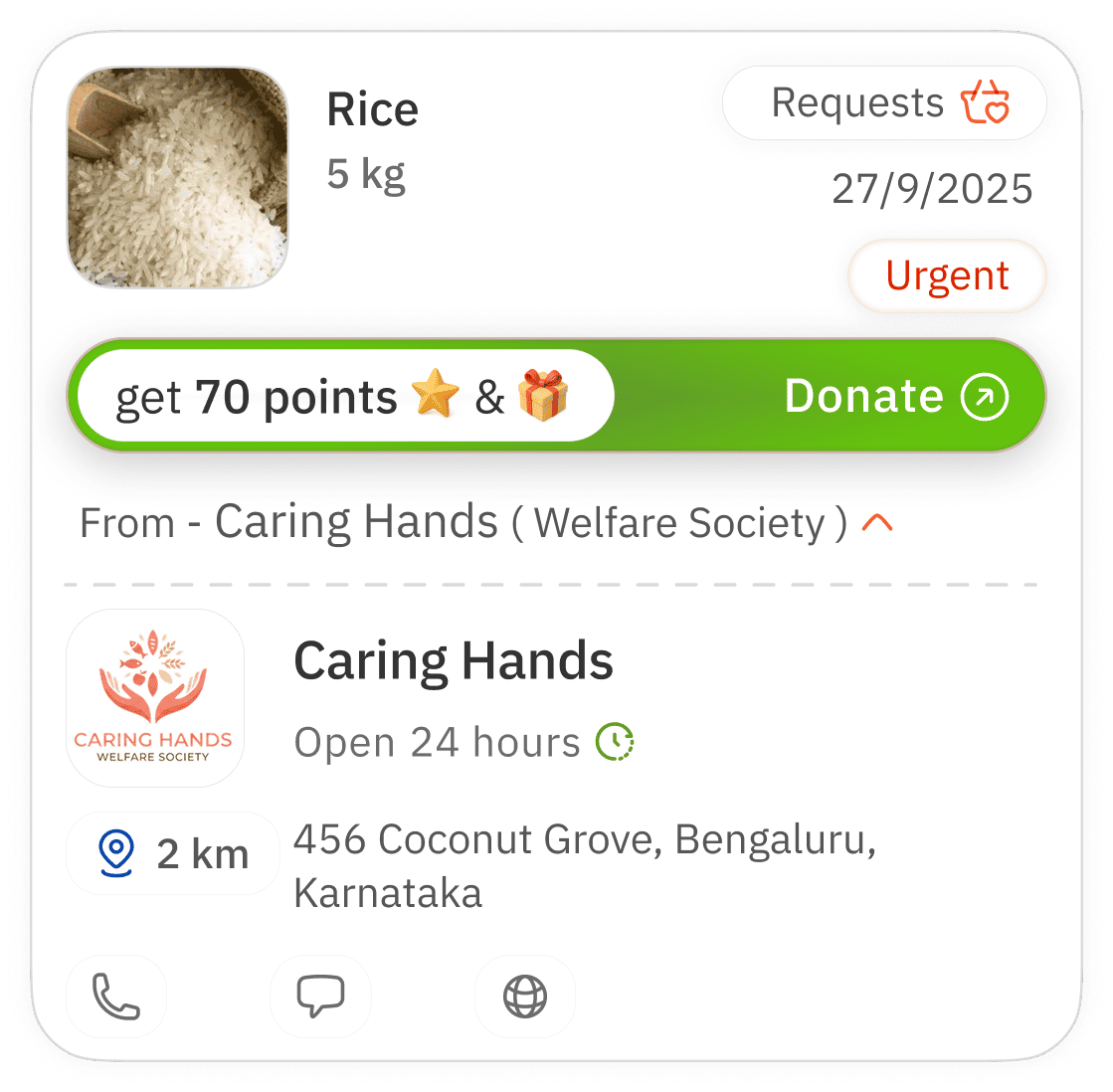
message
notification
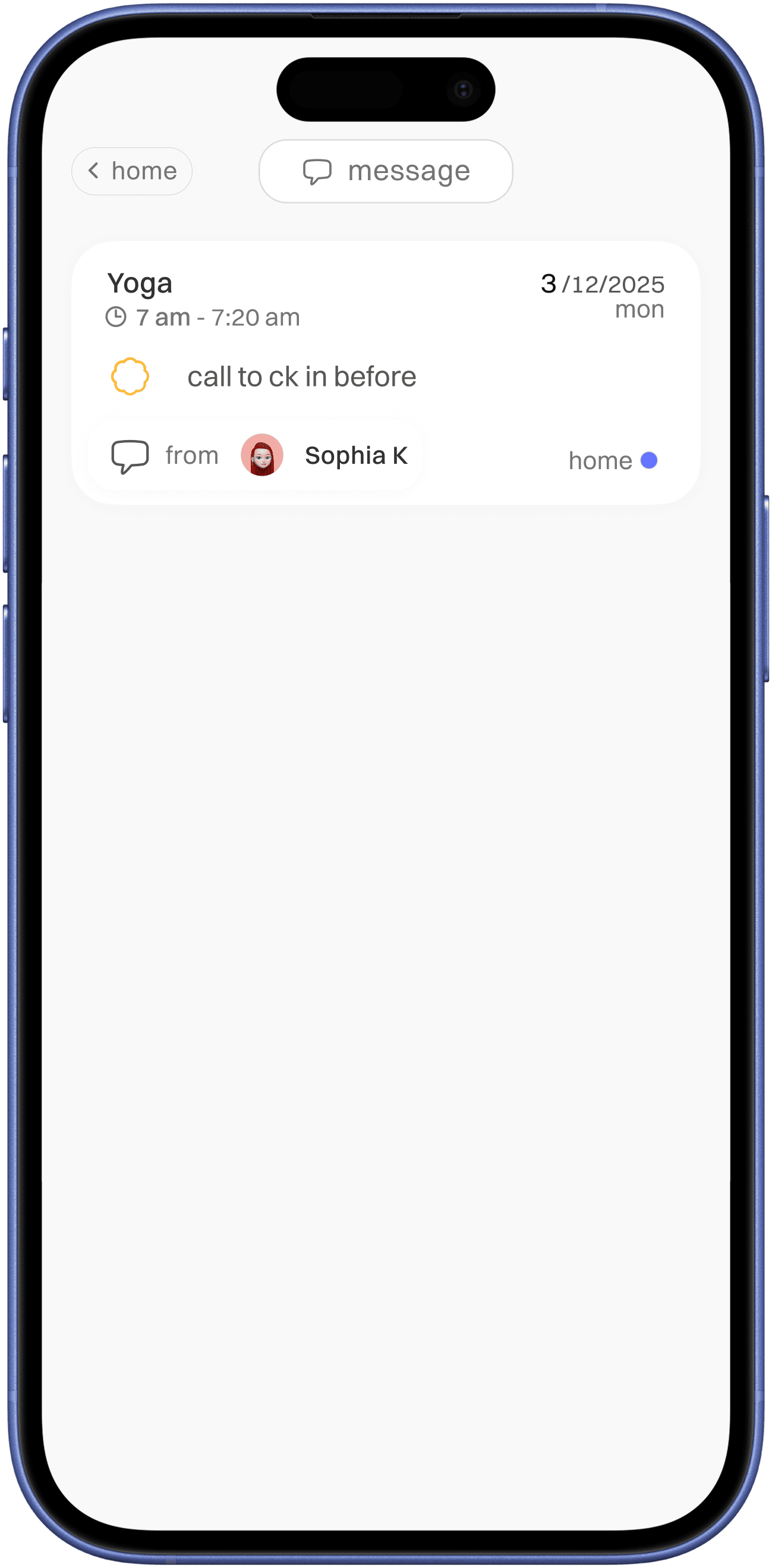
indication with message icon with sender info
indication with bell icon with ( parallel ) shared user who missed a task

follows same design as task/routine/plant card which used missed to complete with added message indication for better enforcement visual identity
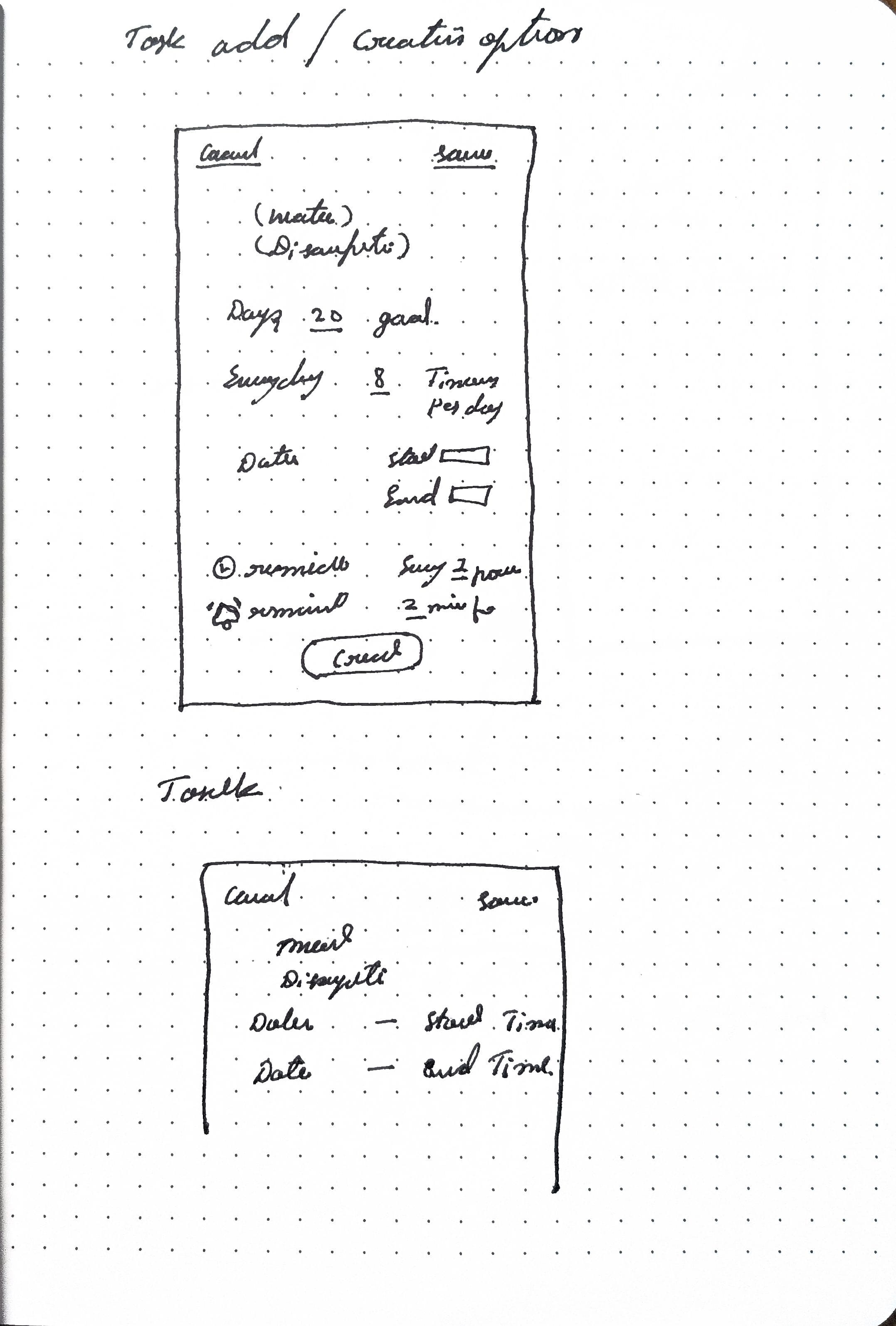
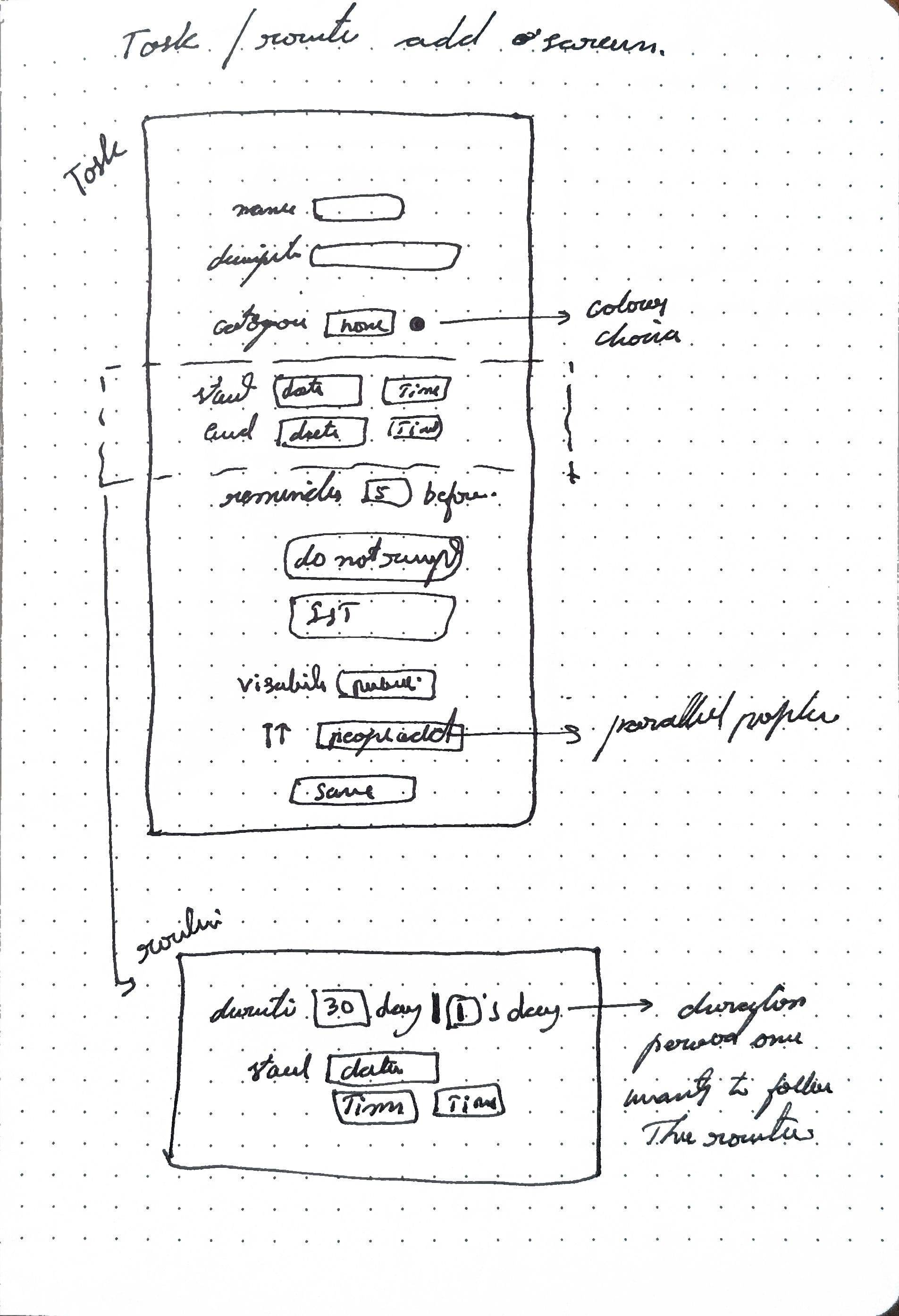
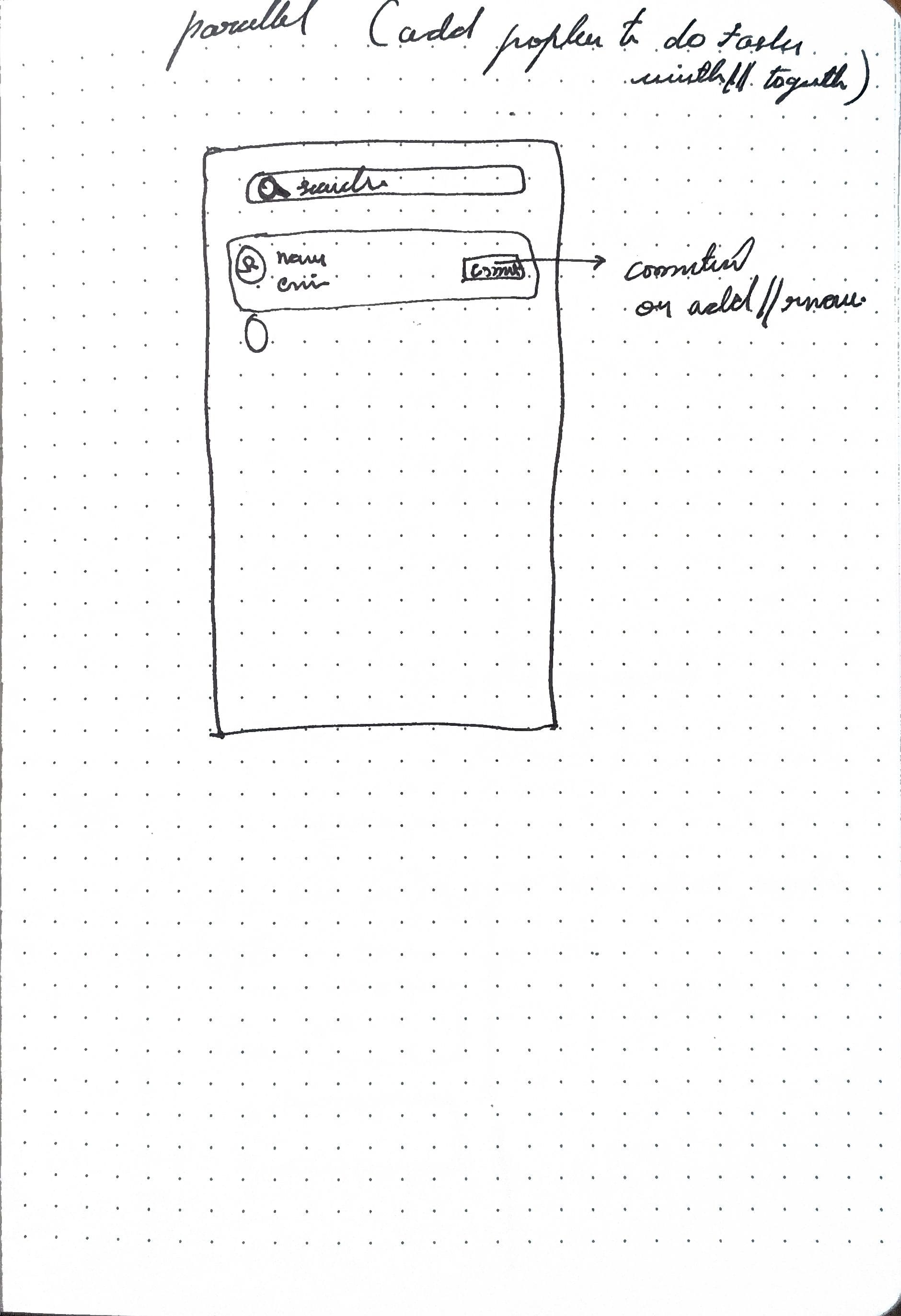
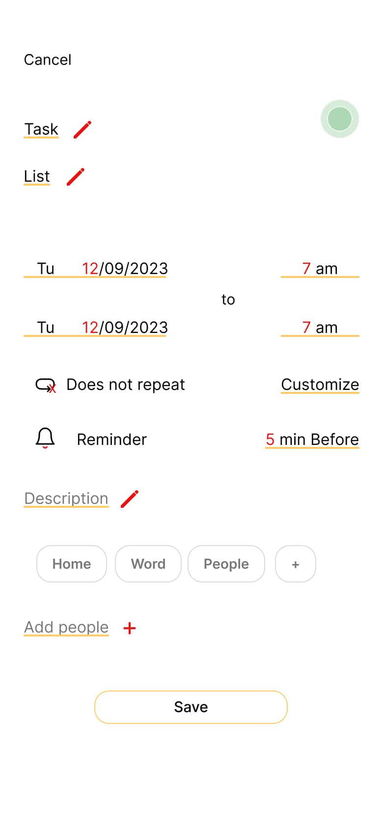
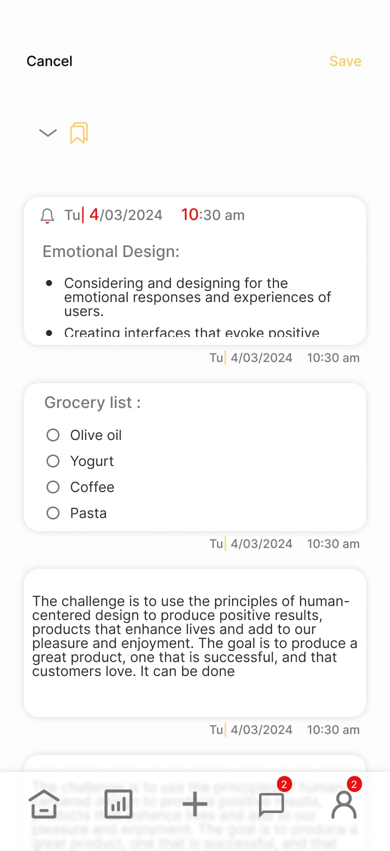
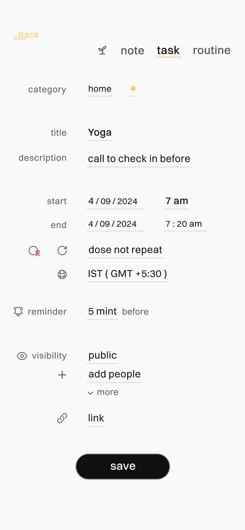
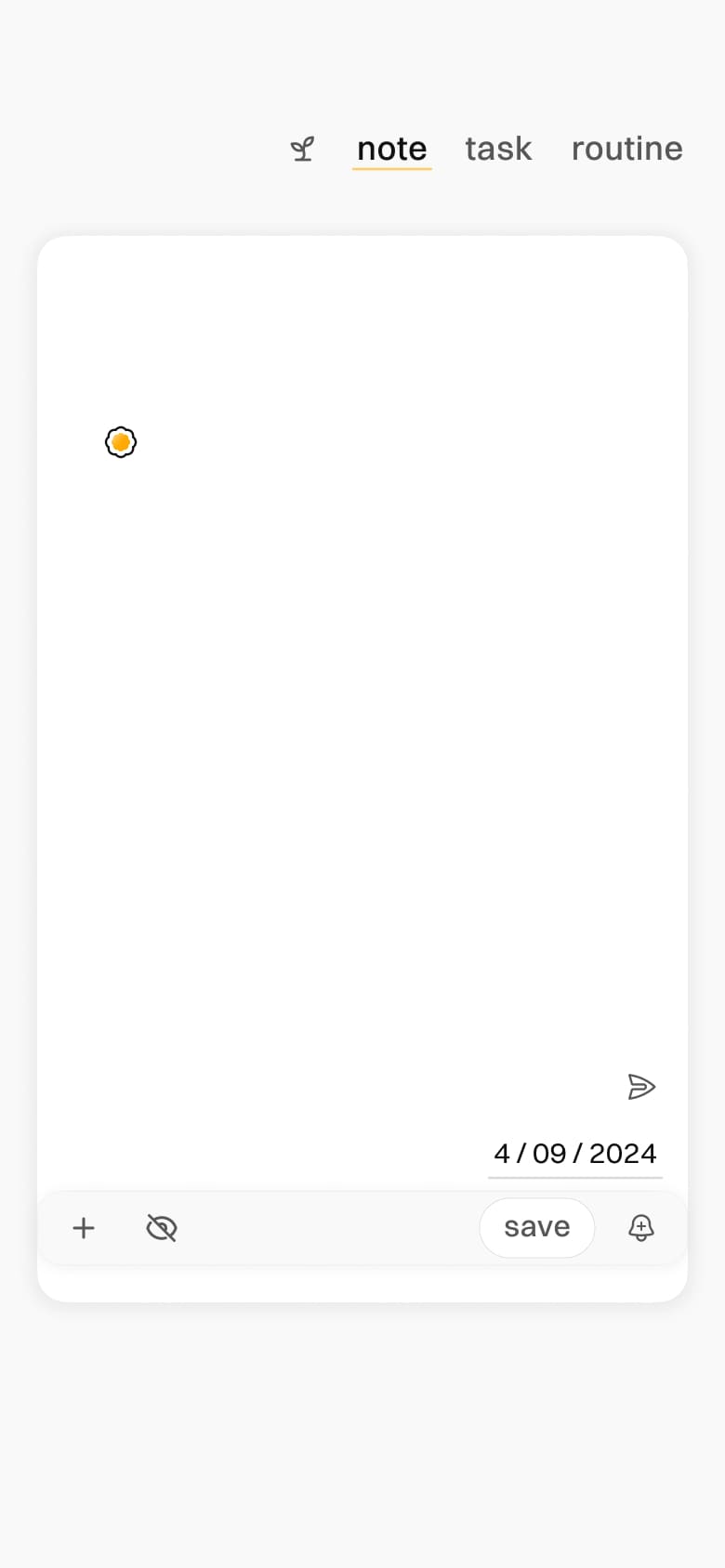
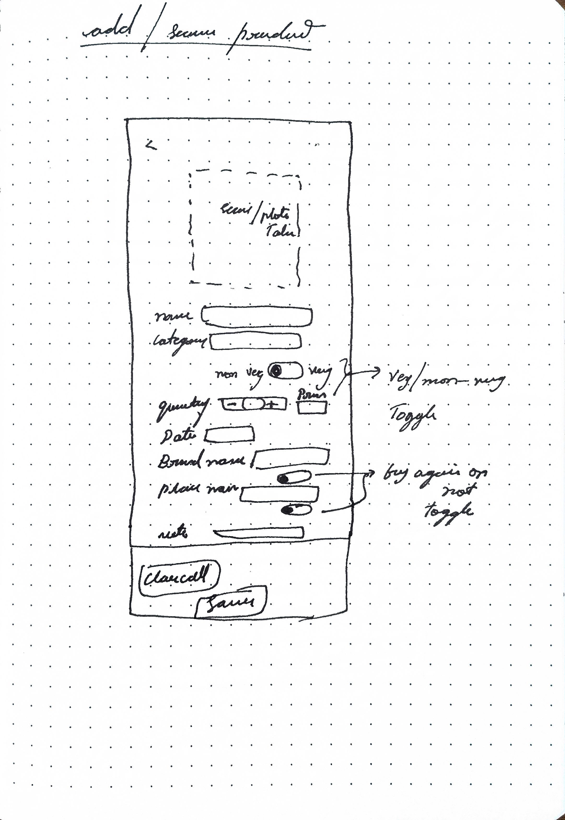
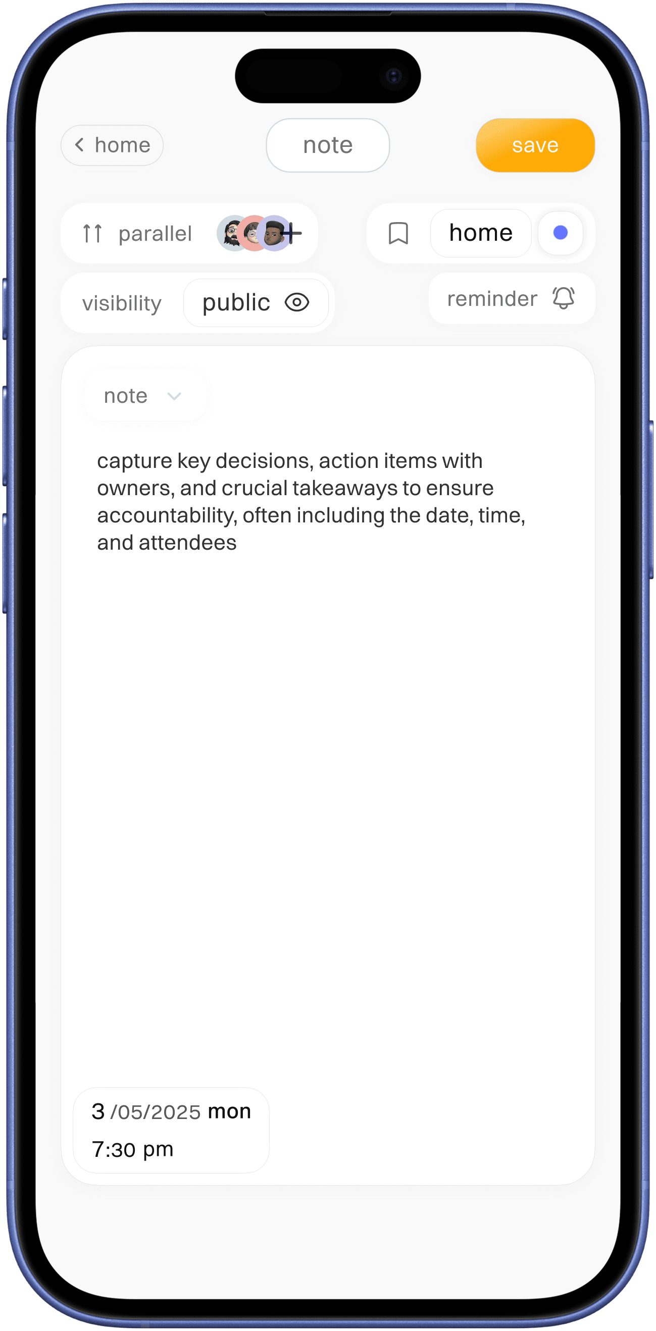
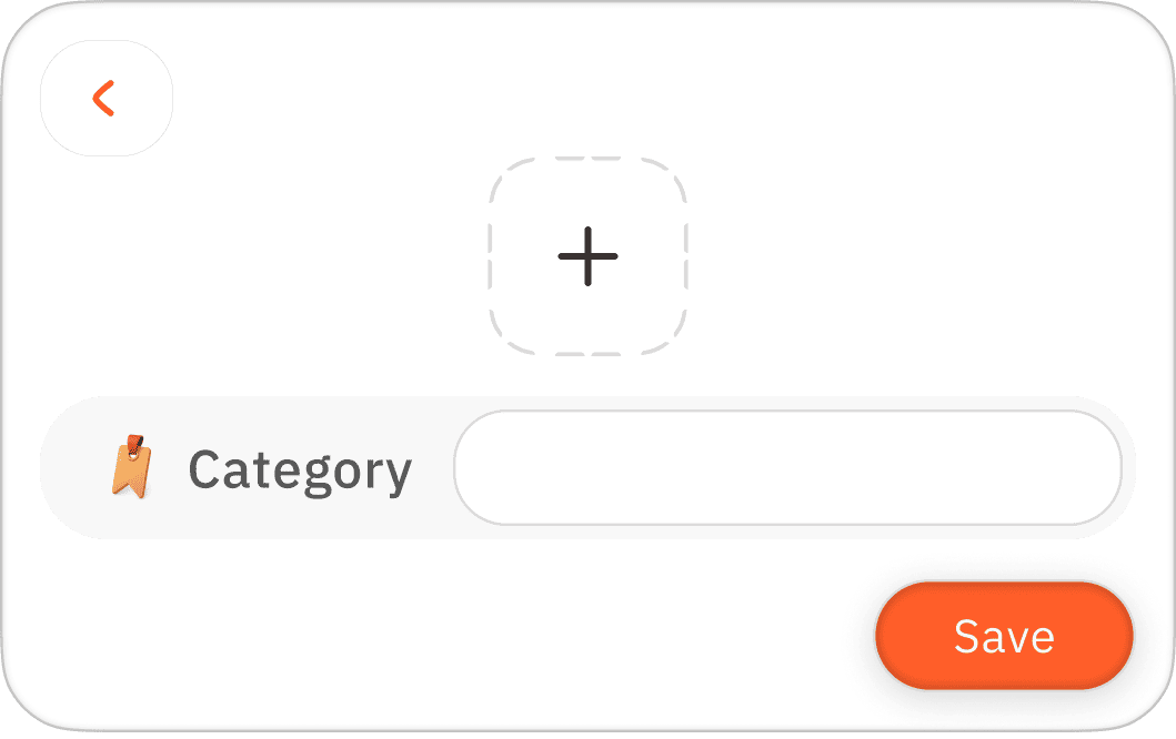
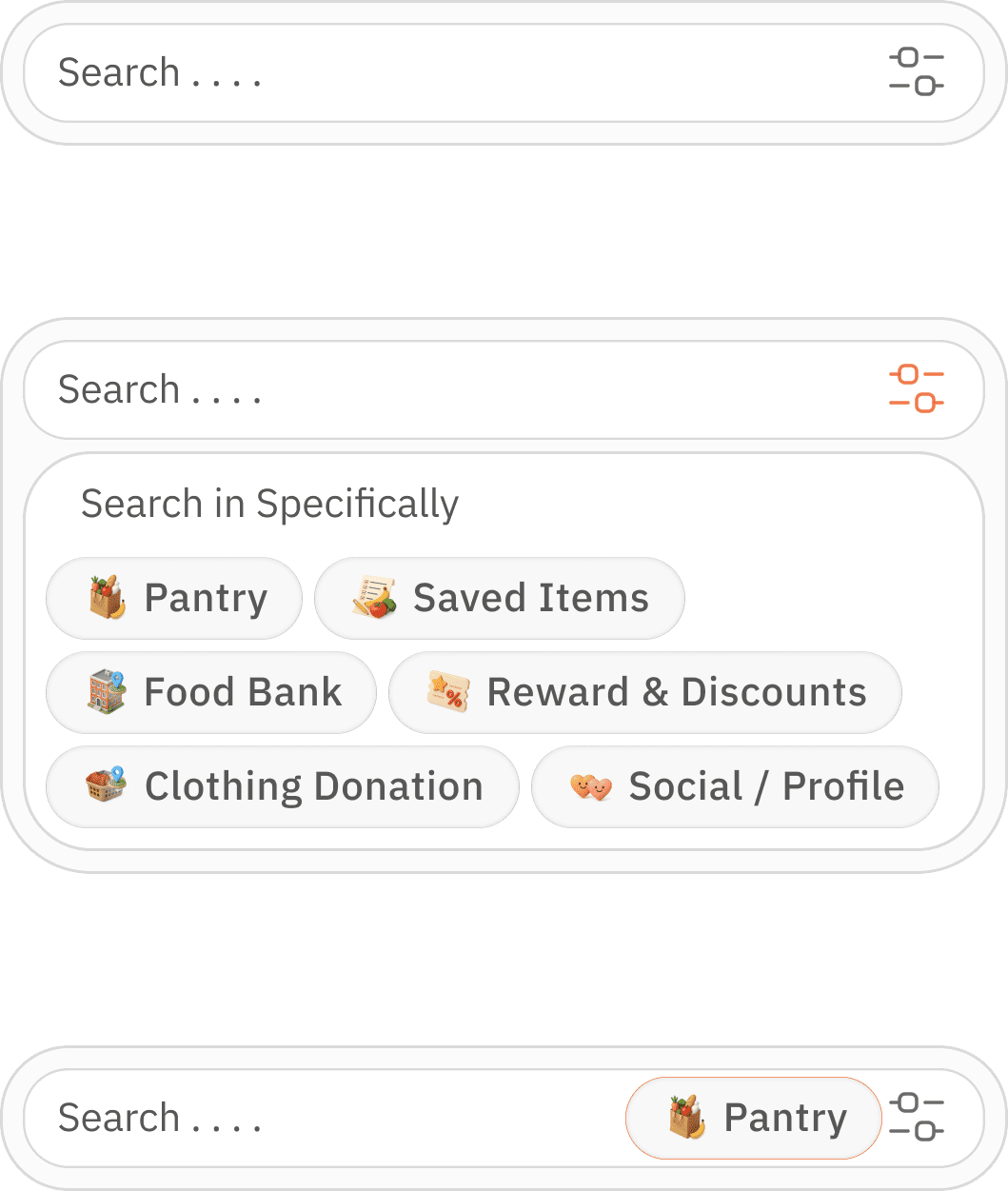
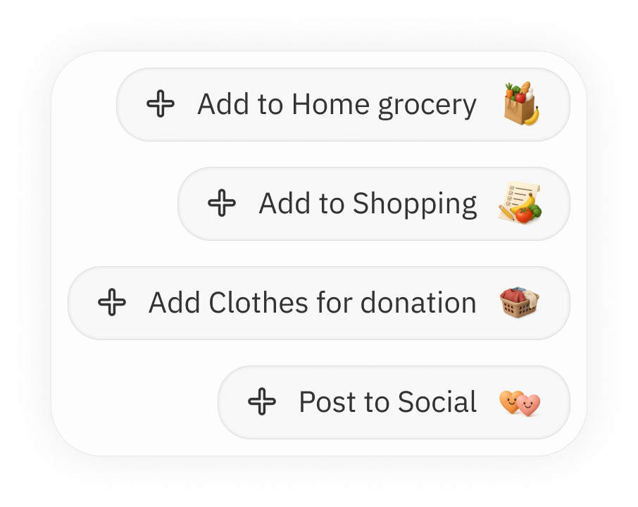
easily accessible add option
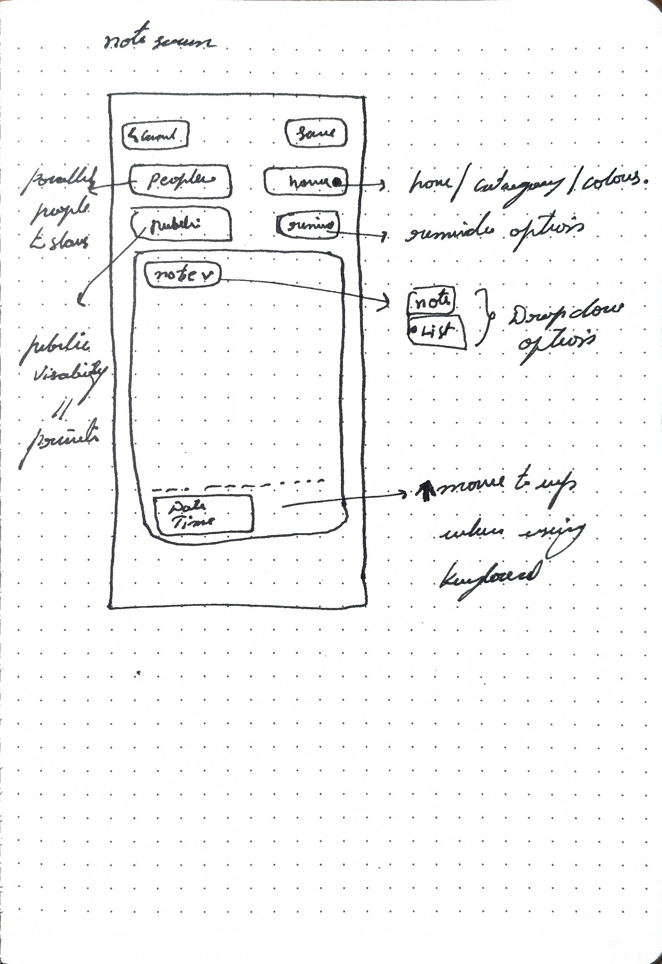
time line as simple input info,
note is given here because it provides for better add info option incase of uncertainty
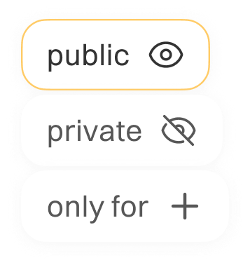
who it as been shared ( referred it as parallel in this app)
time line indication for better clarity
last updated info
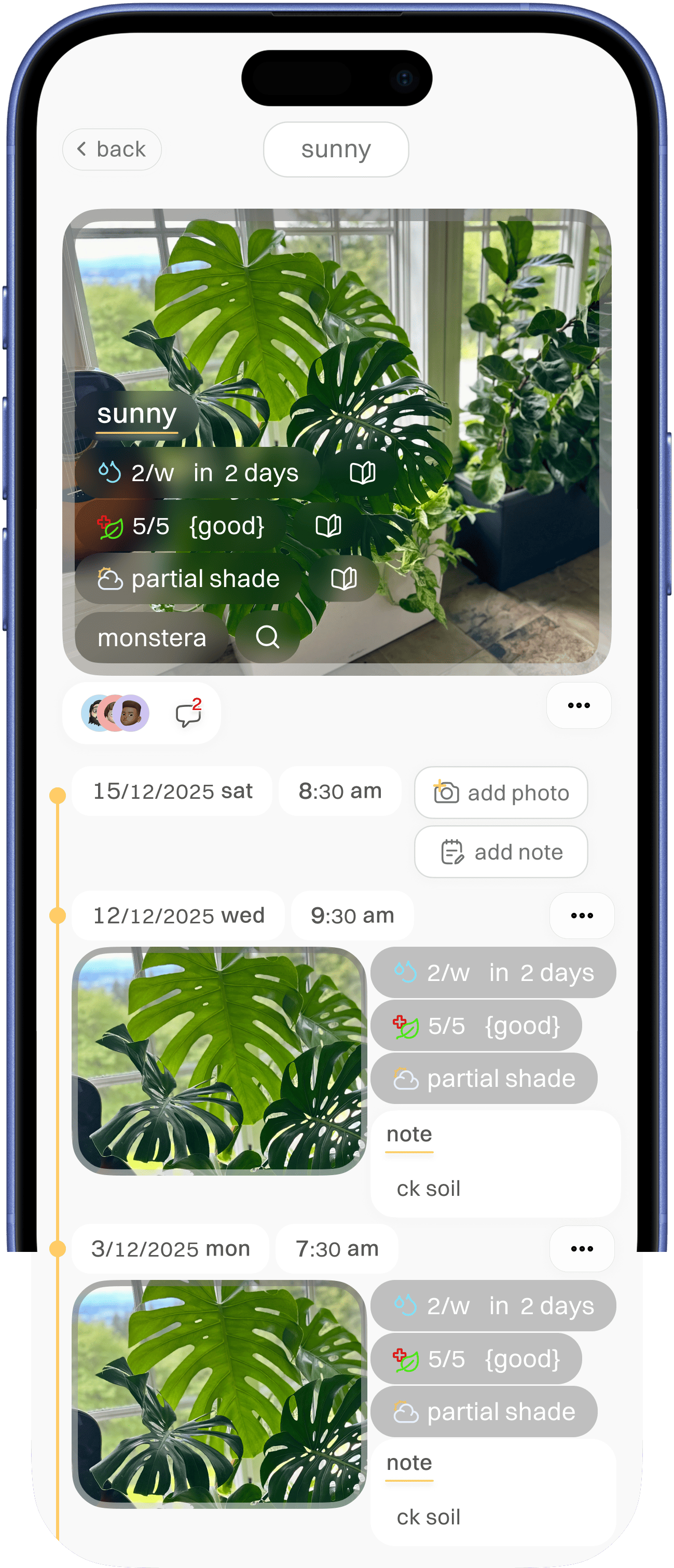


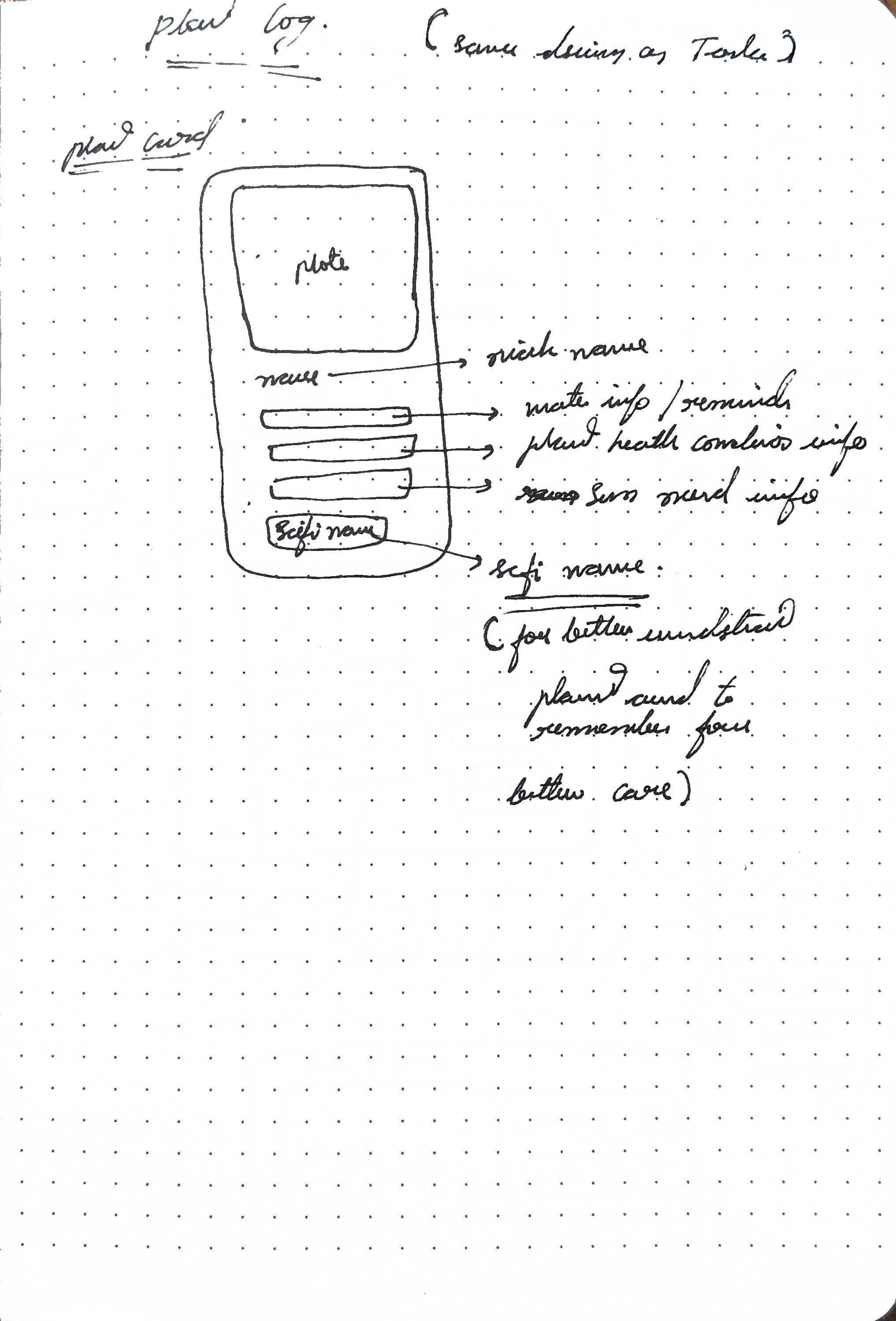
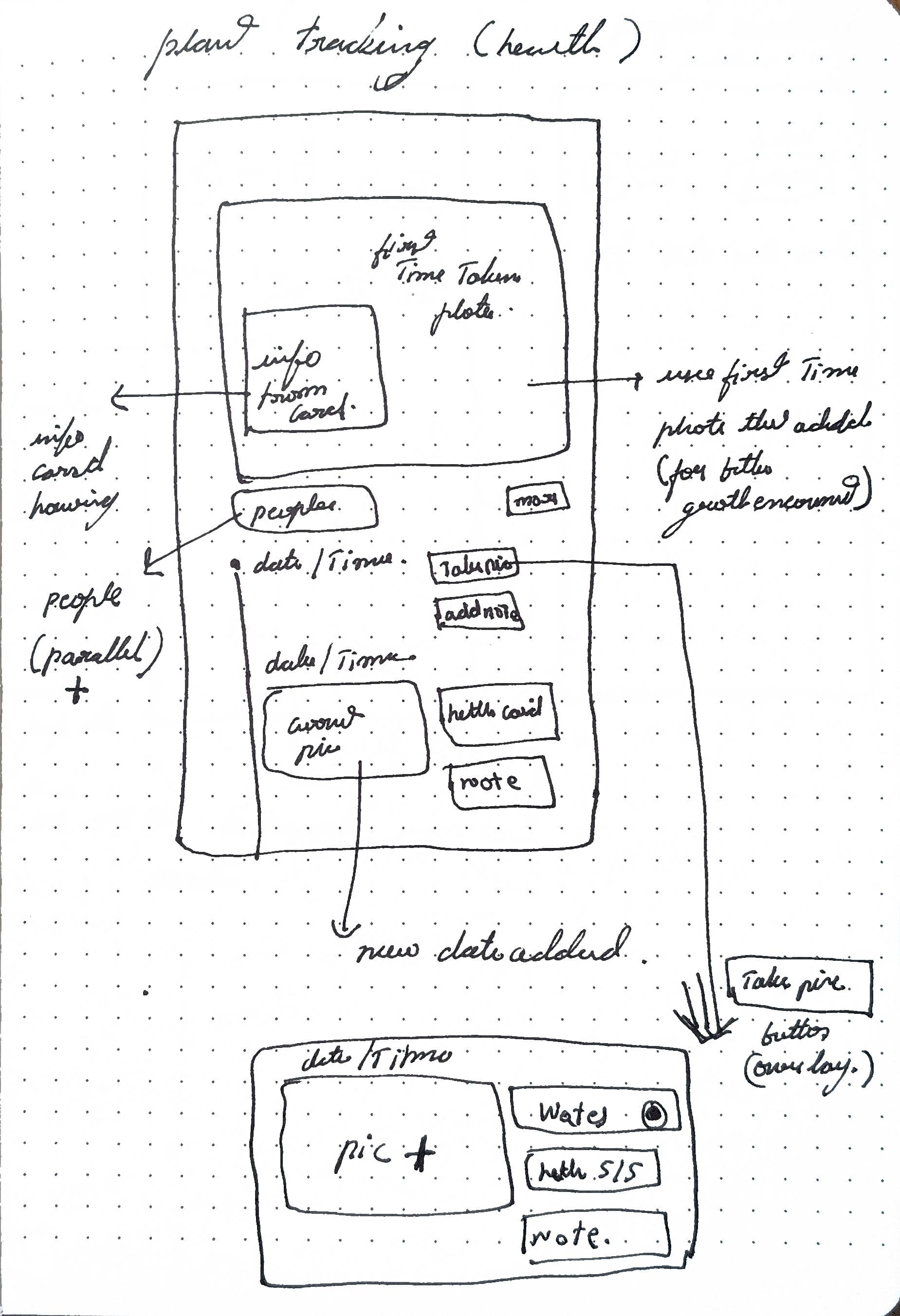
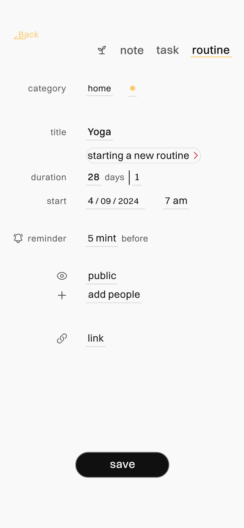
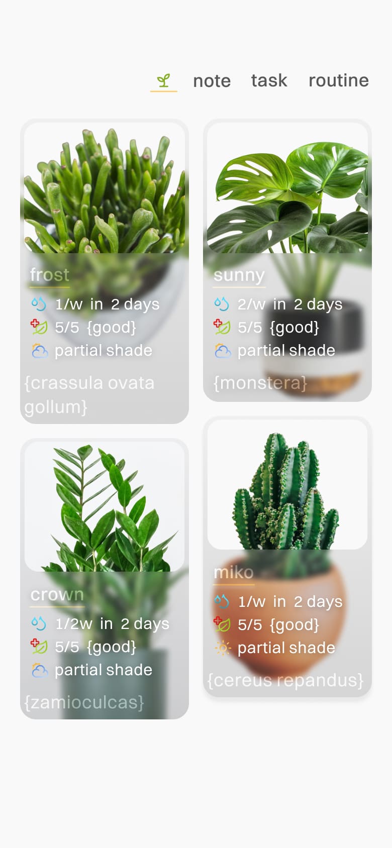
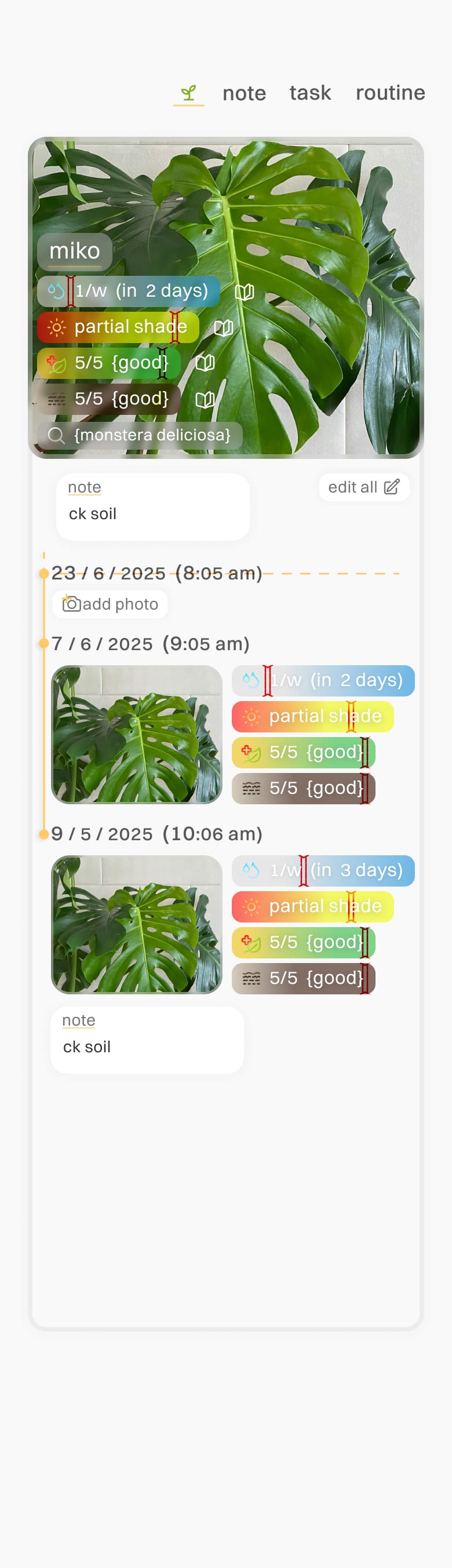
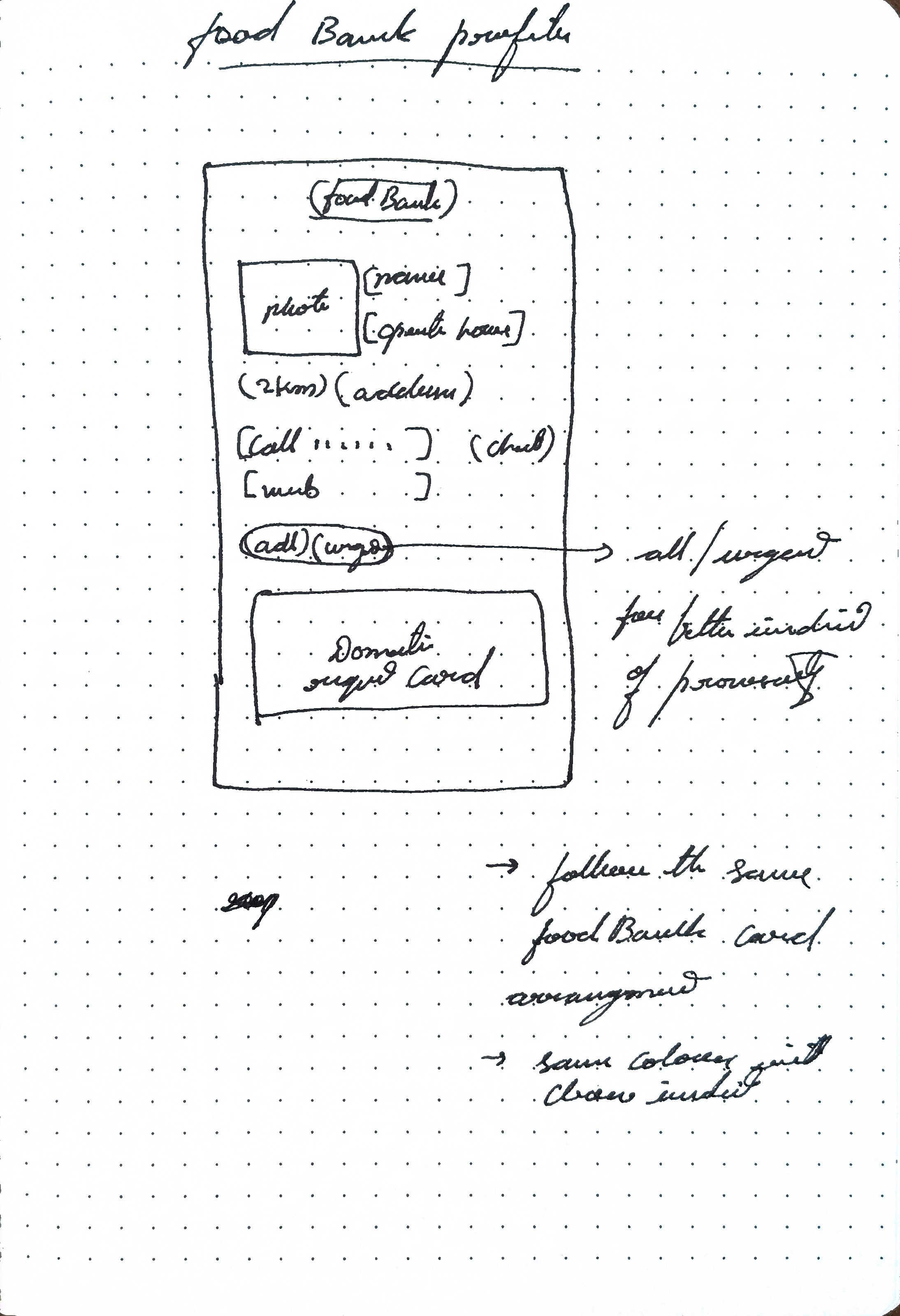
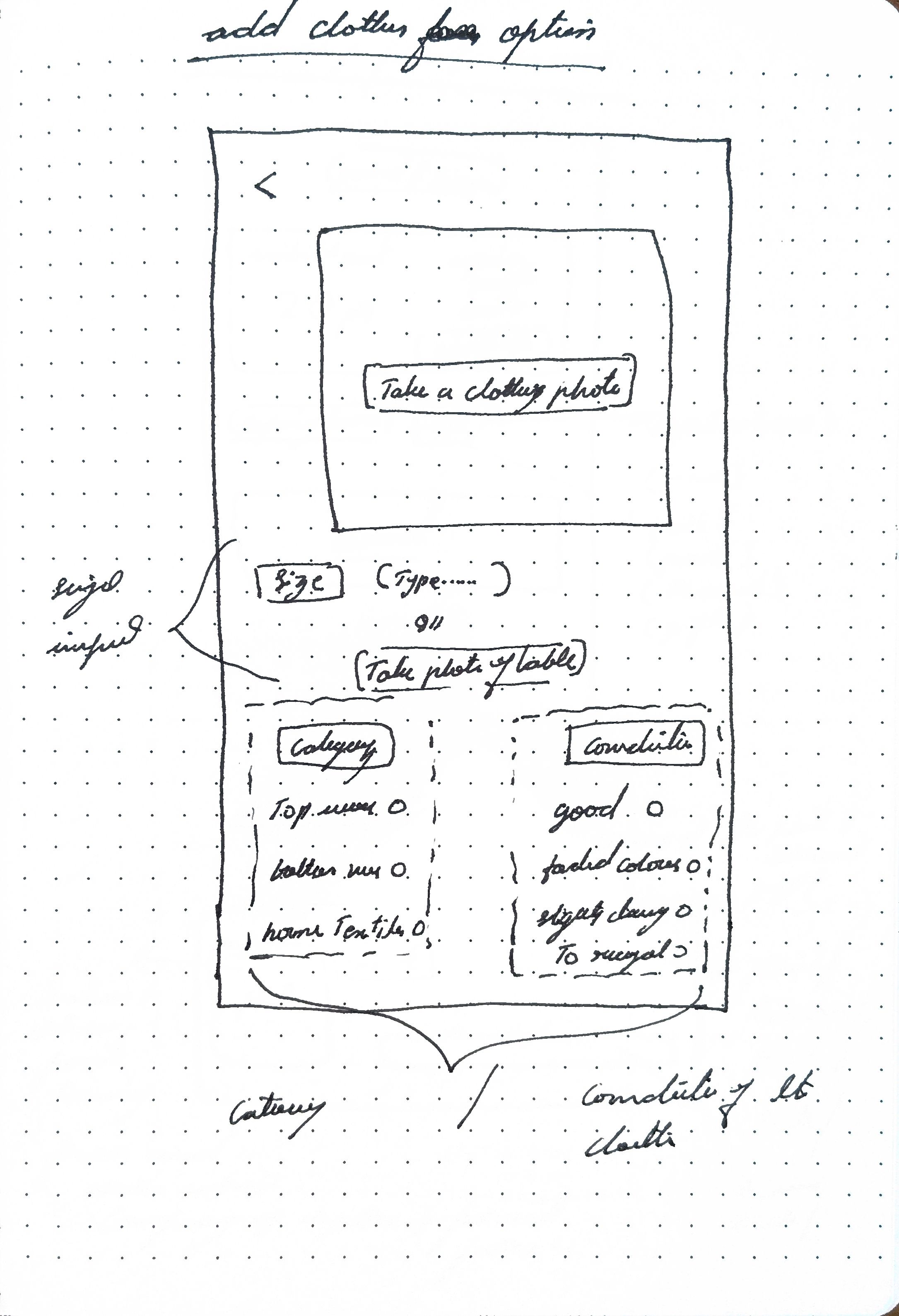
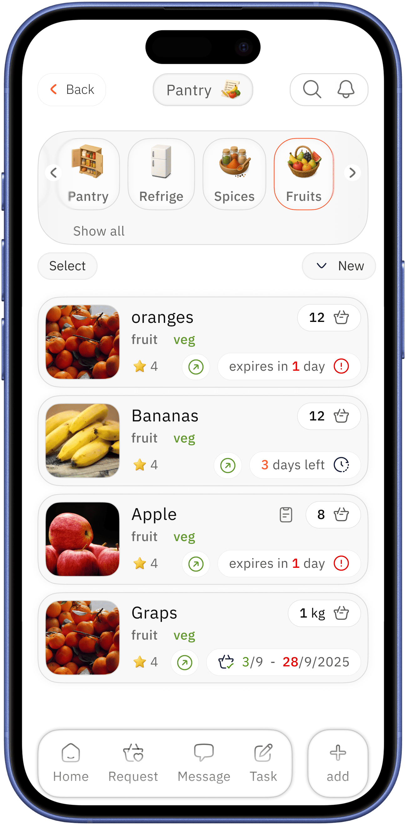
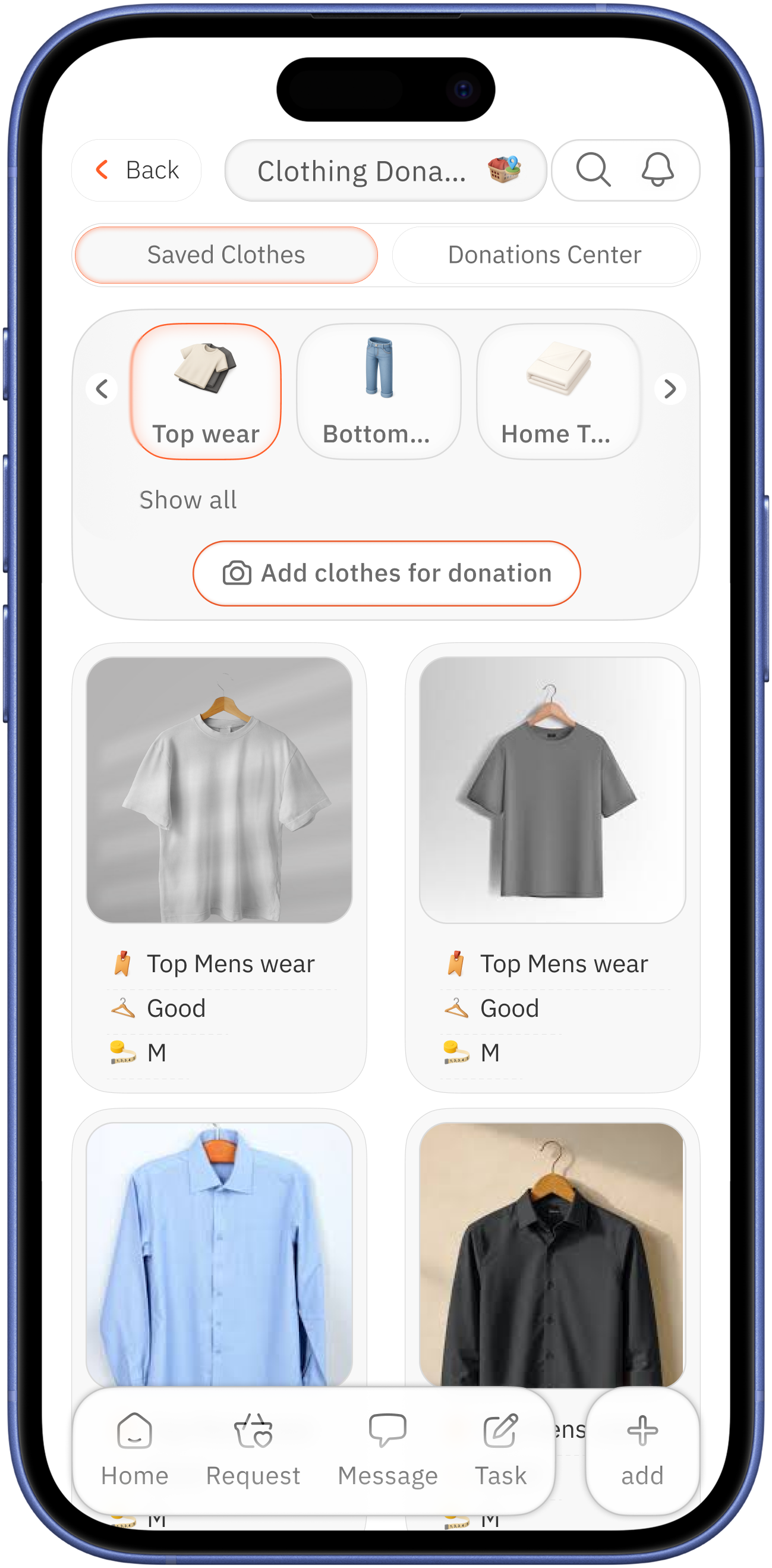
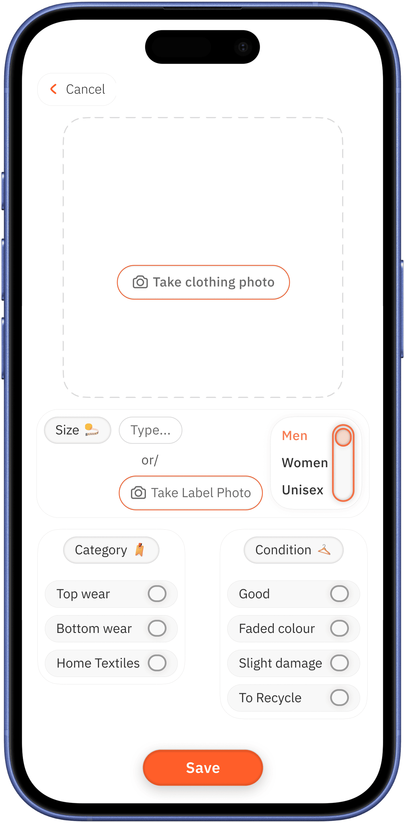
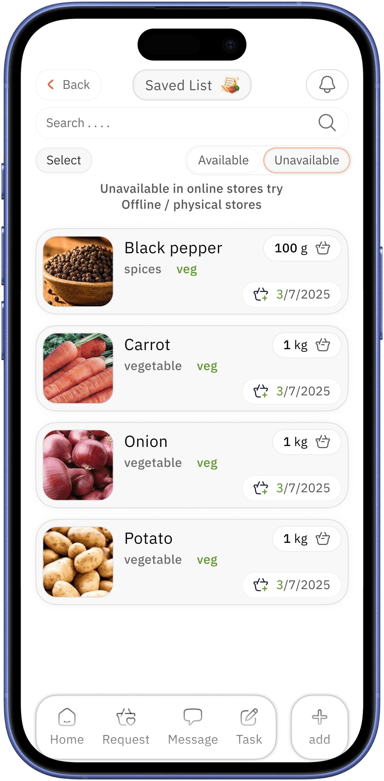
plant health tracking screen
easily accessible area with proximity separational option
custom option selection taken up for better click area for the note

add note / list
better type indication of section label next to what is the day period involved-in
task current status
day label for current event of total routine with who as completed indication


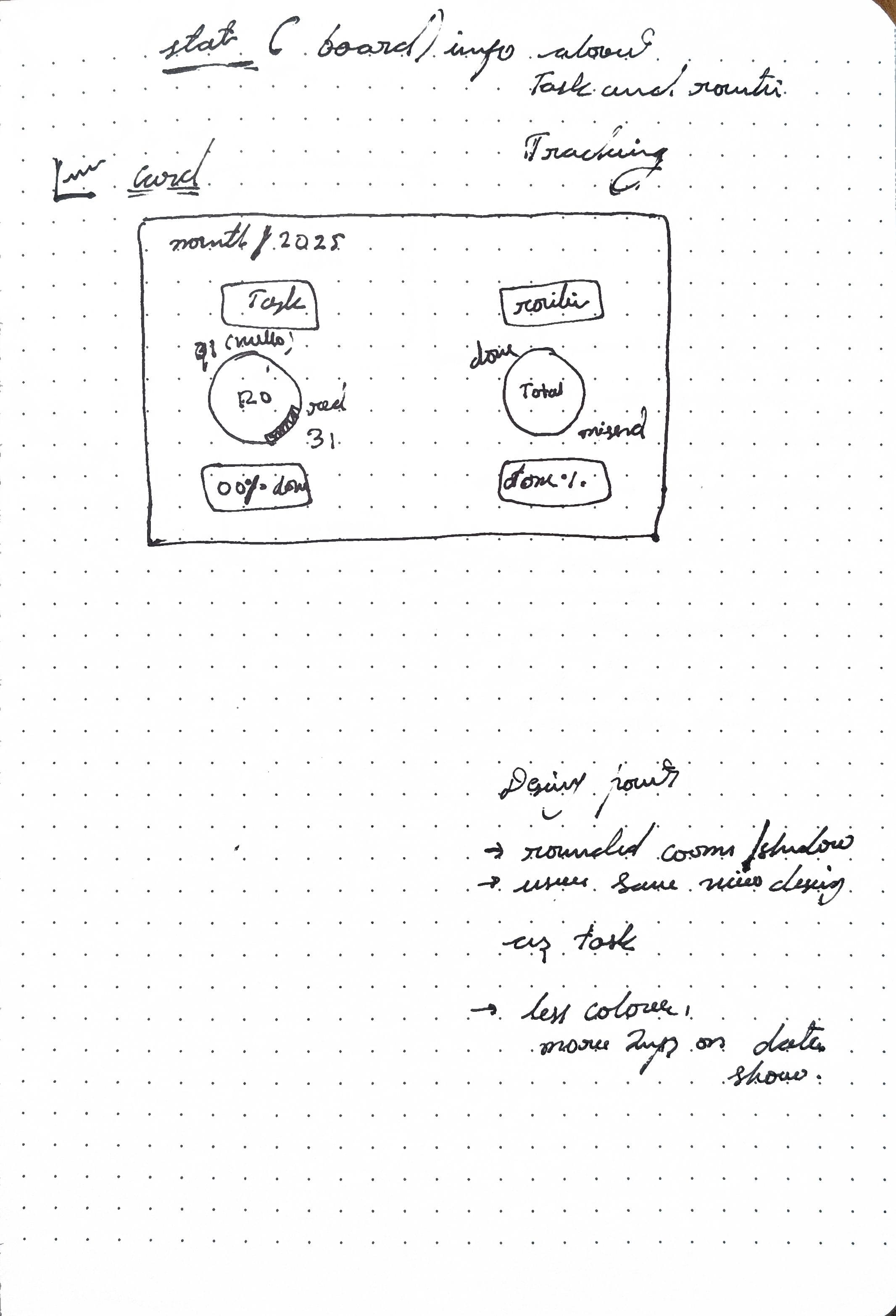
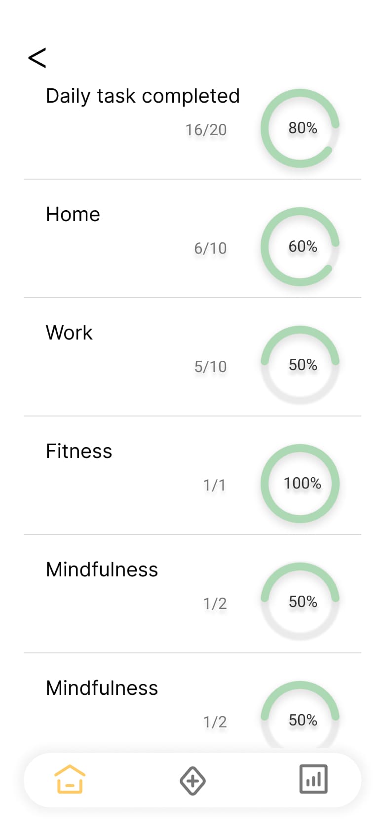
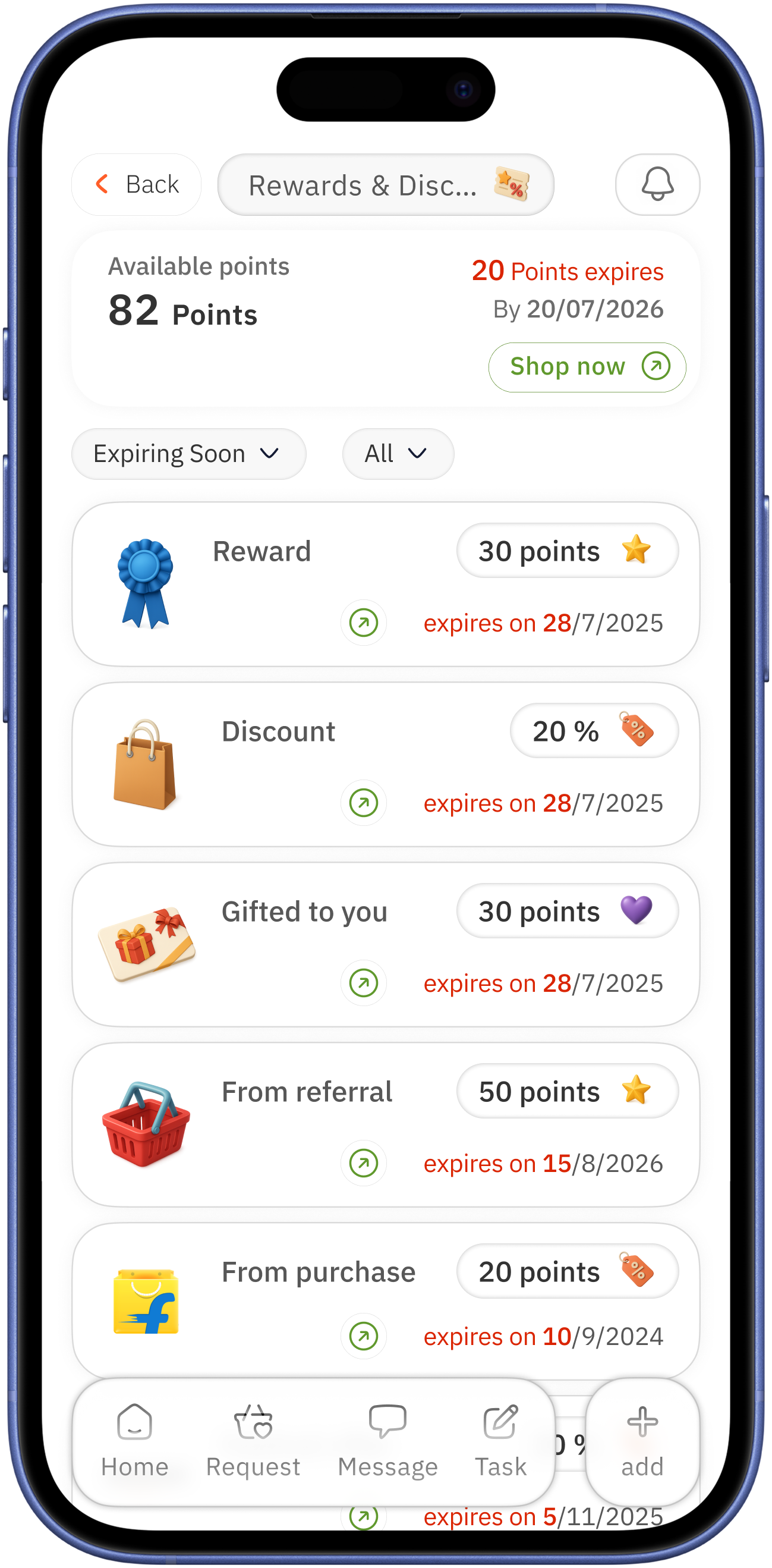
parallel ( shared task and routine )


month specific progress log
percentage value for easy progress measurement
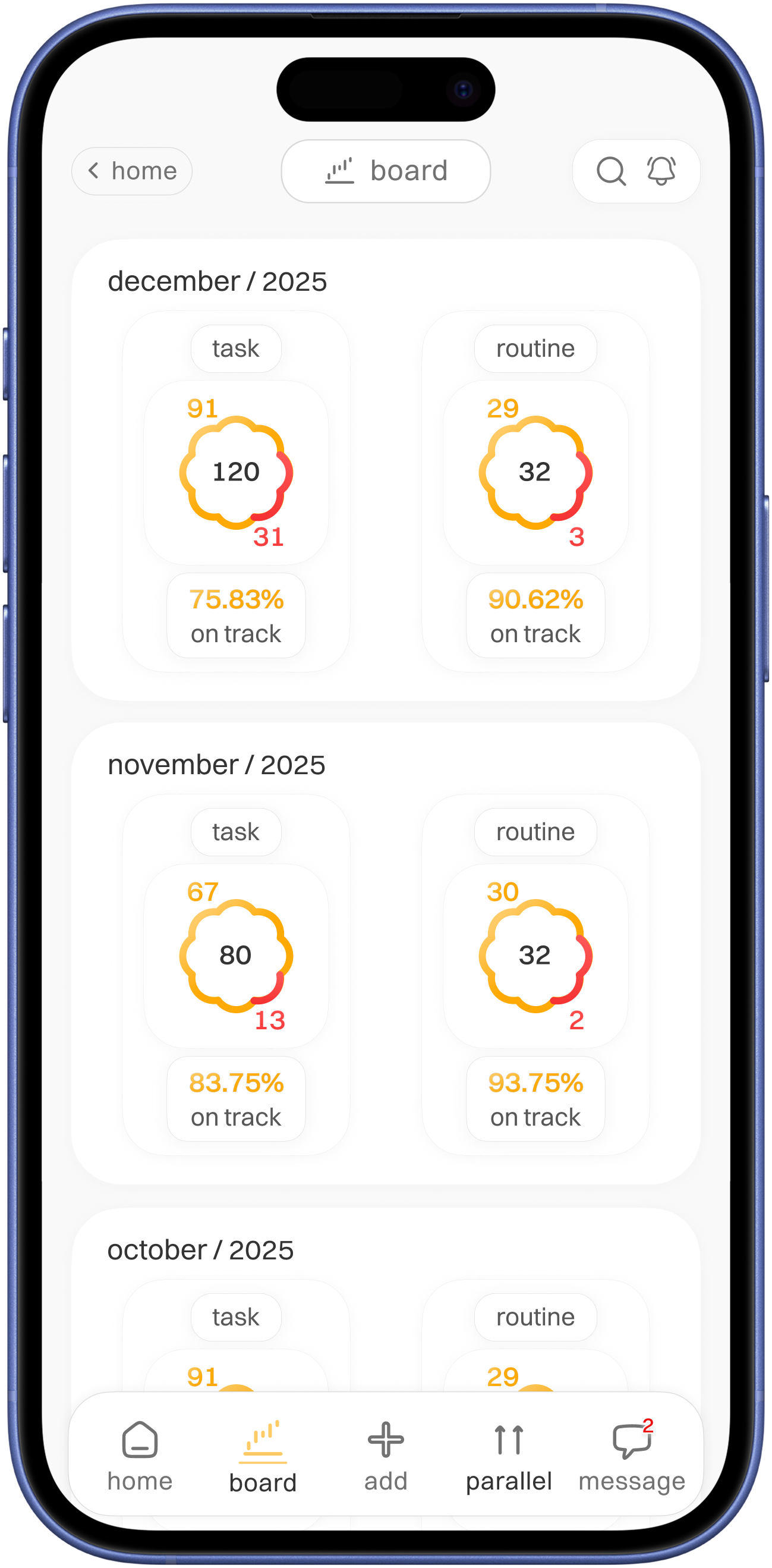


board
( progress log )
type indication
total in center and completed once with app main colour and
missed with red colour for alertness

Visuals
Styleguide
Typography
Typeface
-
Switzer
Switzer
14x
Switzer
16x
Switzer
18x
Colours
789E1C
EC1010
FFCB66
FFCB66
FFAA04
333333
575757
727272
777777
DADADA
F9F9F9
Icons

No usability testing done
Usability testing !
If conducted, will test on
- Check how users can quickly understand the home screen
- Check how user interact with add grocery option, stress on 45+ age bracket
- How easily users can donate
- Accessibility usability test
Reflection on case study
Learnings
This project thought me
- How assumptions lead design decisions
- Need for features simplicity
What would improve
- Conduct real user interviews
- Refine accessibility for at glance
- Micro-interactions