
Pantry tracking meets purposeful donating back with rewards
Manage grocery ( household items ) → Donate what you can
→ Rewards points discounts in return
Project specs
NourishNet - A easy pantry management and Household Item Donation app

This happened, One of my friend decided on shifting the house
After shifting the house, Things needs to be arranged and checked - in that i was helping,
We had this issue beforehand of arranging of things and tend to forget with household items food items and cloths. We decided to have it like list - we know that we will forget that list too,
So we tried to find some other digital solution in which we can manage and also donate things
grocery and clothes.
We could not fine any which would do both management and donation,
So this app question was formed.
Role
UX designer
Duration
3 months
Tasks
UX design
Competitive analysis
Secondary research
Tools
figma
figJam
Project Type
Concept Case Study
( User side only )
Context
Imagine you keep forgetting when is the expiry date, and you want to donate grocery items and clothes in a easy way
A space where you can manage grocery ( household items ) and can donate clothes, you can help upon request of nearby food bank and clothes donation centers.
In return you get points and coupons for
every donation and voluntary delivery help
Problem statement
Other alternative have a lengthy process
Many users use small note pad or note app sometimes even in message apps to keep track of household items, In digital space app have long process of adding items, And it is not easy to donate grocery items cloths easily, no app available for small amount of household donation, There is no easy way to ask for emergency donation help for the food banks and the donations centers
Why this matters
- Easy scan item with camera
- Have auto reminders
- Smooth donation process
- Donation centers can Request help
- In return user gets Points and Coupons
- Community wellbeing
Subject
Constraints
- No real user interviews
- Limited project timeline
- Dependent on secondary research
- No user testing
Subject
Assumptions
- User will donate if the process is easy
- Reward increases donation behavior
- Companies will sponsor rewards for Corporate Social Responsibility (CSR) visibility
- AI scanning reduces friction
- User want grocery inventory management
- Volunteers will do the deliveries
Research
Competitive Analysis

Robin Hood Army
No waste
Out of Milk

Goonj

Volunteer Match

OLIO

Share The Meal

Bring!
Observation
- No single platform connects pantry management to donation
- No rewards the can be used for everyday shopping
- Corporation CSR participation is underutilized, Not visible to individual donner for trust building
- Volunteer logistics are mostly manual
Design gaps
- Camera based input / AI
- Keep interactions lightweight and simple
- Donation notification for near expiry products
- Easy donation after functions and celebrations in home and community
- Reward and points on donation and volunteering work
- Can share donation receips post or volunteers work on social media, encourage others
Research
Review mining
What user want
- Automatic item scanning
- less manual inventory management
- Easy donation pickup
- Fast donor-recipient matching
- Rewards and incentives
- Clear social impact tracking
- Flexible volunteer opportunities
- Donation tracking
Pain points
- Too much manual work
- Donation logistics are manual
- users lose motivation over time
- Lack of rewards
- Poor transparency
- volunteer coordination is manual
- Limited impact visibility
- Too many notifications
Research
Business model
Donate → Earn Points → Redeem Coupons → Brand Gains Customer → Brand Funds More Rewards → More Donations Occur
Stakeholder
Gives
Gets
User / Doner
Food, Clothes, Time
Points, Coupons, Recognition
Volunteer
Delivery service
Points, Coupons, Social status
NGO
Verification, Distribution
More donations, Reduced Logistics
Brand / Company
Coupons, Sponsorship, Budget
Visibility, Customers, CSR impact
Platform
Technology and Matching
Revenue, Partnerships, Data insights
Coupon and Point Ecosystem
Stage
User action
Brand benefit / Company
Platform revenue
Earn
Donate food
Brand exposure
Campaign fee
Earn
Deliver package
Brand exposure
Campaign fee
Redeem
Use coupon
Customer visit
Commission
Purchase
Buy product
Revenue growth
Affiliate revenue
Repeat
Return customer
Retention
Brand renewal
User profile
Aged between (22-45) and shared users
User type 1 - Aged between (22-35) Urban grocery managers
( Individuals who buy groceries regularly, live alone/with roommates/partners, and already use digital payments, delivery apps, or shopping-list tools )
Scan groceries once, get reminders automatically, and donate usable surplus in a few taps
User type 2 - Aged between (22-45) Community donors / volunteers
( People motivated by social impact who are willing to donate food/clothes or help with local deliveries if coordination is simple )
See a nearby request, accept it, deliver it, and instantly see the impact you created
User type 3 - Aged between (45+) Older adults seeking simple giving
( Individuals with time and willingness to donate or volunteer, but who may be less comfortable with complex mobile interfaces )
Donate household essentials without complicated setup or travel
User type 4 - Supporting stakeholder CSR/ESG brand and company partners
( Companies sponsoring coupons, points, or campaigns )
Fund rewards tied to completed donations and receive auditable impact and engagement metrics
Core summery
User
Age
Core goal
Main friction
Key feature
Urban grocery managing
22 - 35
Track groceries / reduce waste
Manual inventory keeping
Photo / barcode scanning
Community donor / Volunteers
22 - 45
Help locally / minimal effort
Coordination / trust
Nearby task matching / verification
Older adults seeking simple way to give
45 +
Donate easily
Complex UI
Accessible, very few step flow
CSR / ESR ( Brand and company partners )
Buy product
Visibility / impact reporting
Attribution / analytics
Campaign dashboard
Goal
Lightweight UX process
In point addressing design gaps and pain points, building system to help with managing inventory, input scannable, accessible, very few step flow
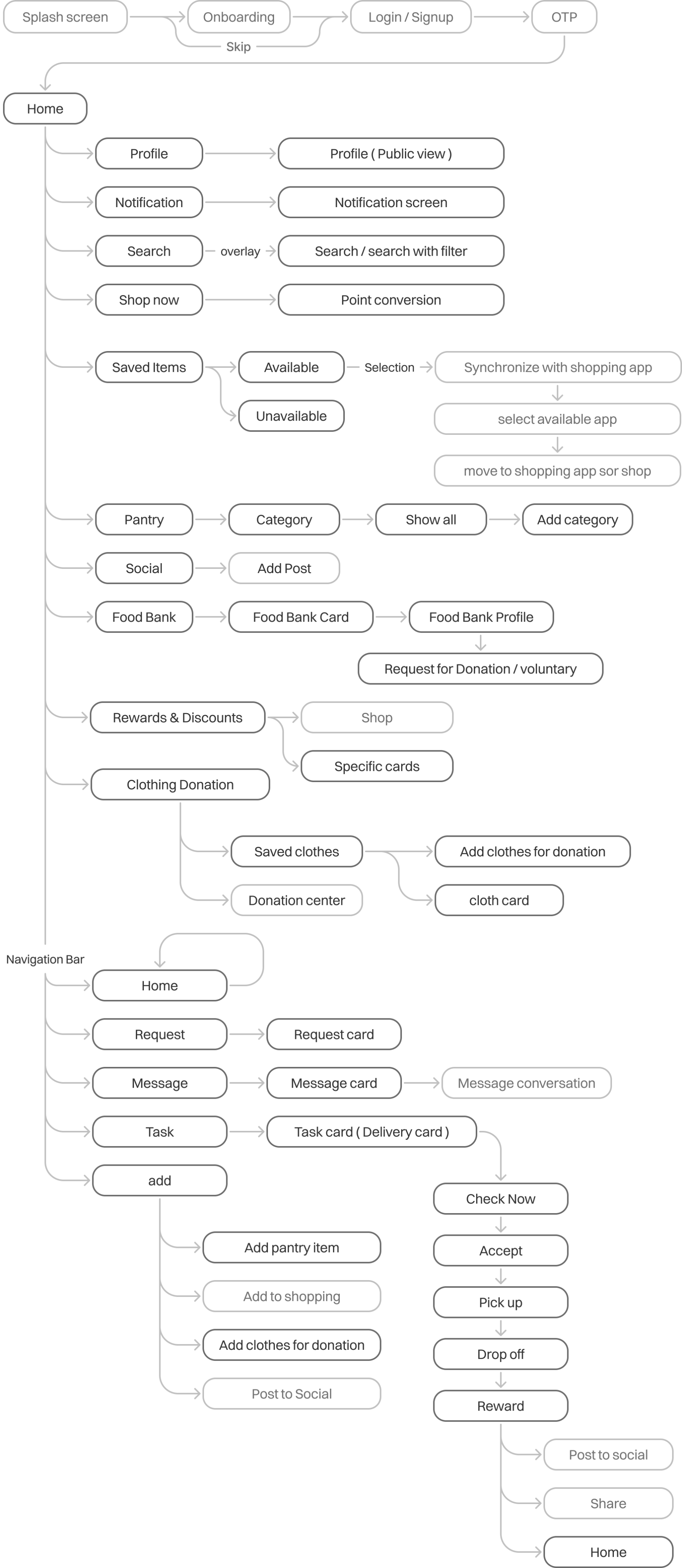
Use flow
The User flow is quite extensive, so highlighted the necessary steps that have taken in this case.
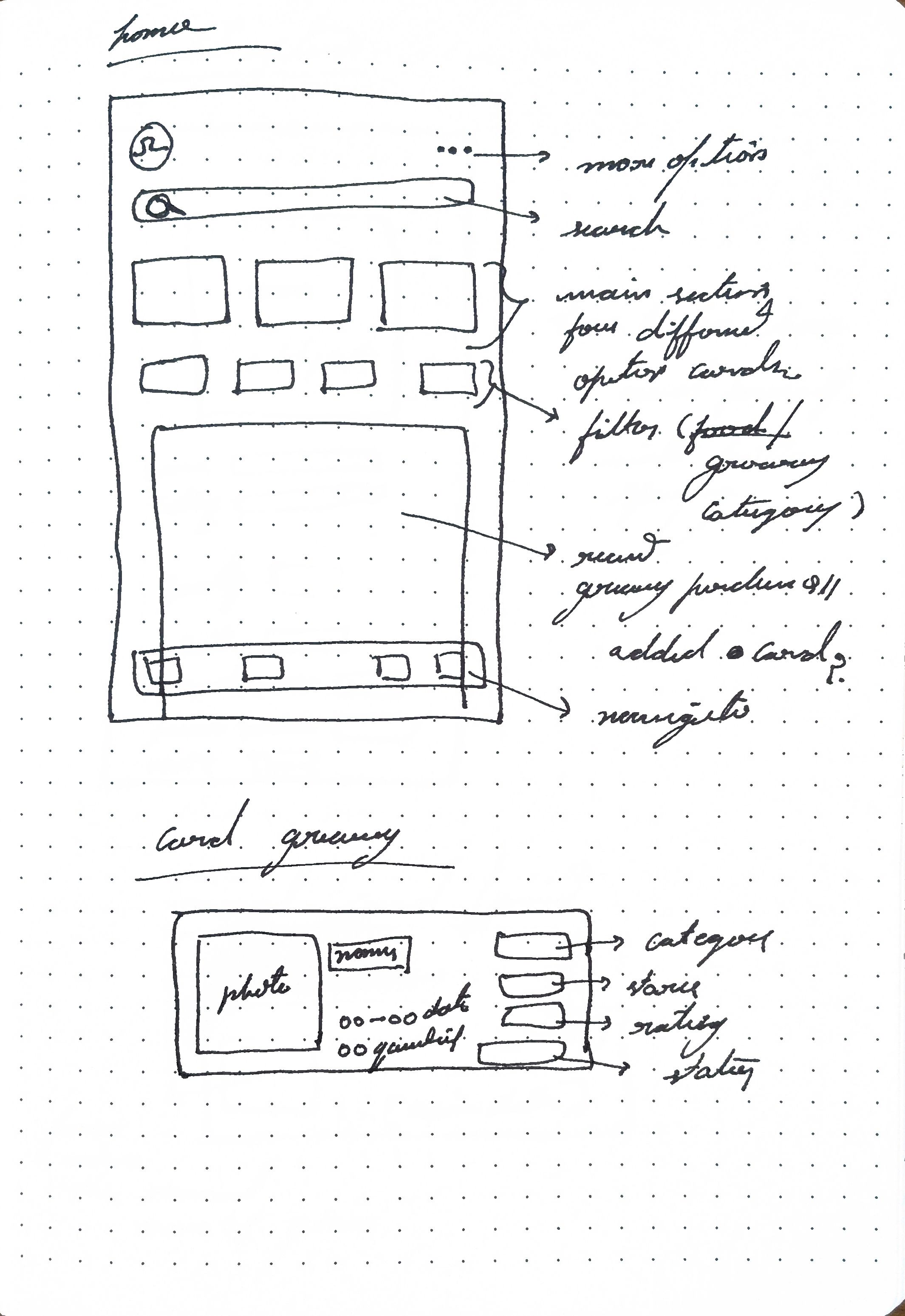
Brainstorming & ideation
Wireframe sketch
Trying to fit all the info in one screen, with functional buttons with limited button clickable space with visual info, was learning that took place with iterations that followed
After few ideations
Started designing screens
Final iteration
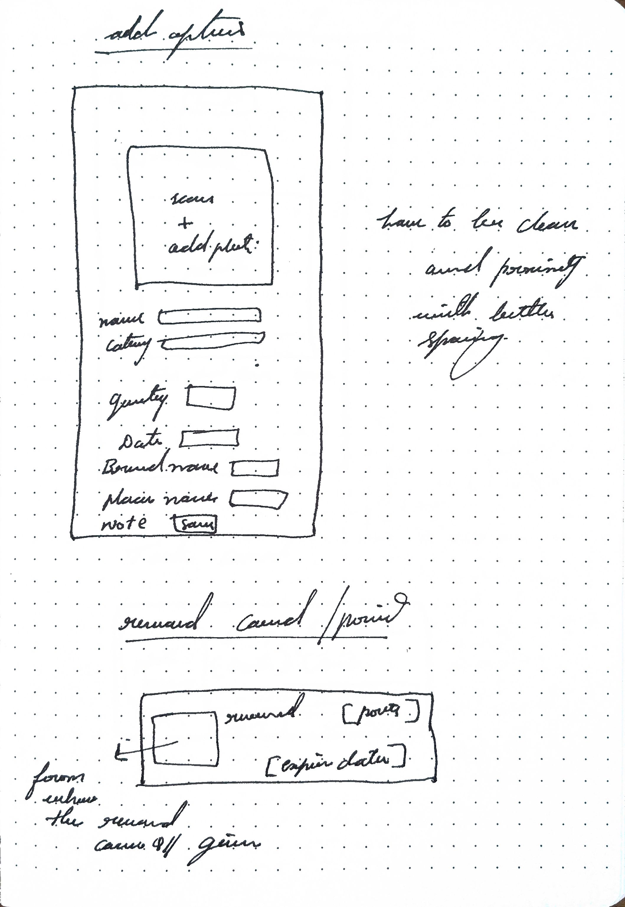
Wireframe sketch
Making space for important elements and removing non-essential
Iterations
Screen designs
After starting screen designing it was learning about information visual
- Clickable space and spacing
- Proximity content
- Visual spacing and hierarchy
- screen flow
Arrangement
These are the initial screens, To see the visual language
After this went back to wire frame sketching to proceed with remaining screens
Card info
Took considerable amount of rethinking about visual information presentation
Colour and visual spacing and Card refinement
Need change because
- Colour visual fatigue
- Spacing proximity is major issue
- Need cards elements clickable space and key visuals
Iterations
Final design
Key design decisions
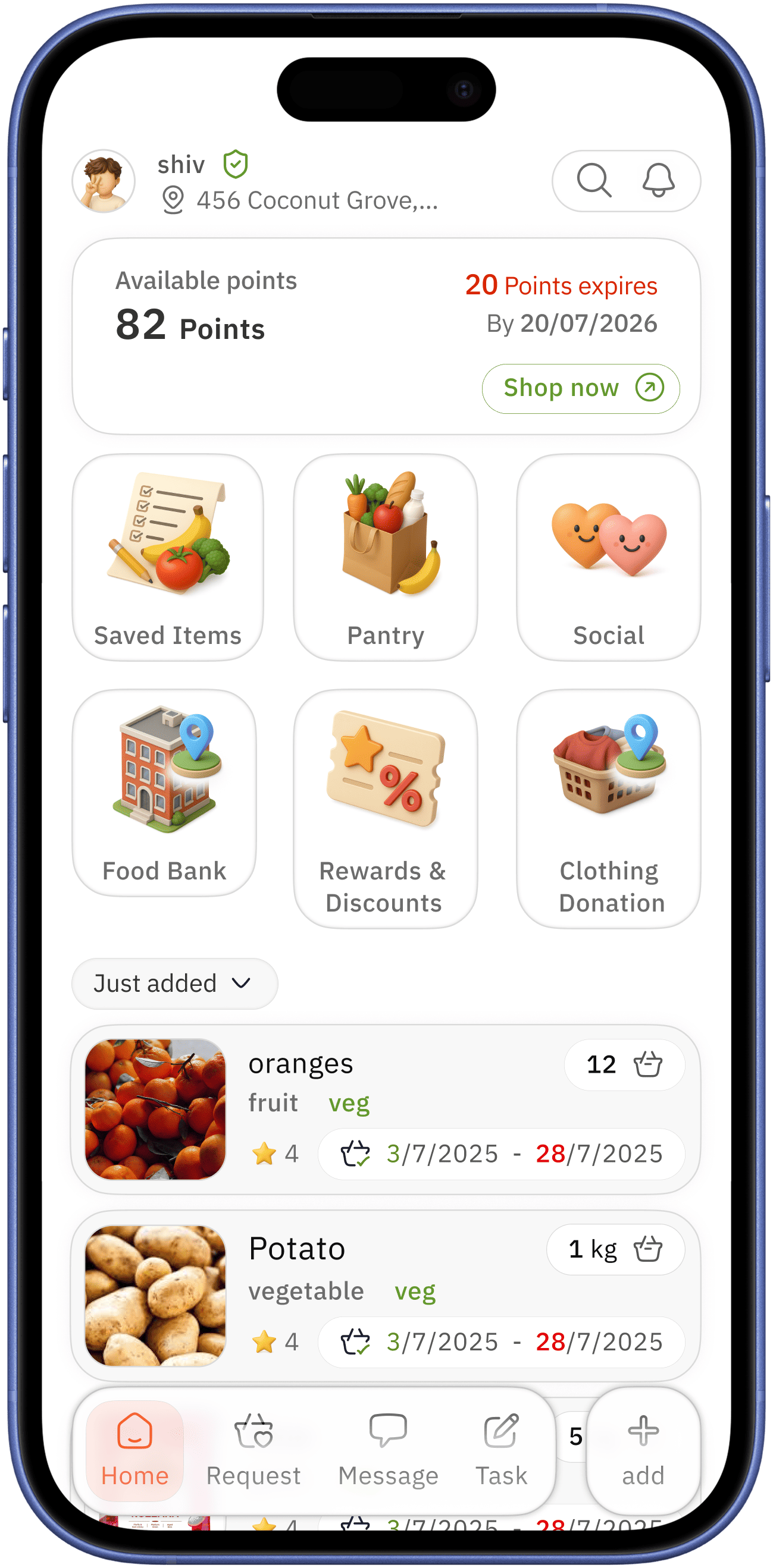
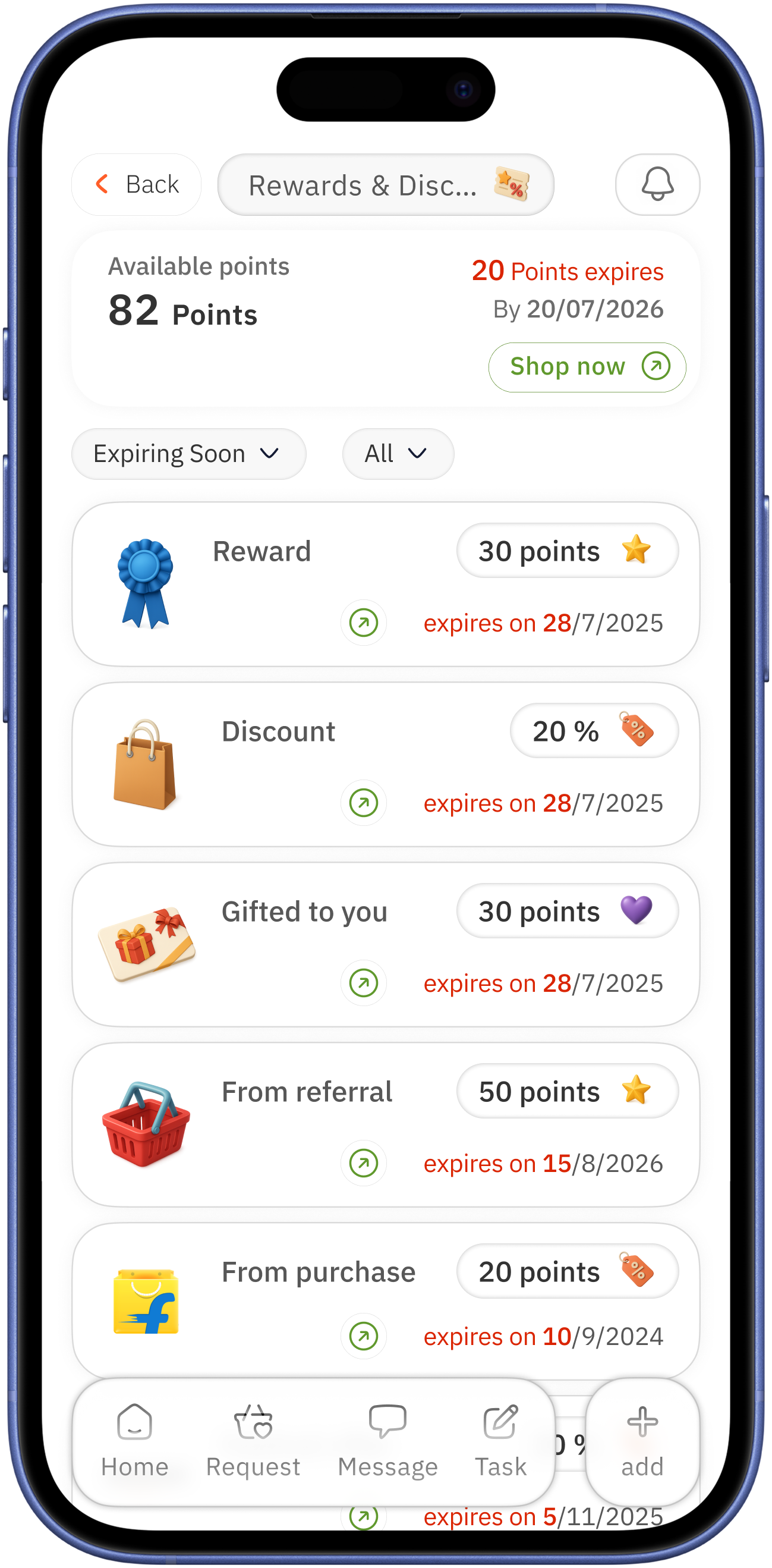
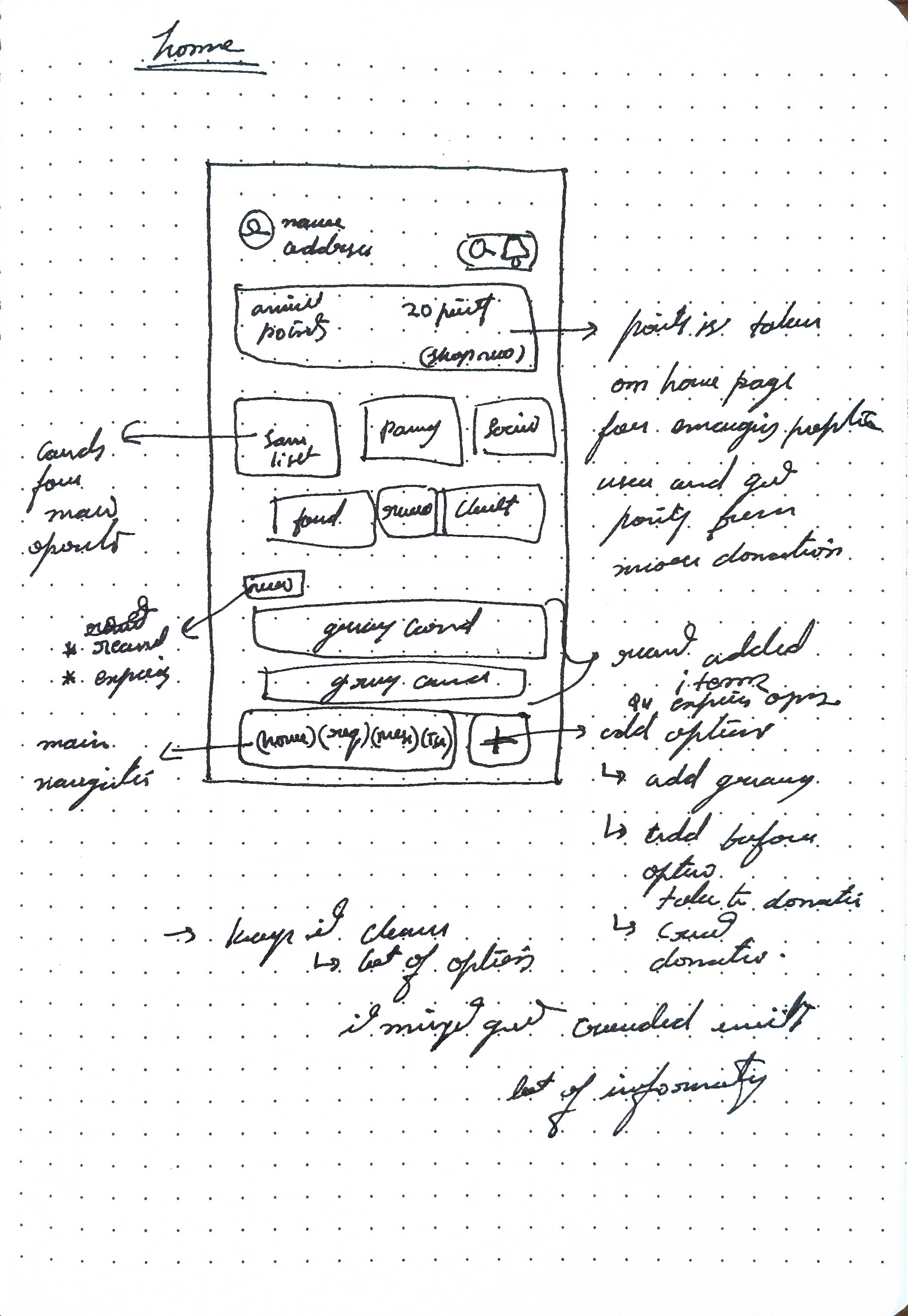
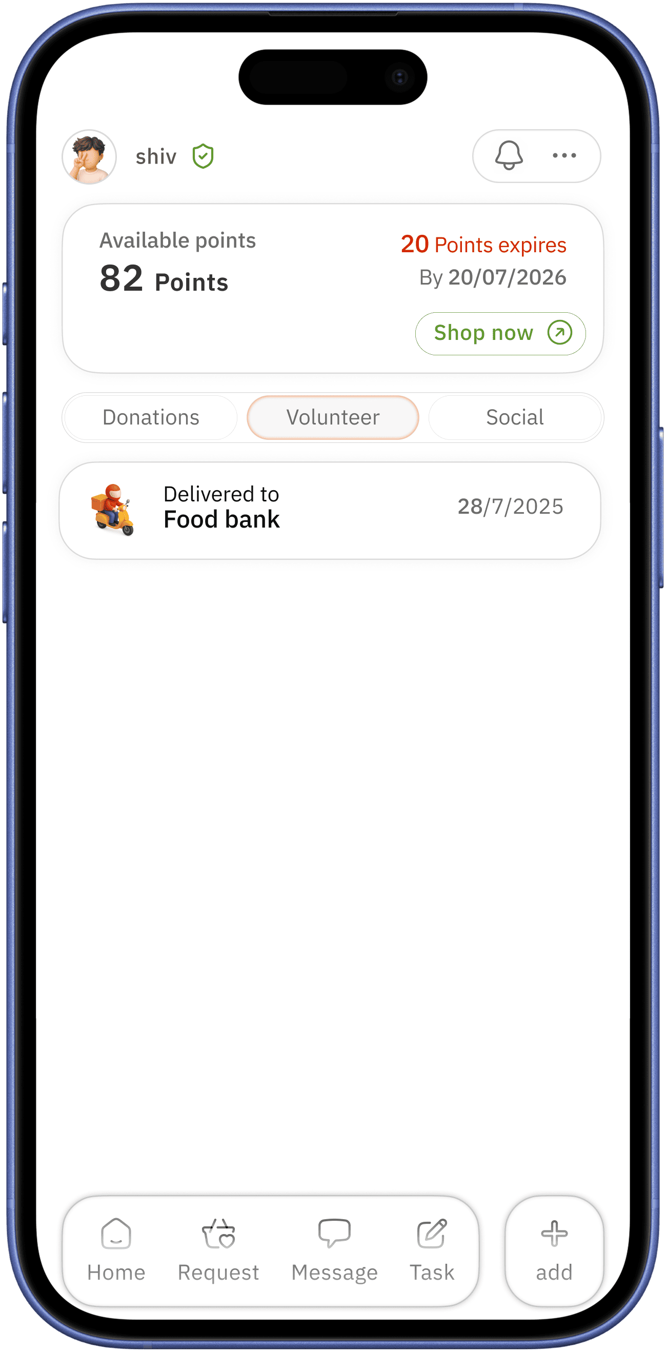
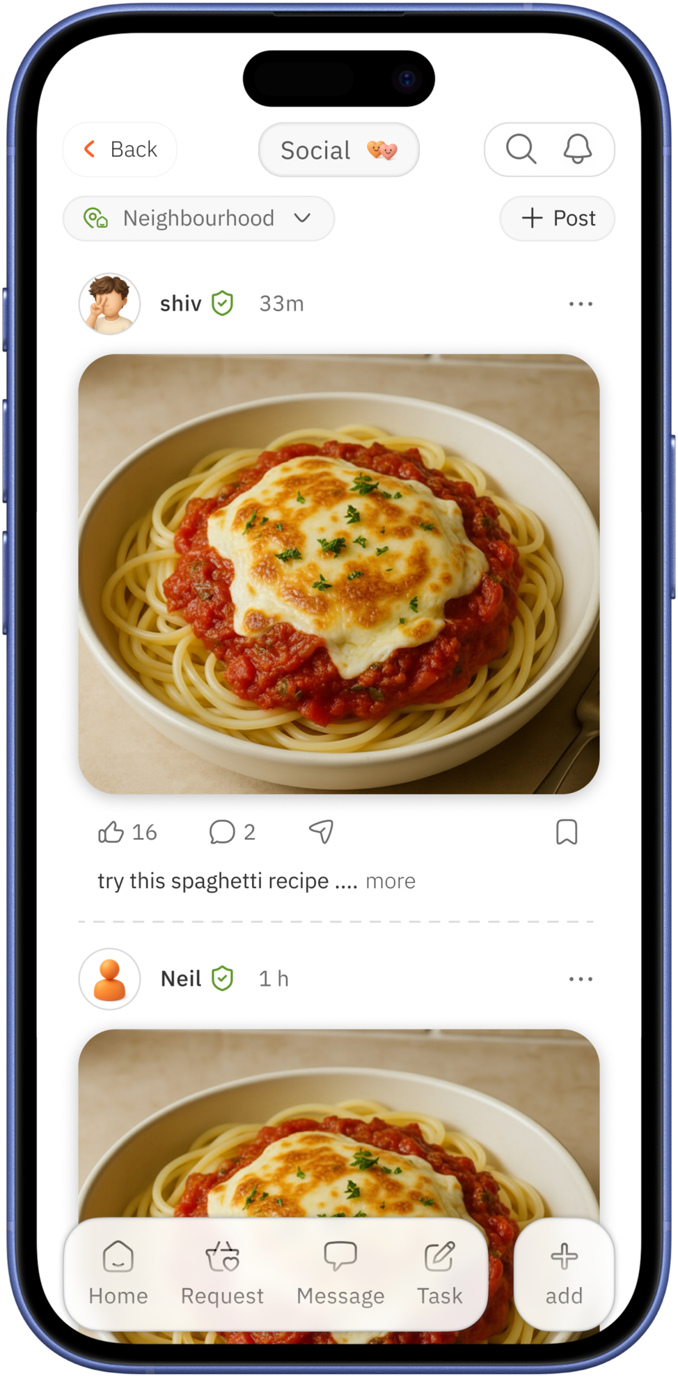
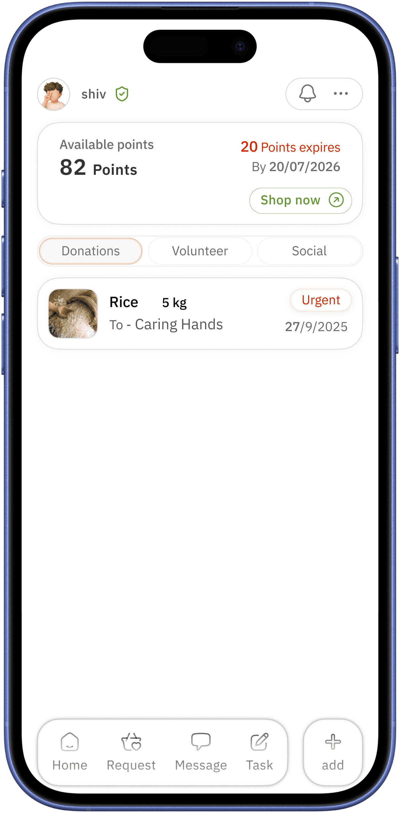
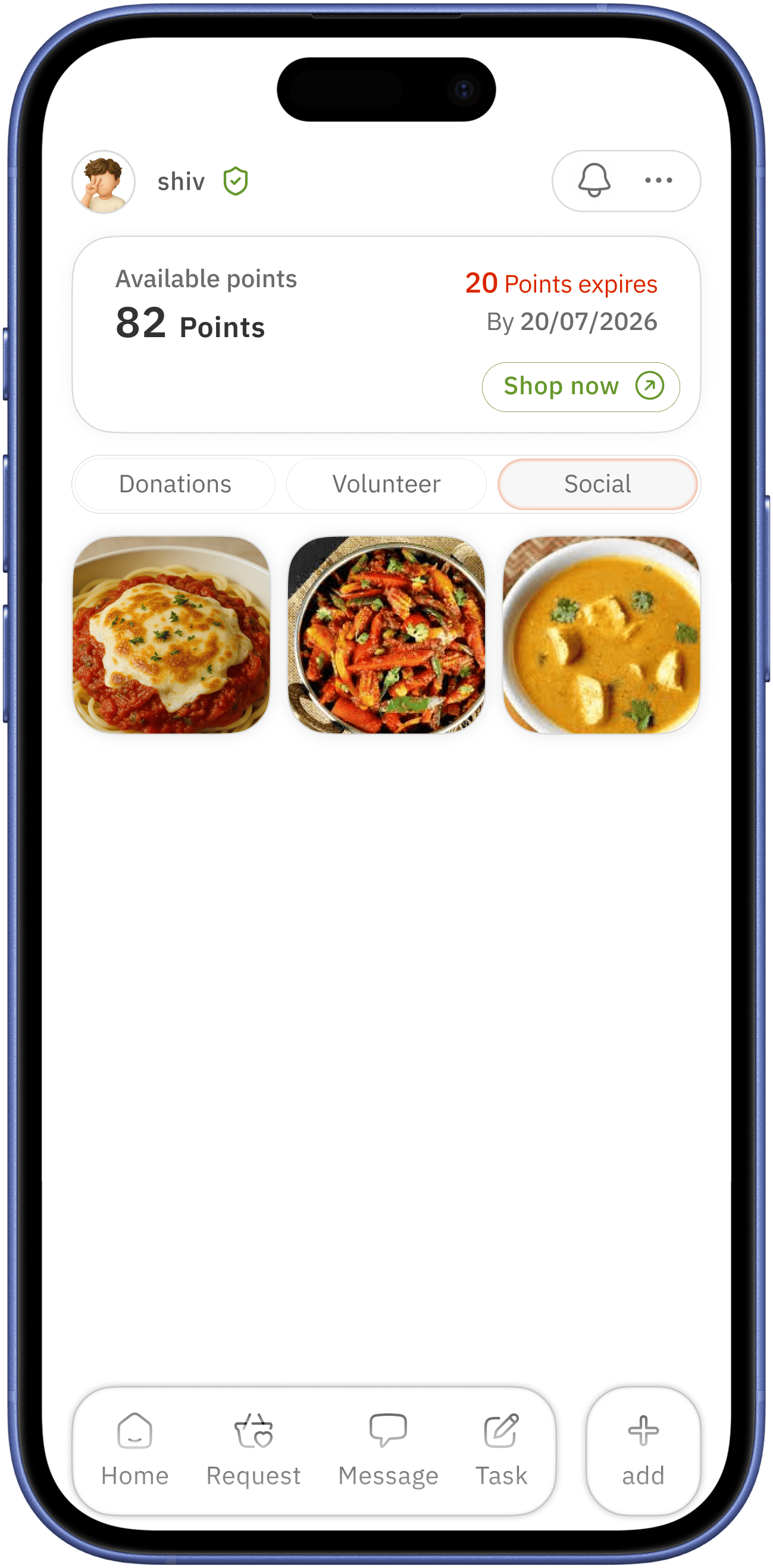
clear indication for alerts/ notification coupled with search option
point card is on top and first to see,
- Showing which encourages user to shop
- availability of points and keeping them in mind to increase ( user wants discounts always )
- encouraging user for donation and volunteering
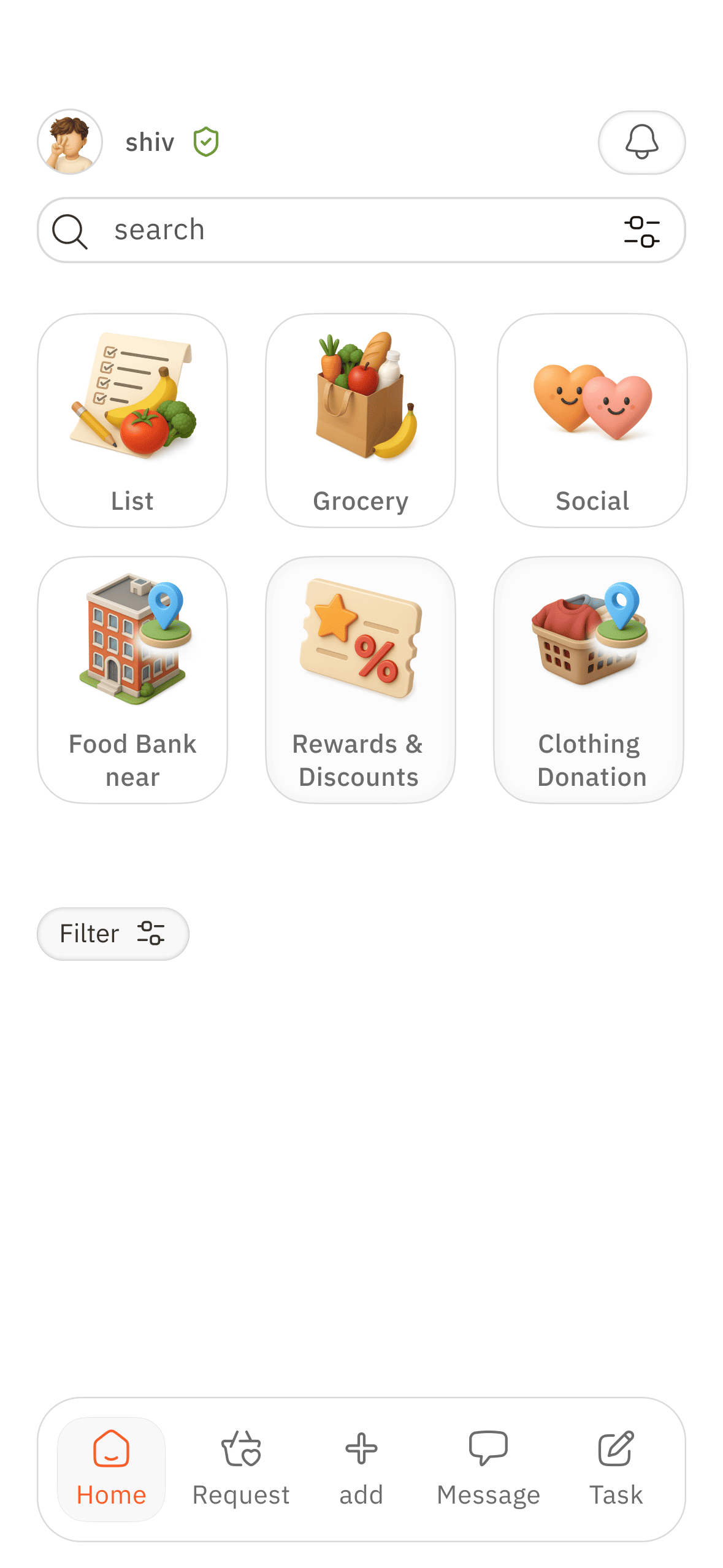
home
easily accessible simple home navigation with active colour indication
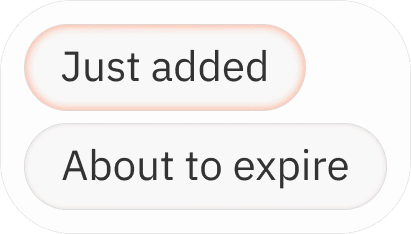
after adding new groceries it will show Just added - after interval shows About to expire → home screen which indicates expiring grocery can lead to better usage / donation
easily accessible add option to distinguish the elements operation
showing the user what just done/ history of added grocery - act as reminder of previous action → acts as feel good after work dine
since the user range is young to old age,
( assumption - old age user don’t like to search through whole app )
- big elements
- home screen to make clear what is available in a single screen
easily accessible profile and location


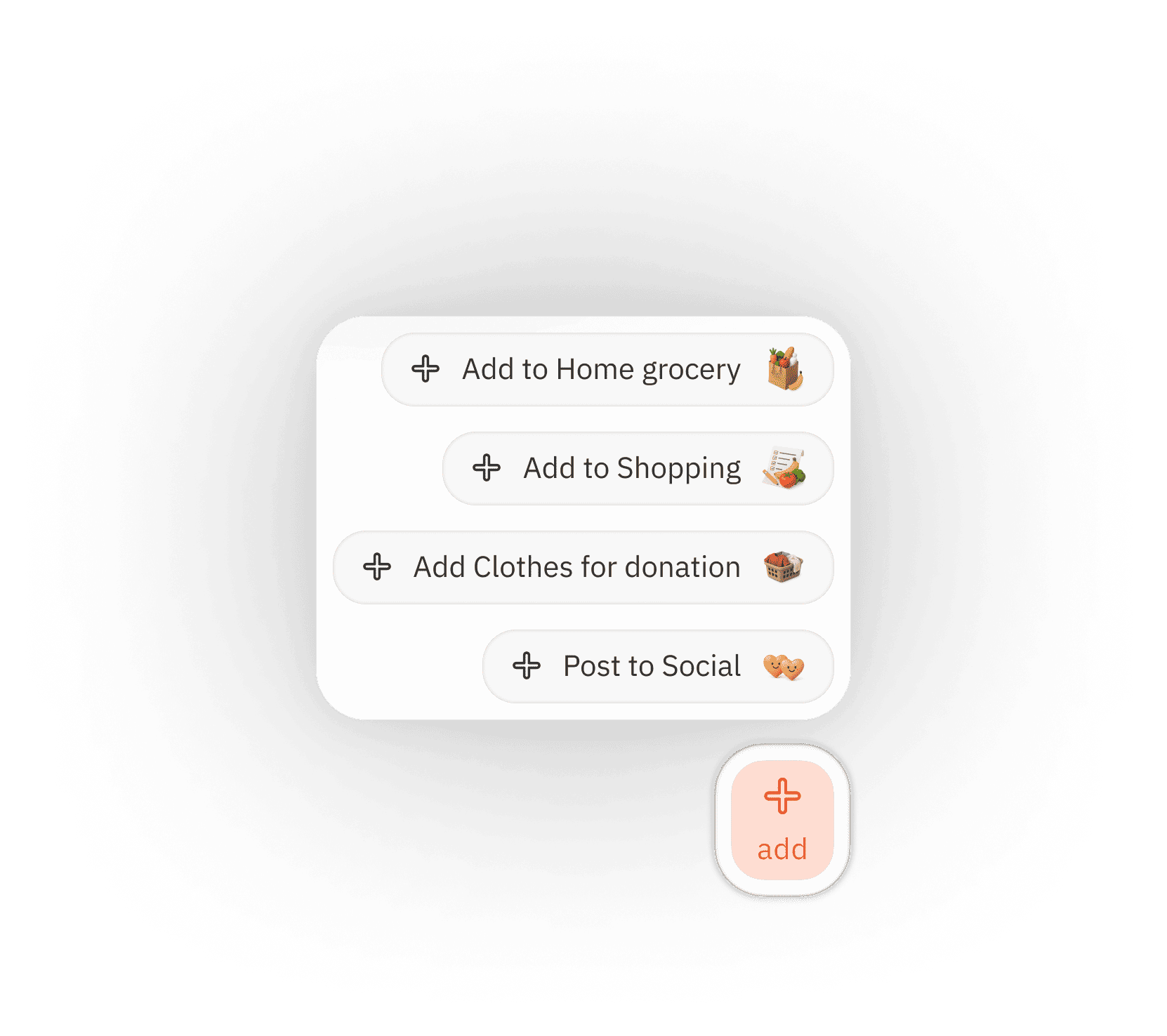
“add” overlay
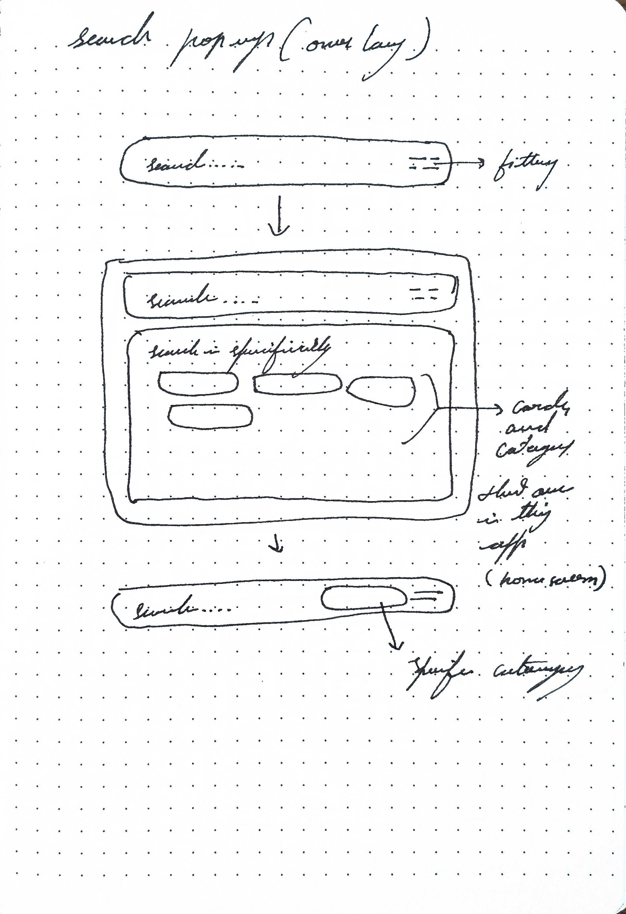
search
search with filter option for better specificity
filter selection tray
proceed with search
tap
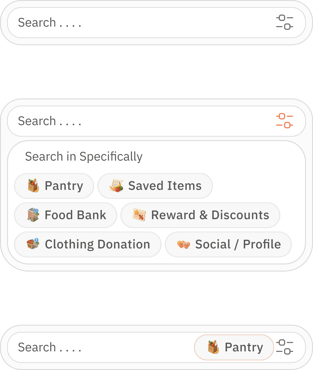


selection option for multiple selection
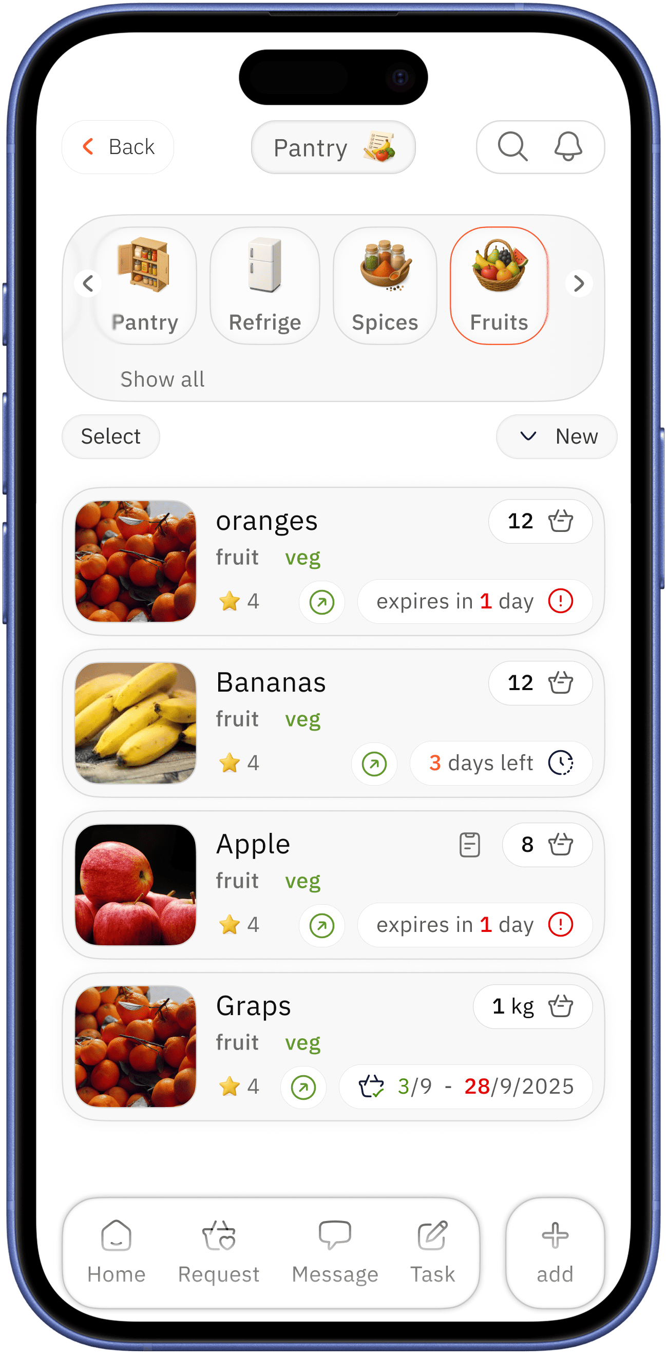

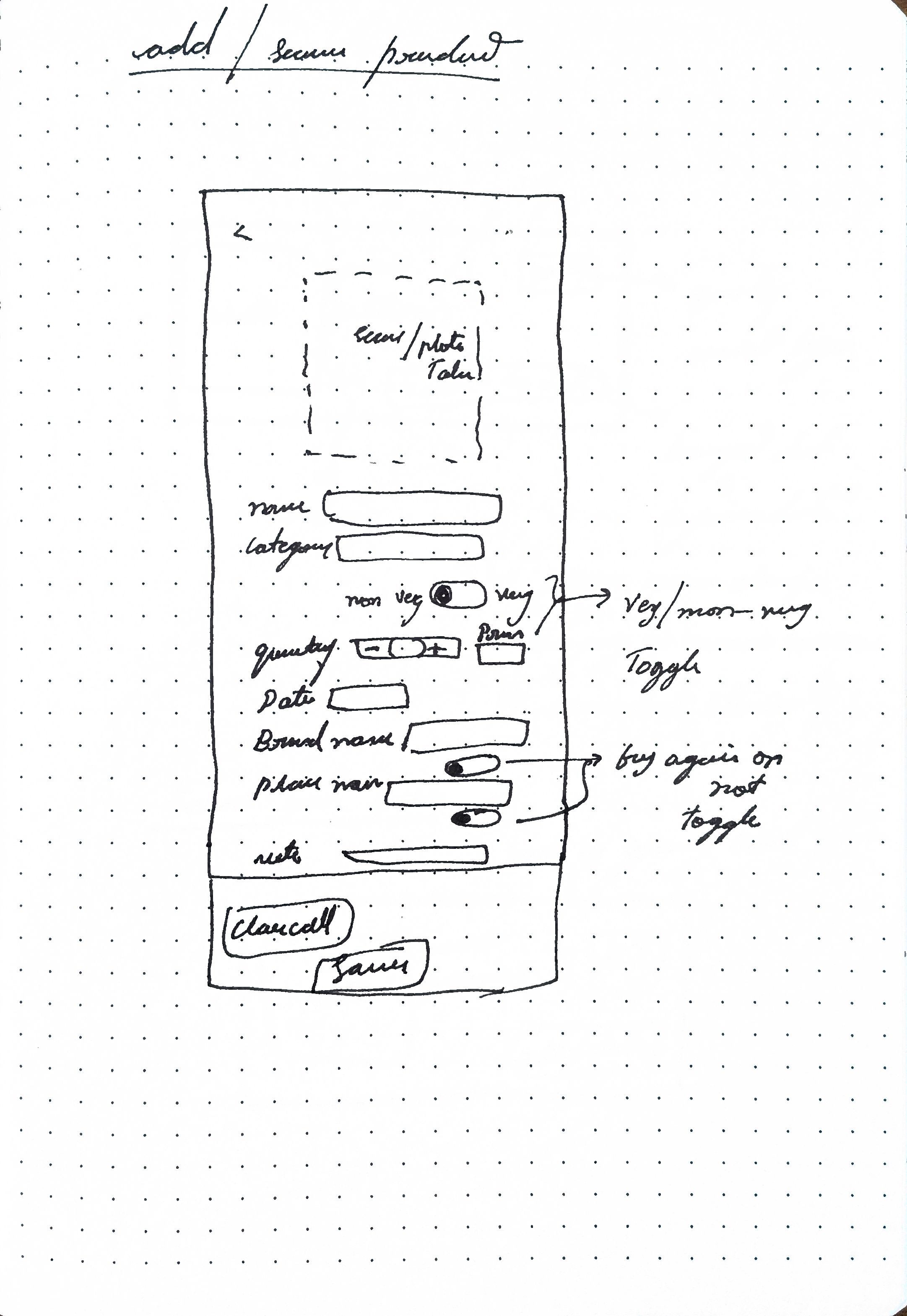
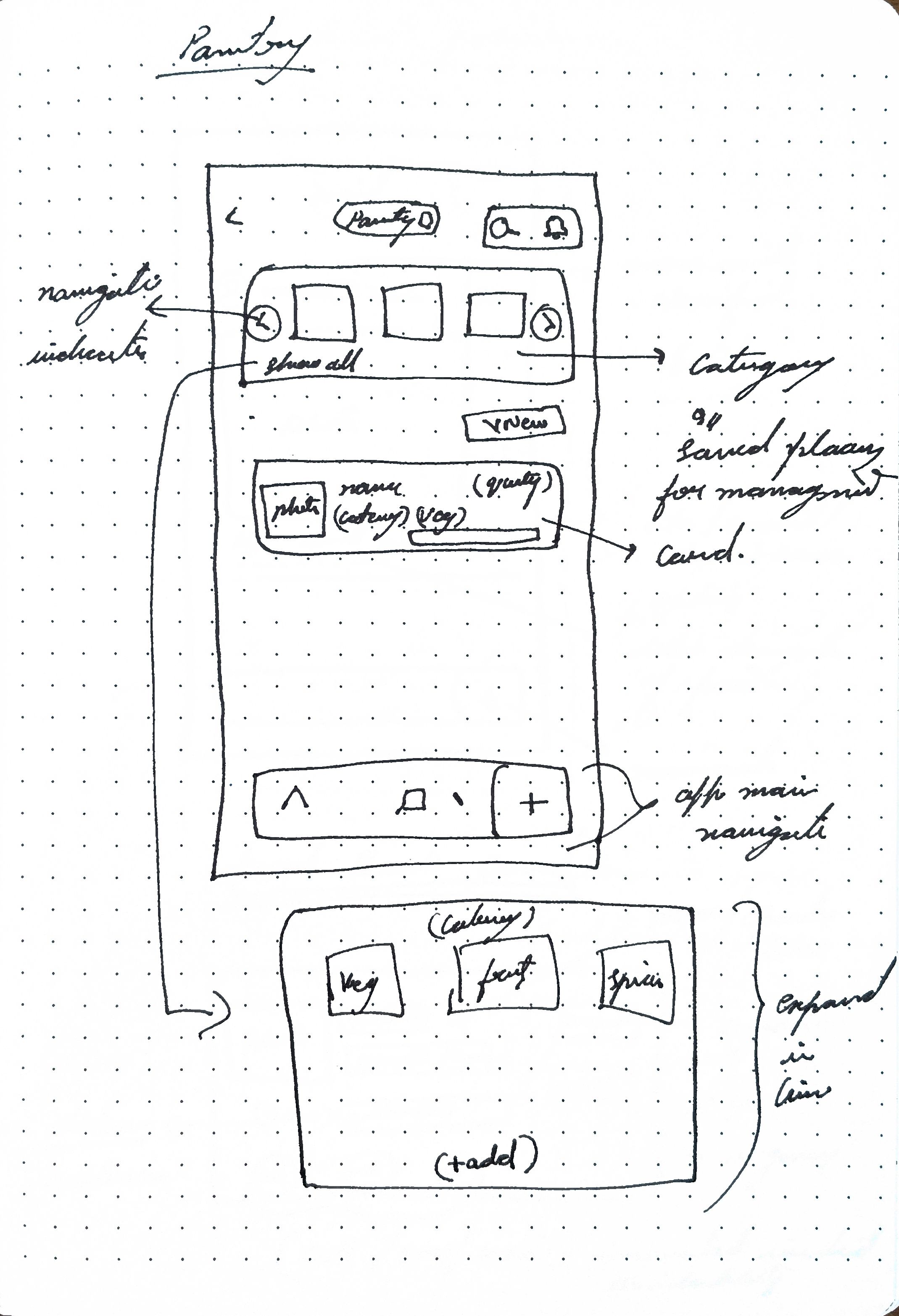
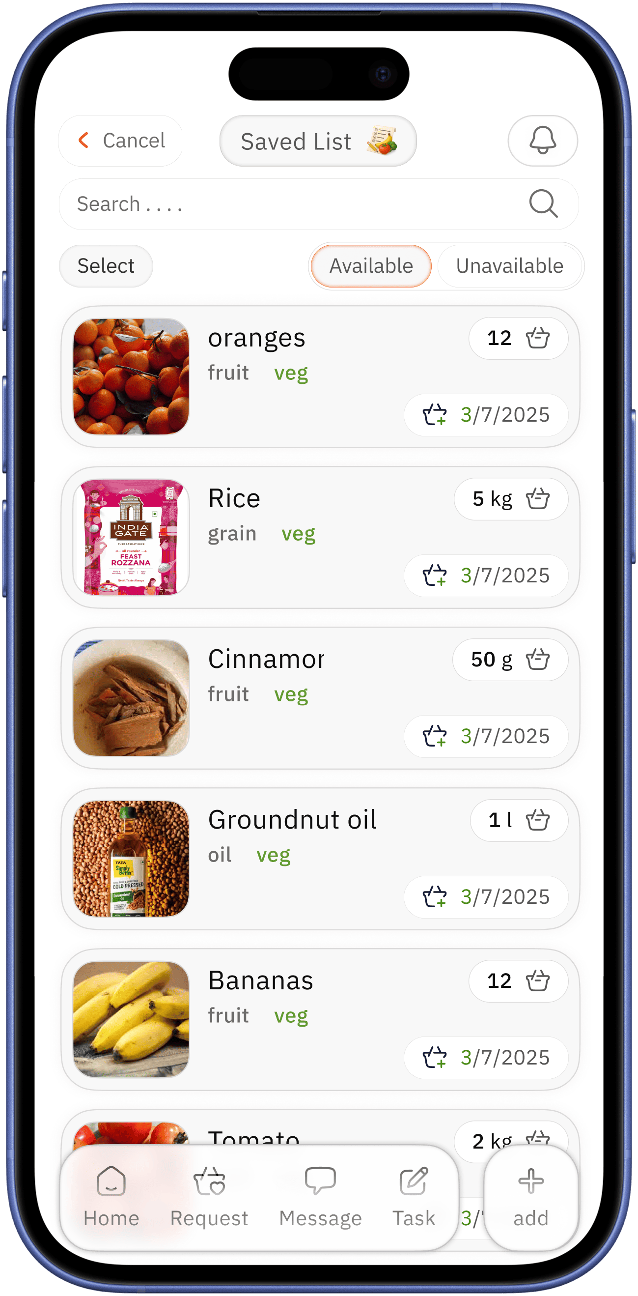
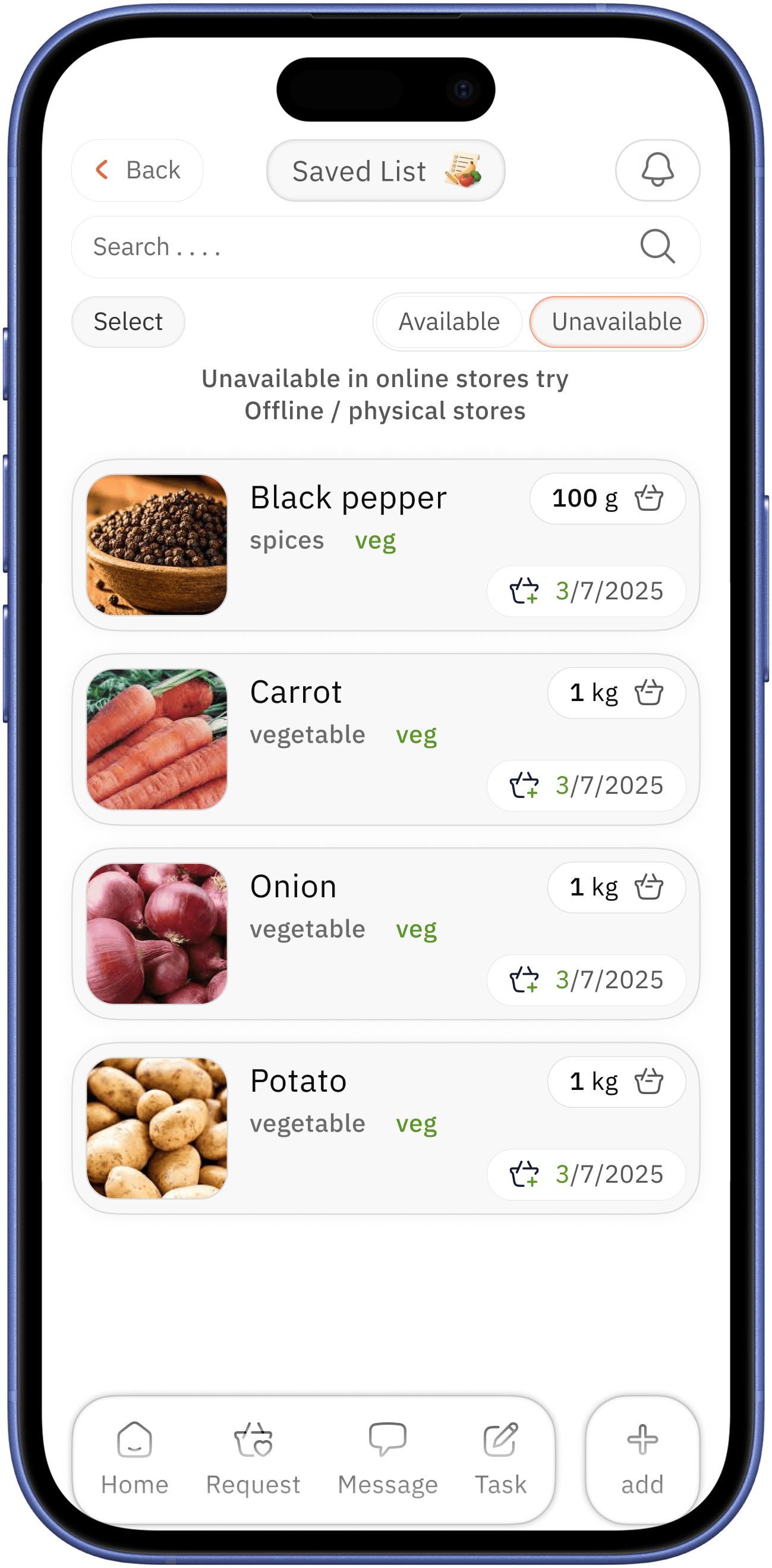
pantry
overlay
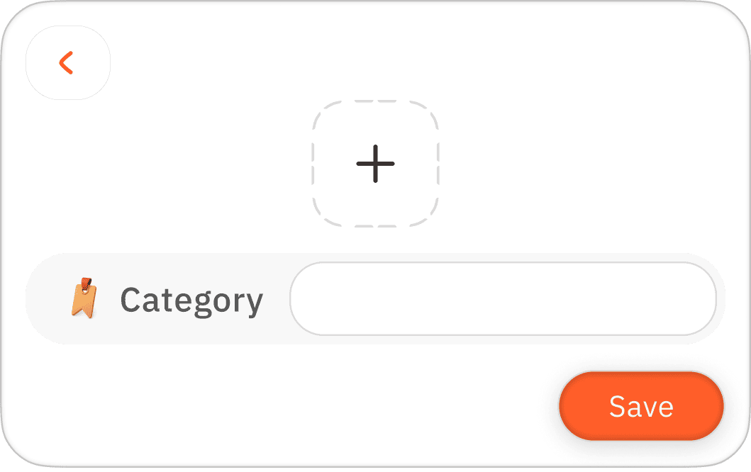
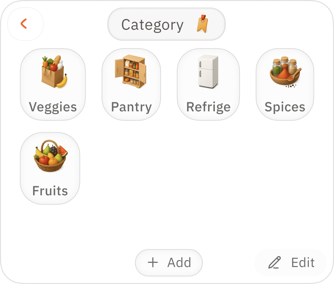
adding new category
easy accessible categorisation for better management

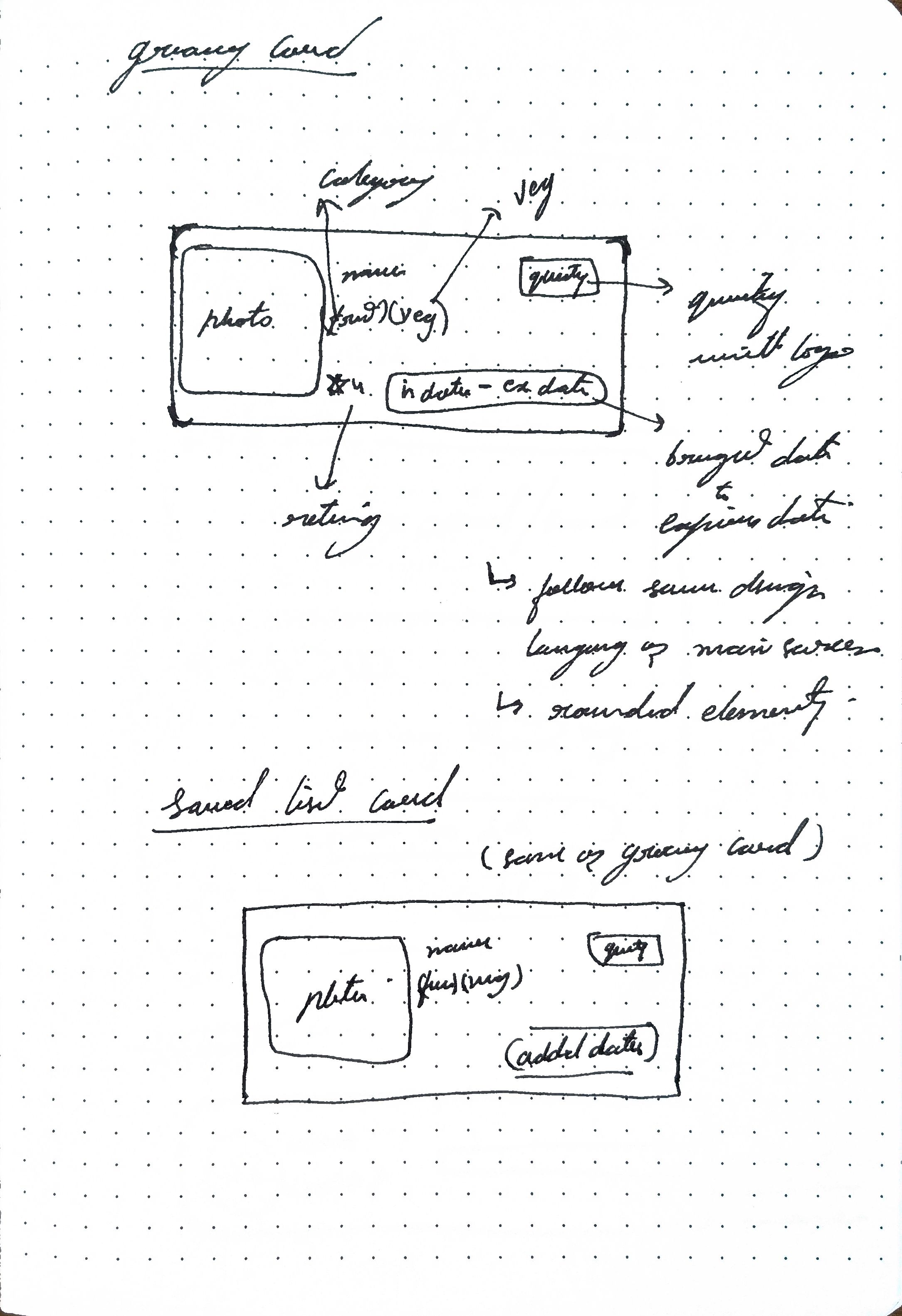
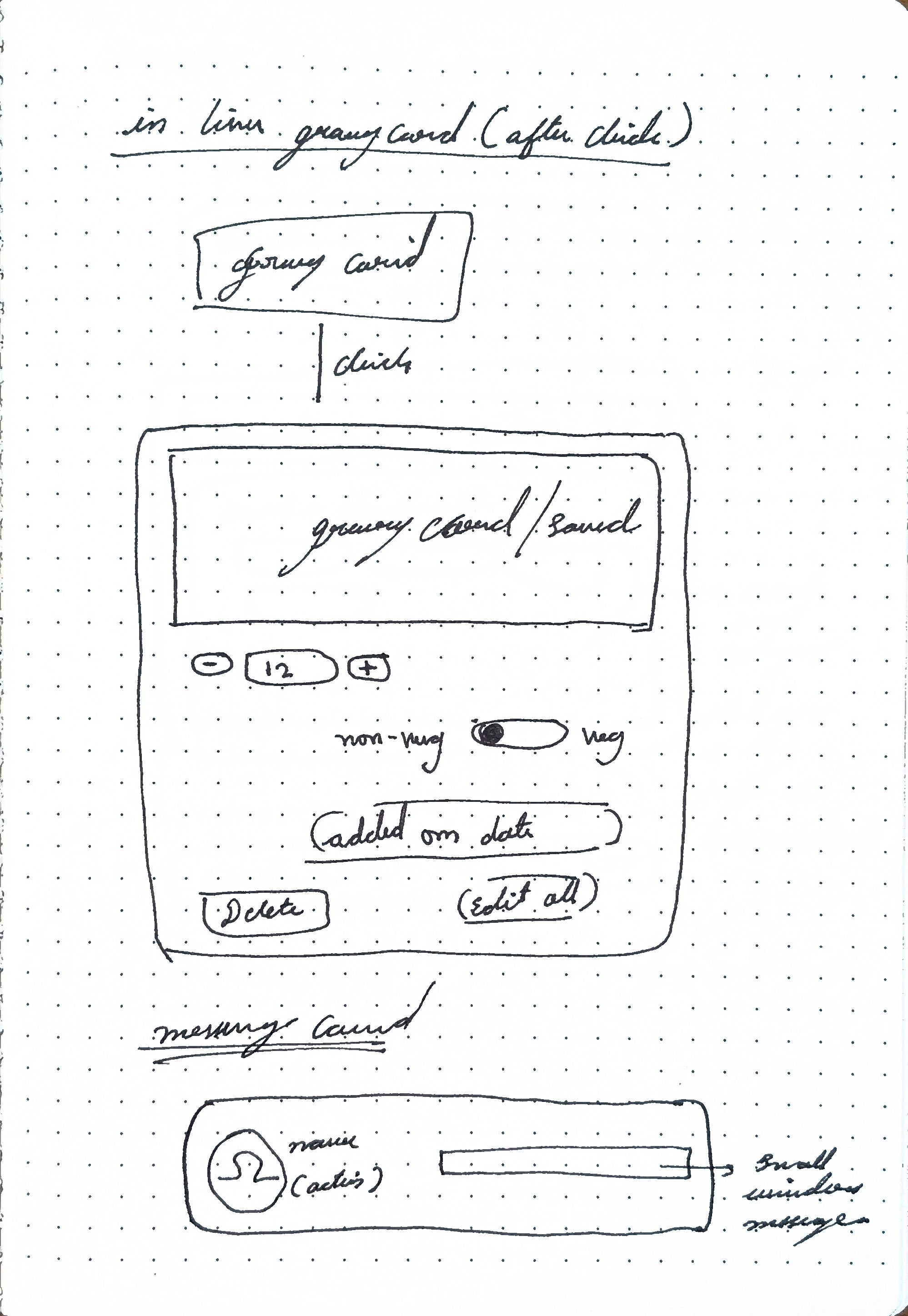
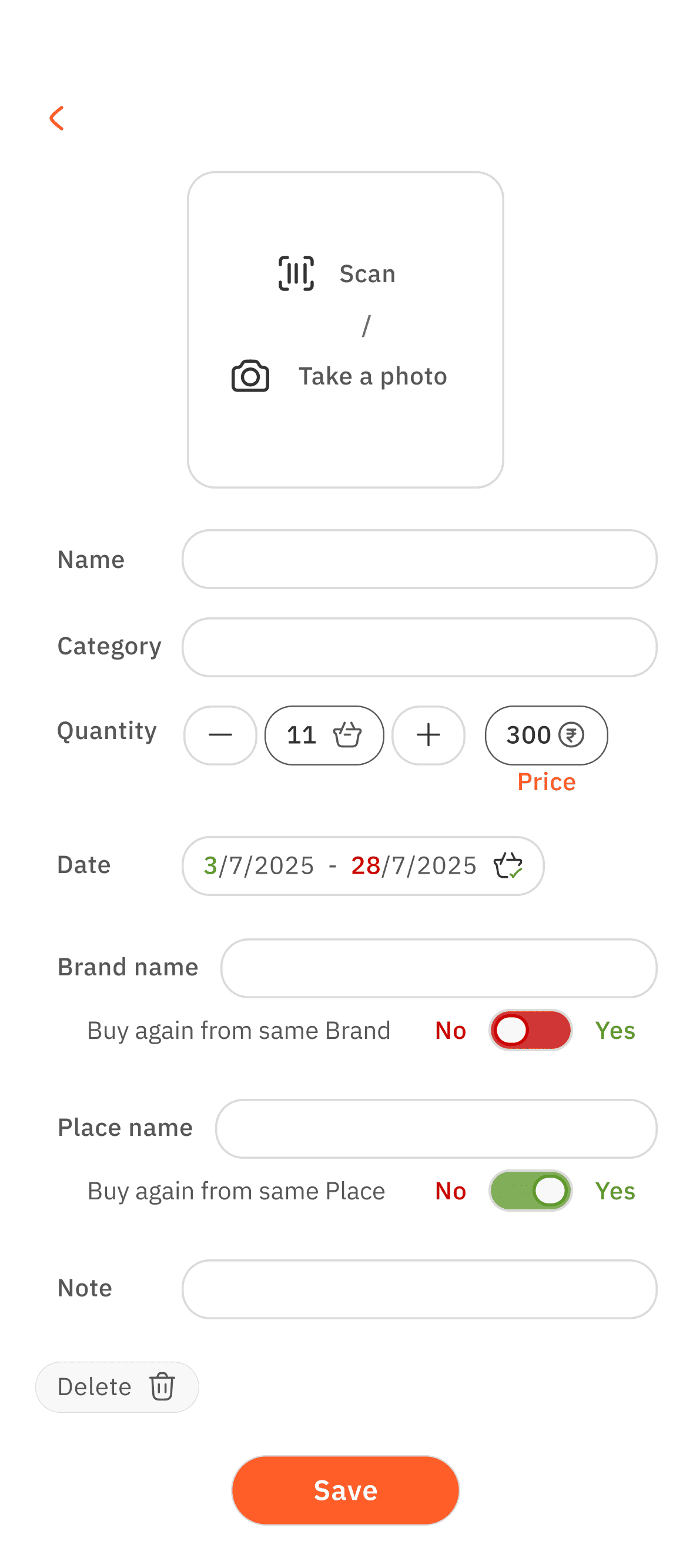
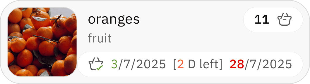
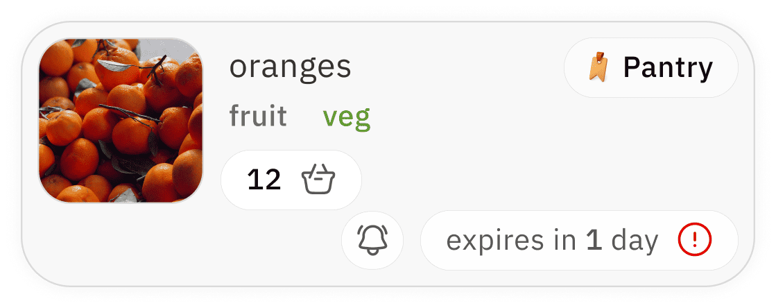
pantry card
expand for quick options
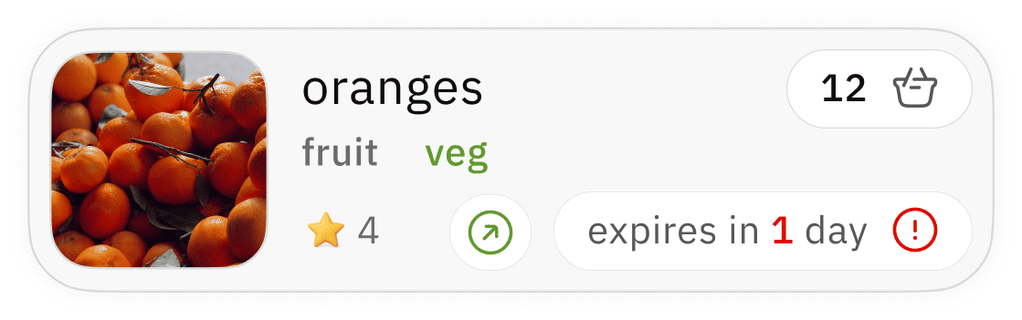
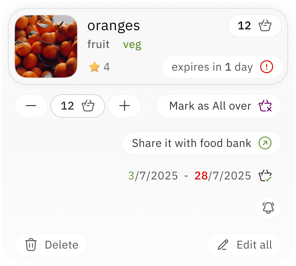
available quantity
quick option to clear the product
takes back to initial “ add home grocery” screen for complete re-edit
freshness period indicator / reminder with red colour for alertness
clear photo / image incase of product scan
for easy indication
category label for organization with label for product type
users usage rating for → better choice repurchase indicator


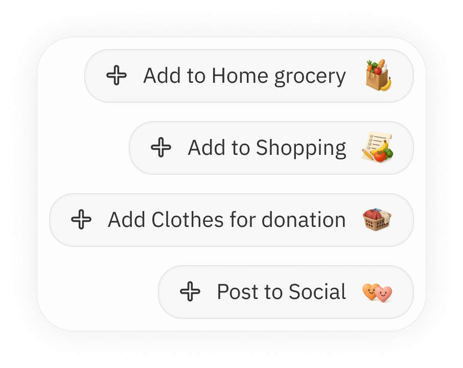
add to home grocery
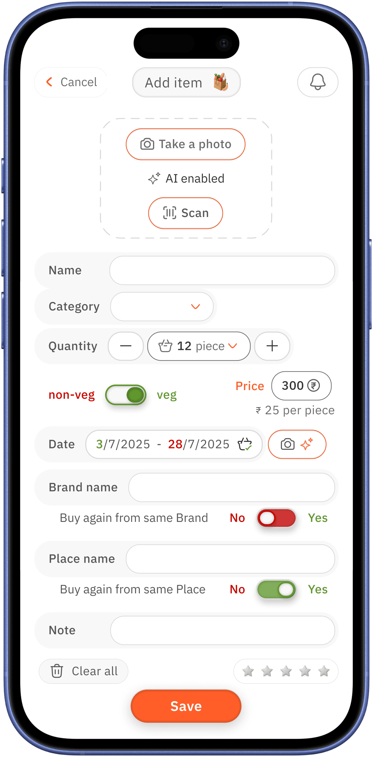
AI enabled → which is one of the core pain point and design gap need to address
photo option for products without barcode to scan / scan option for the bar products


better proximity
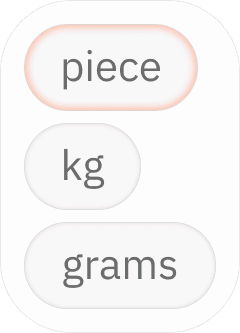
easy add or remove option for piece / and manual selection options for other measurement
camera with AI enabled option is for case where bar code scan does not have data on usage date ( most of current system do no have usage period data )
so the user who is has low vision can just take photo of the date
overlay open with already created category / to create new category
better repurchase preference → toggle
rating the purchase for better repurchase decision


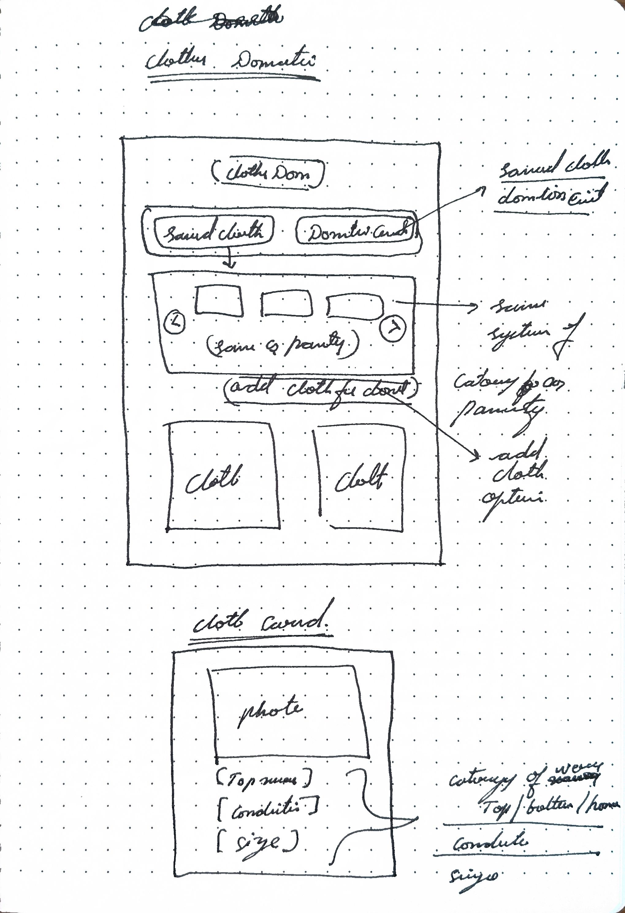
clothing donation and saved
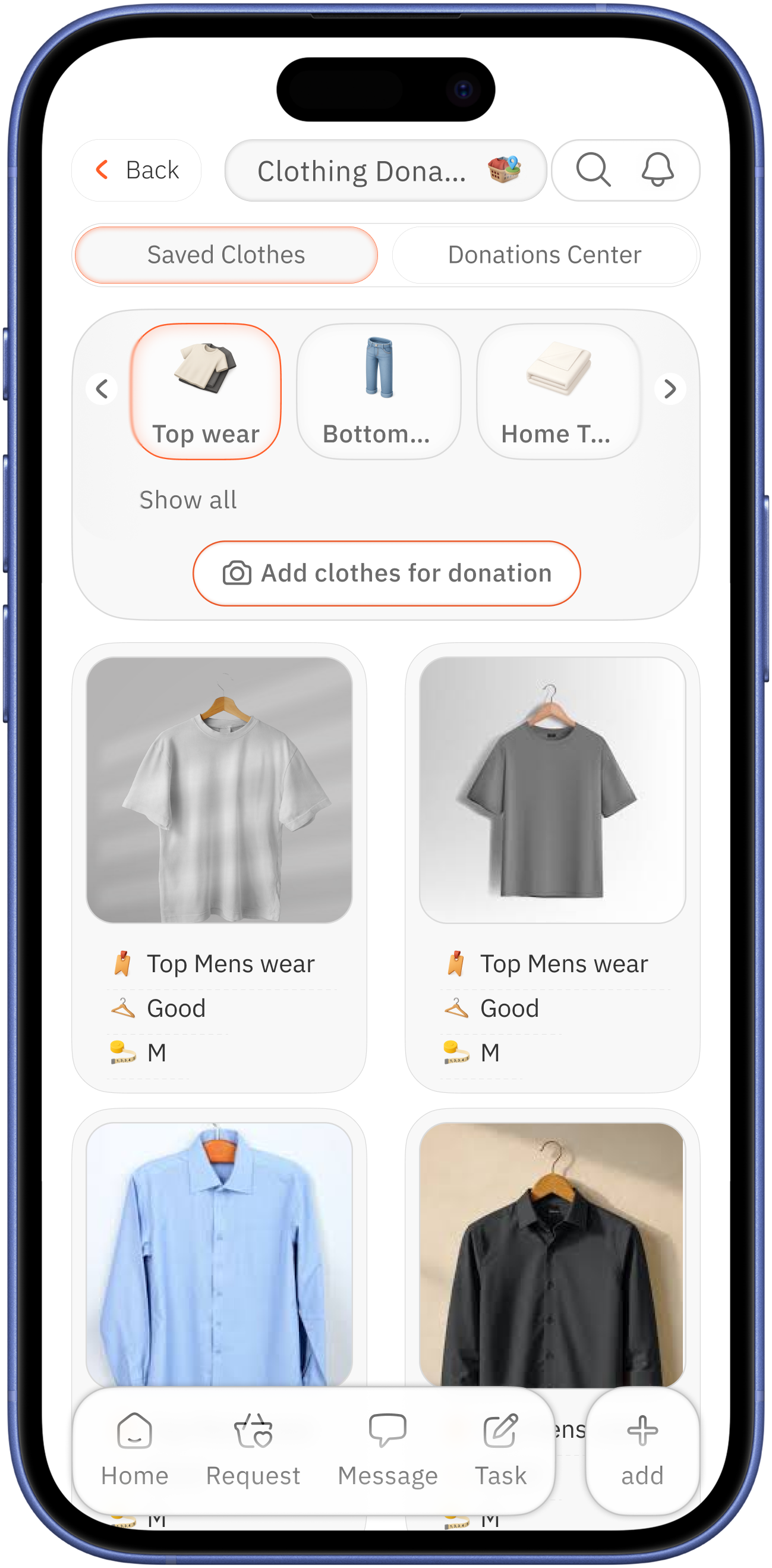
tab switch option for to create single environment center
category card for management / with add clothes for donation
added clothes card
primary-photo for better assessment with
secondary-condition of the cloth and size, user type

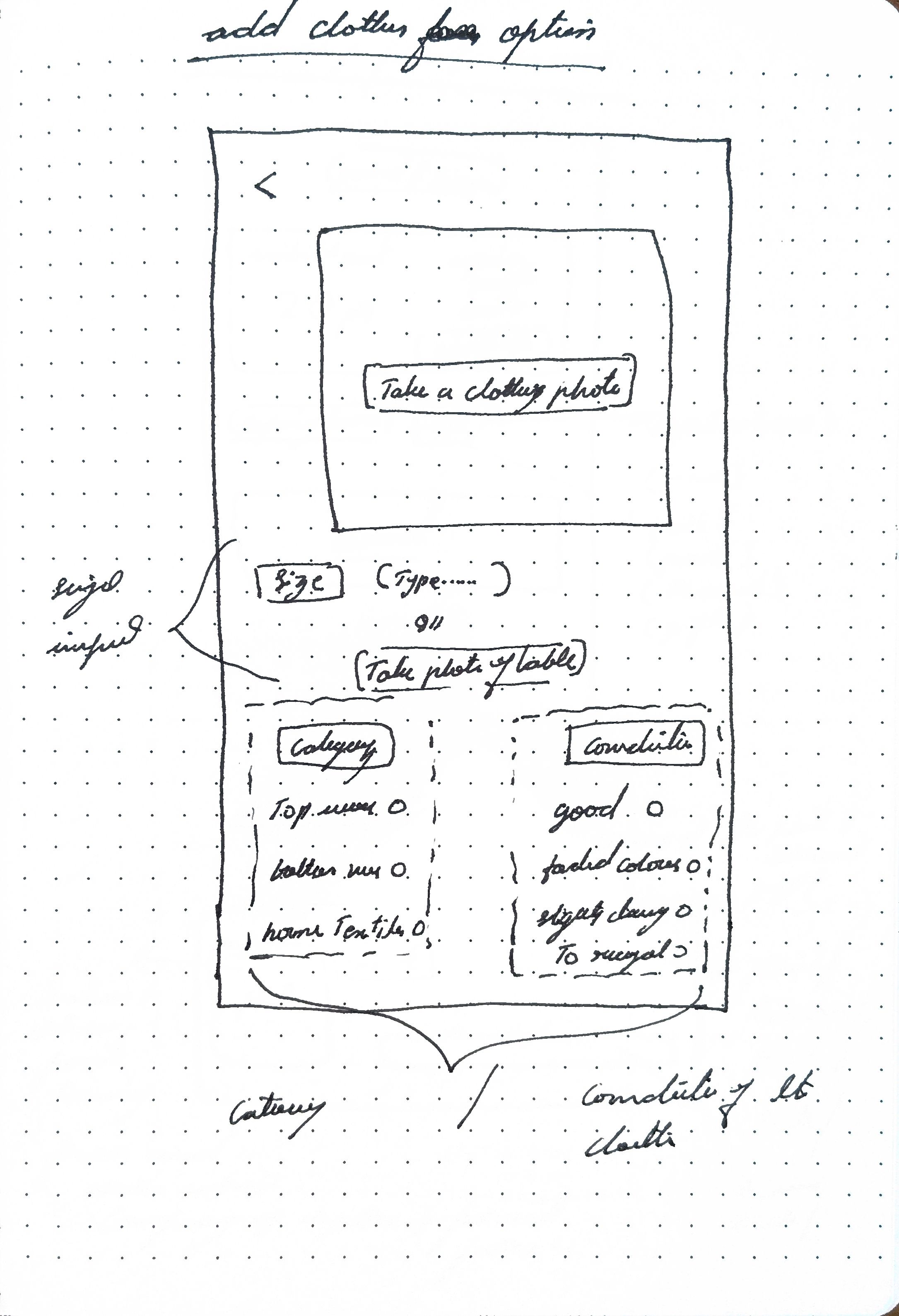
add cloth
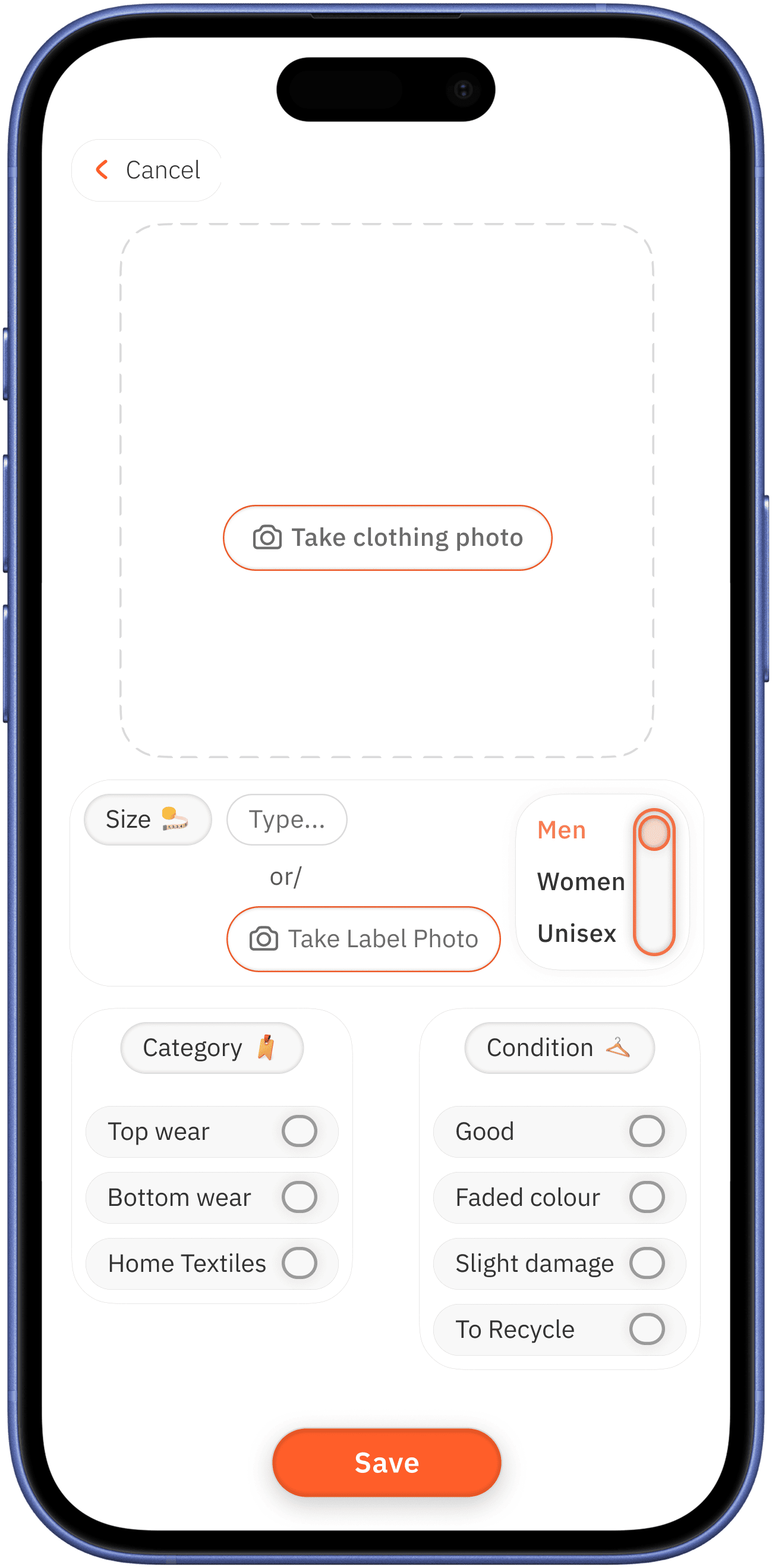
add photo for better assessment

user type selection option with three-way toggle
manual size add /
take photo to add option for vision low user
to input condition of the cloth, there are four easy options are provided for easy quick decision


simple categorization
for quick decision
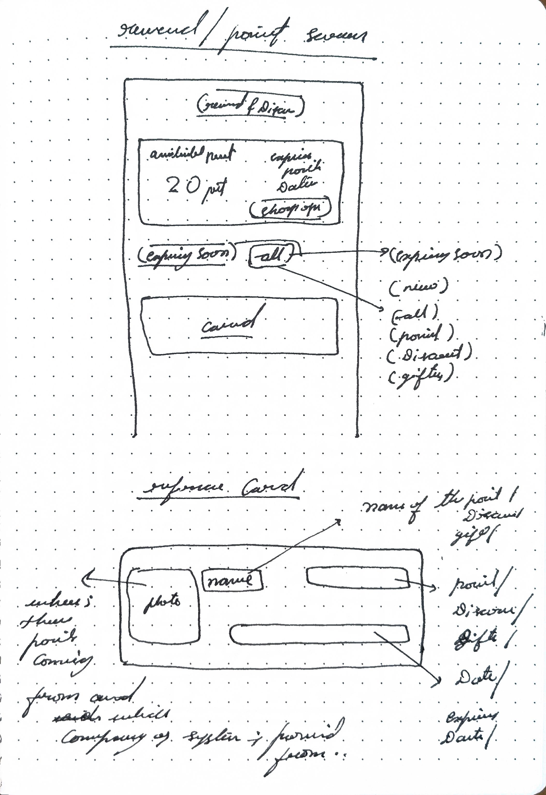
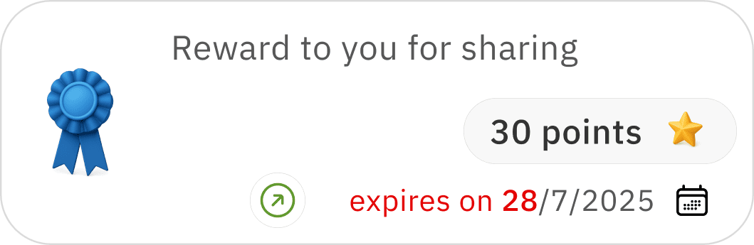
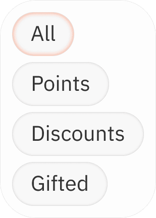
rewards & discounts, points
overlay
type of reward
clear indication
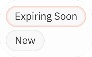
expiring points with colour for alertness / placed with date for proximity relation
focus on expiring points → date ( period limitation ) → shop now ( encourage to use the points )
usable limit date


image of the reward provided from / where it can be used ( in discount type of reward )


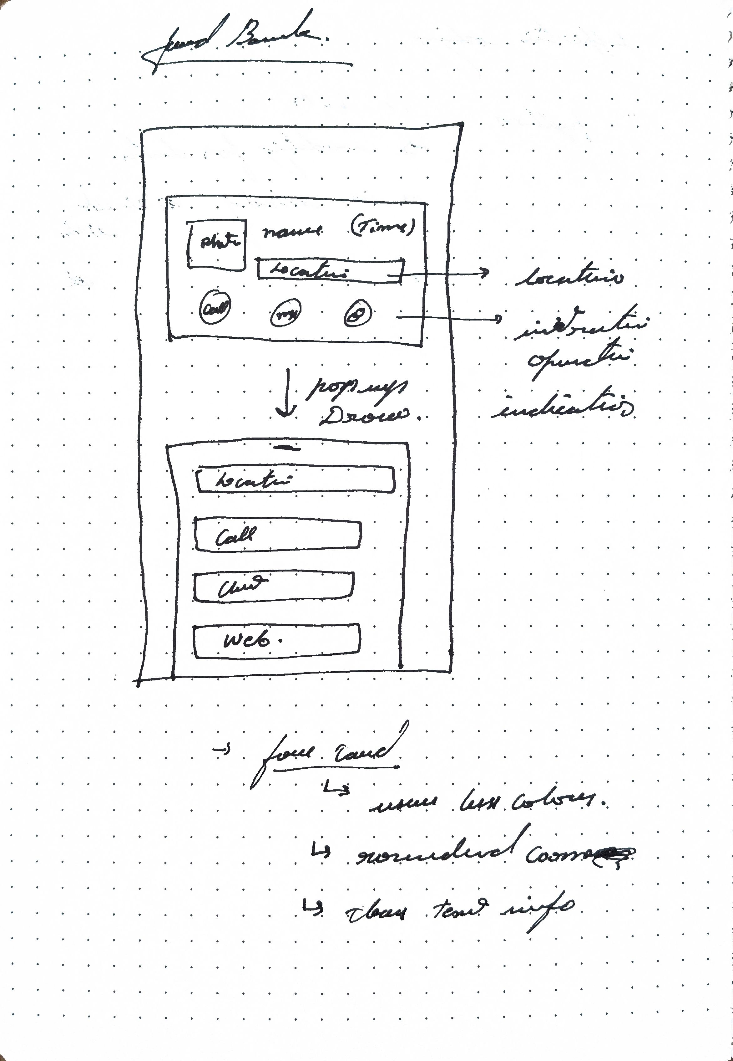
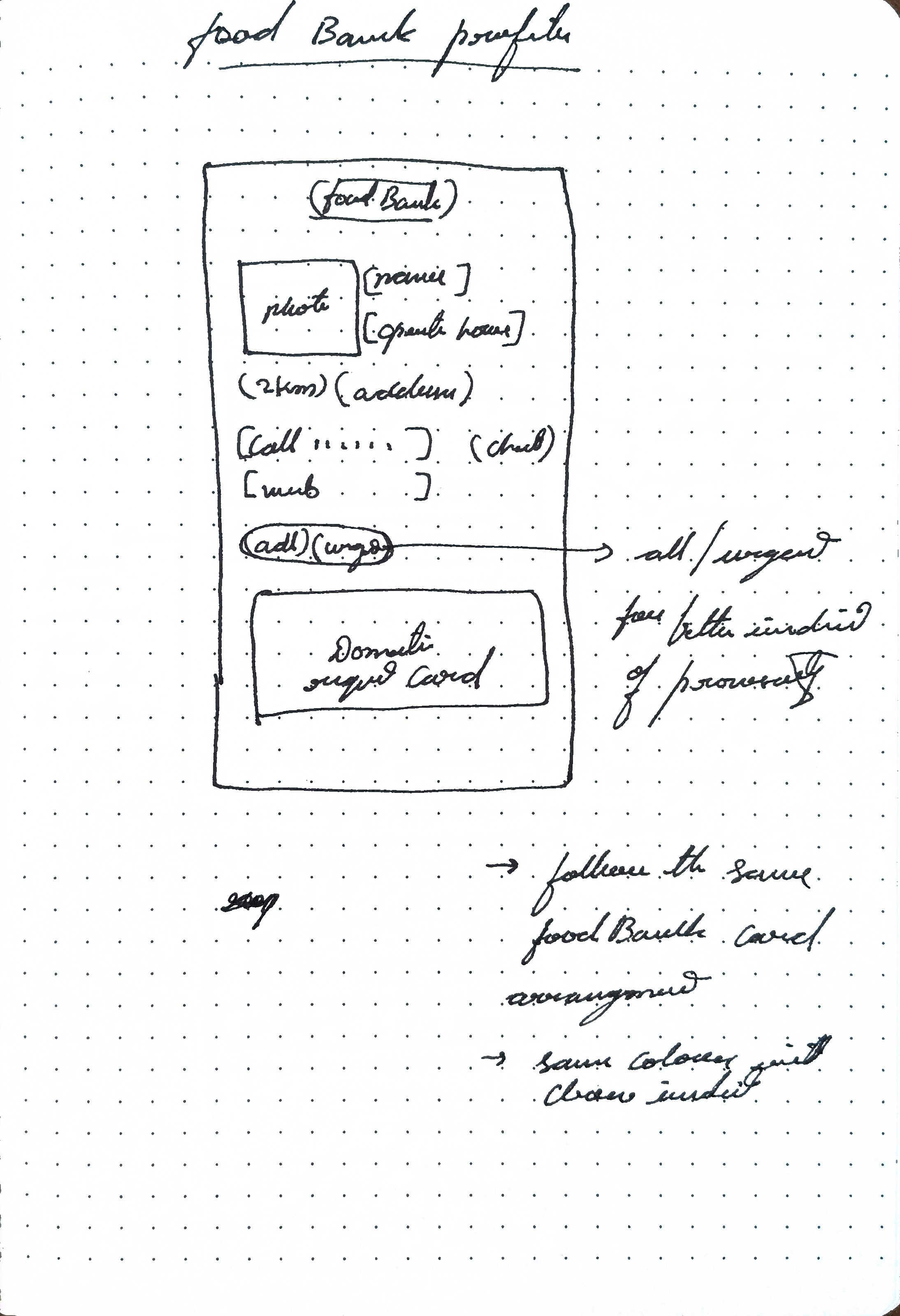
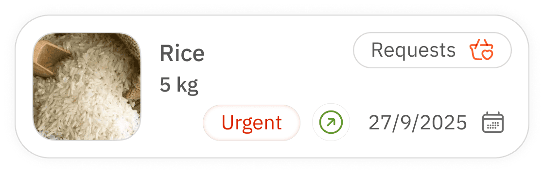
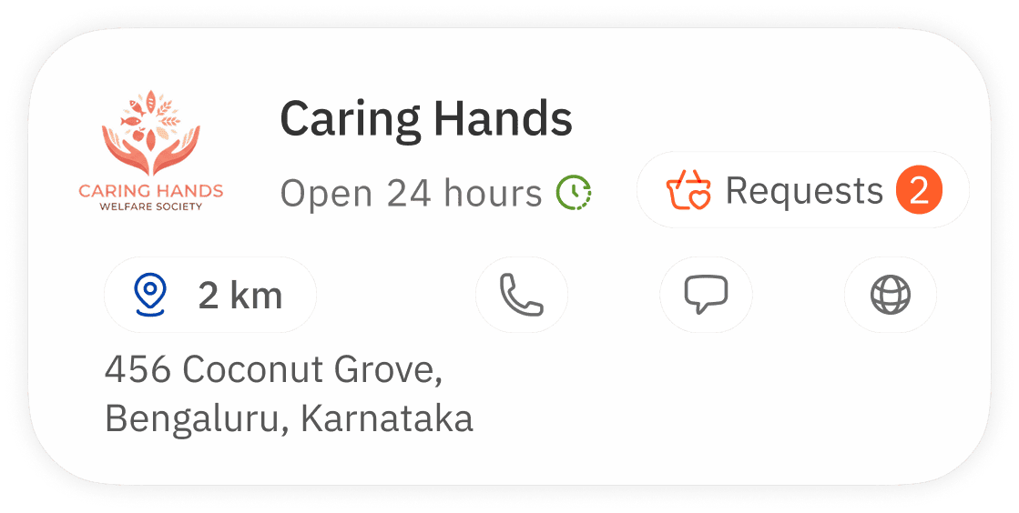
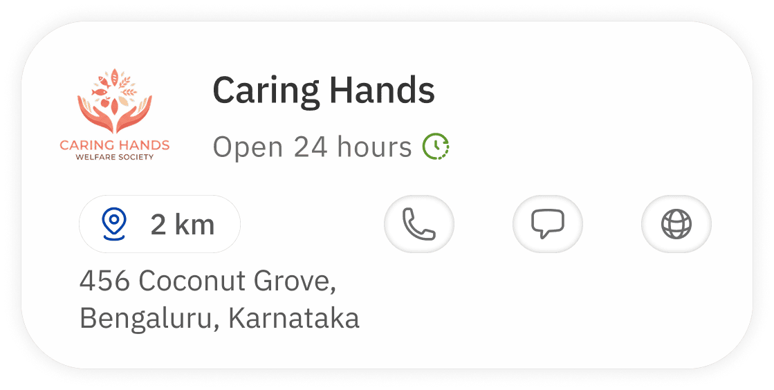
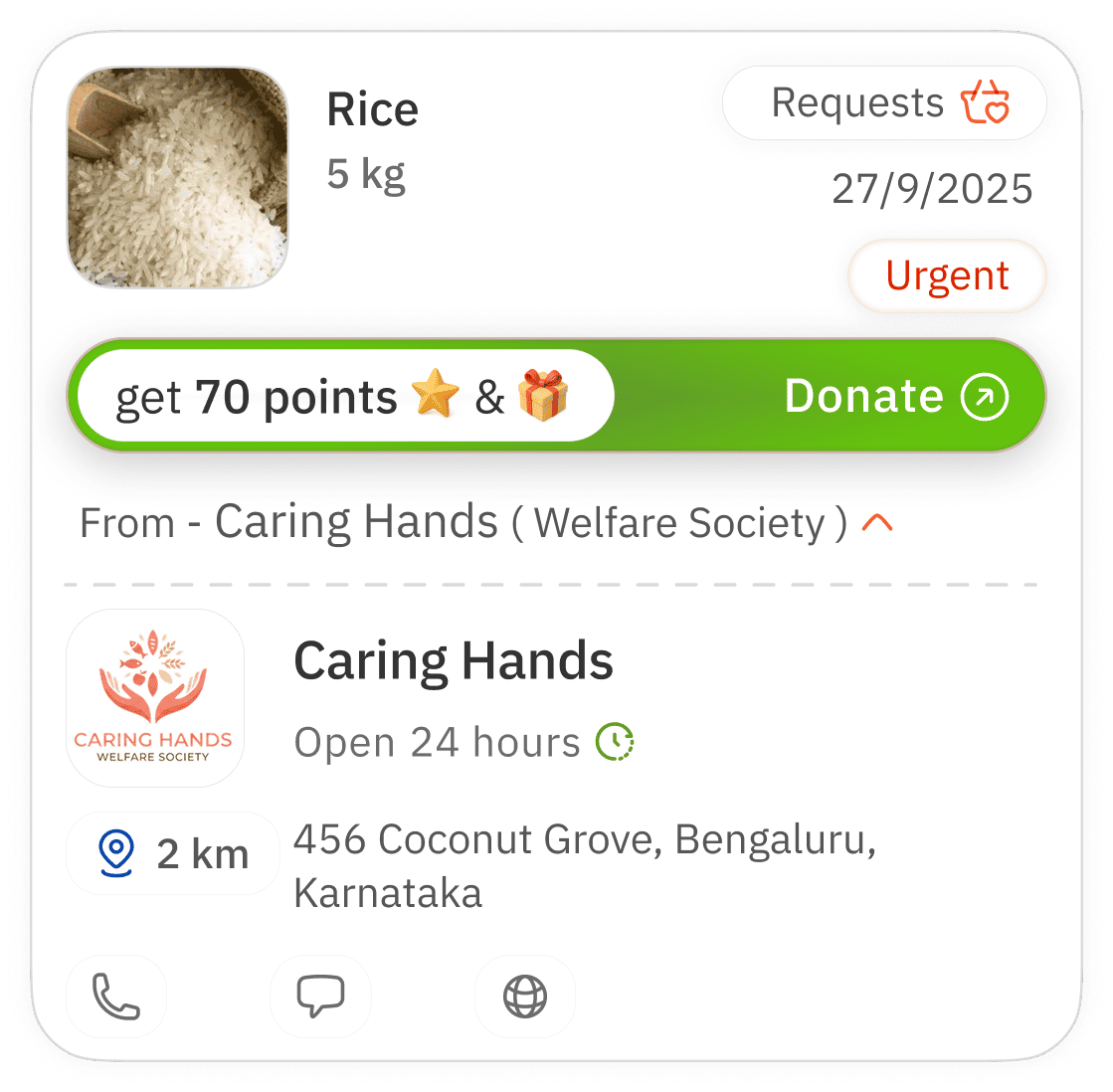
food bank
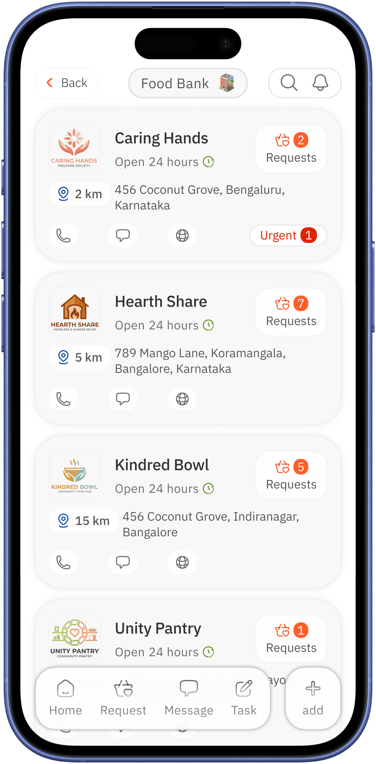
request and how many / main colour is used
urgency with red colour for alertness
shows near to the user in order coupled with address
clear image name with operation hours in proximity for quick identification
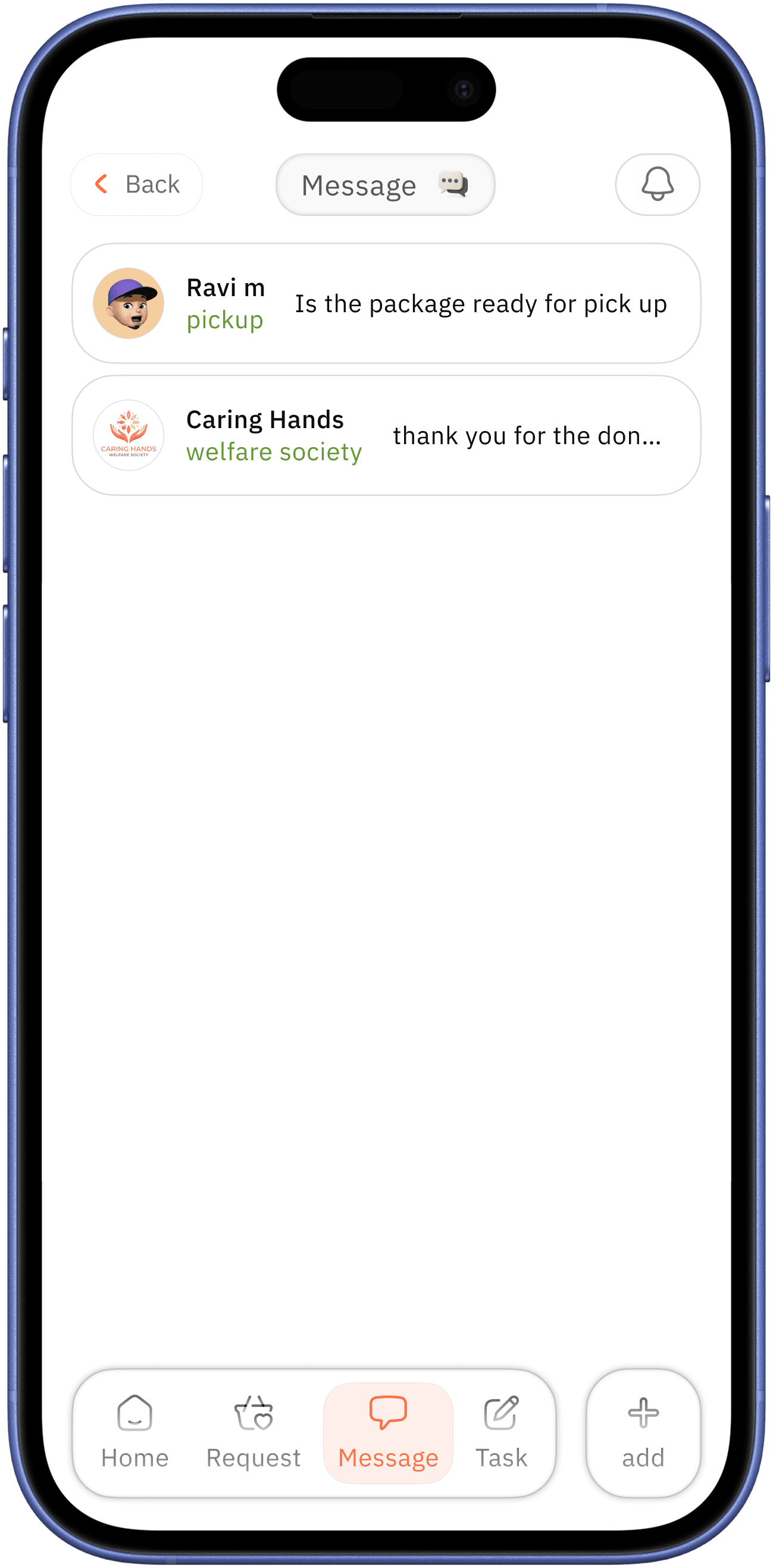
available communication easy assess


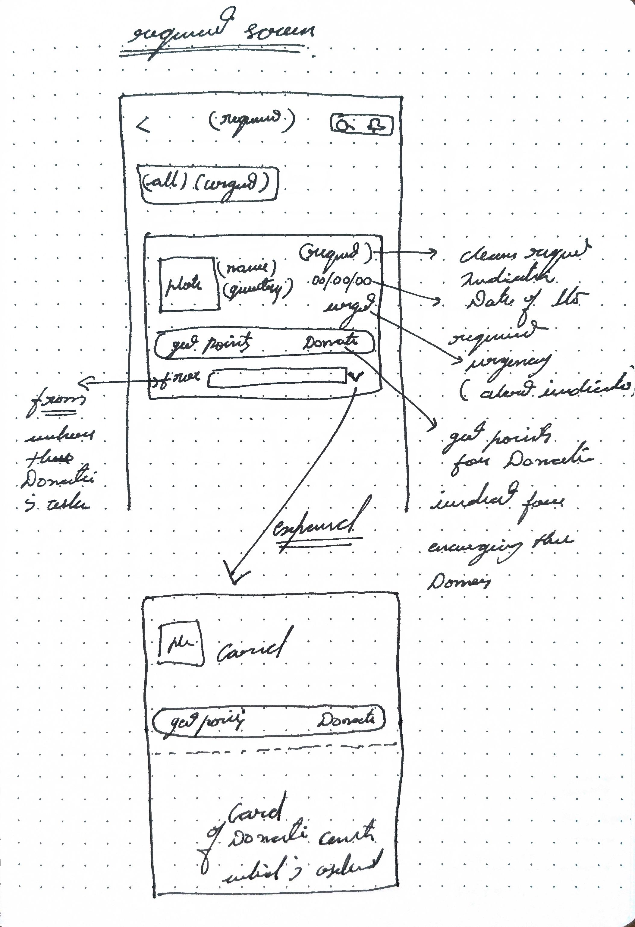
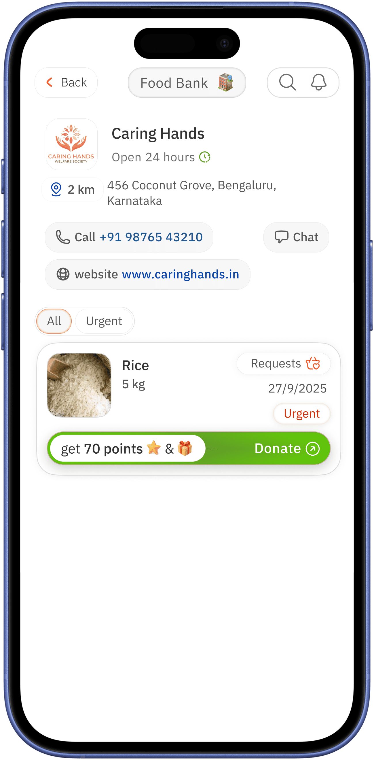
request
expand
can go to welfare profile if the user interested
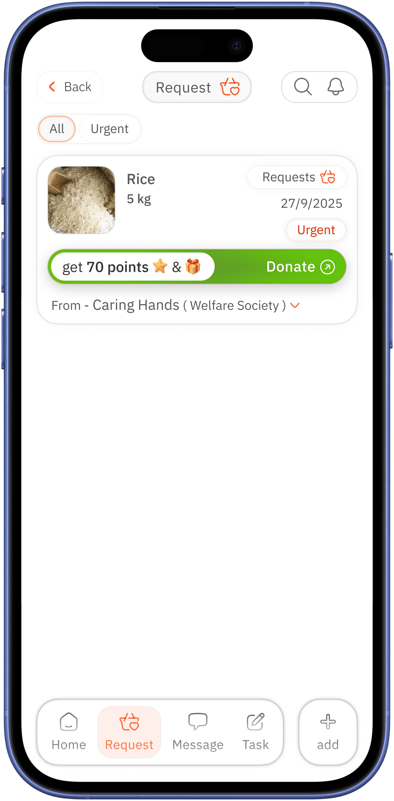
urgency with red colour for alertness
name of the welfare center for building community welfare and identity / arrow for expansion for more info

clear image name and quantity for easy identification
clear classification aiming at urgency
indication for donation request lead by reward and surprise for encouragement of user

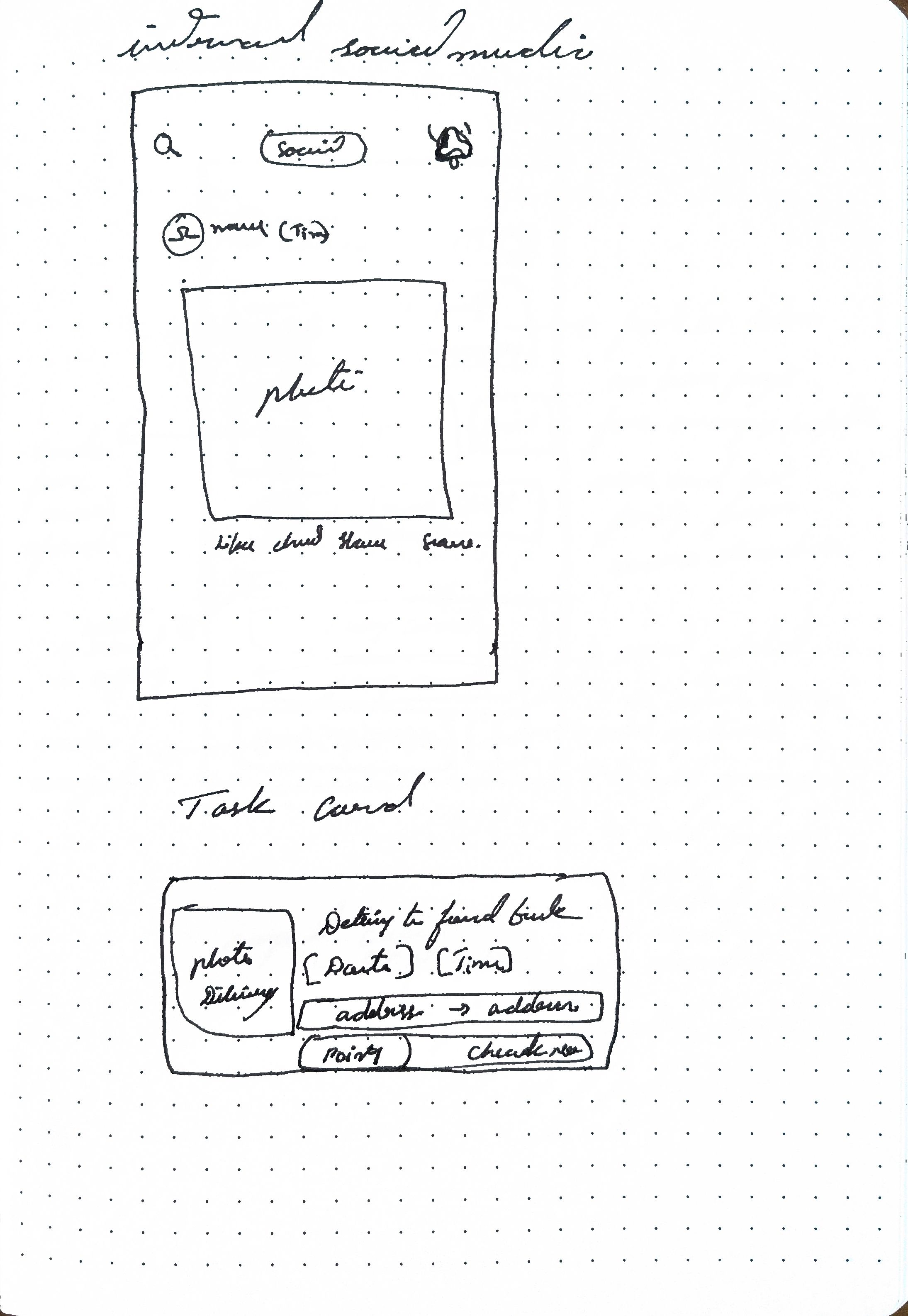
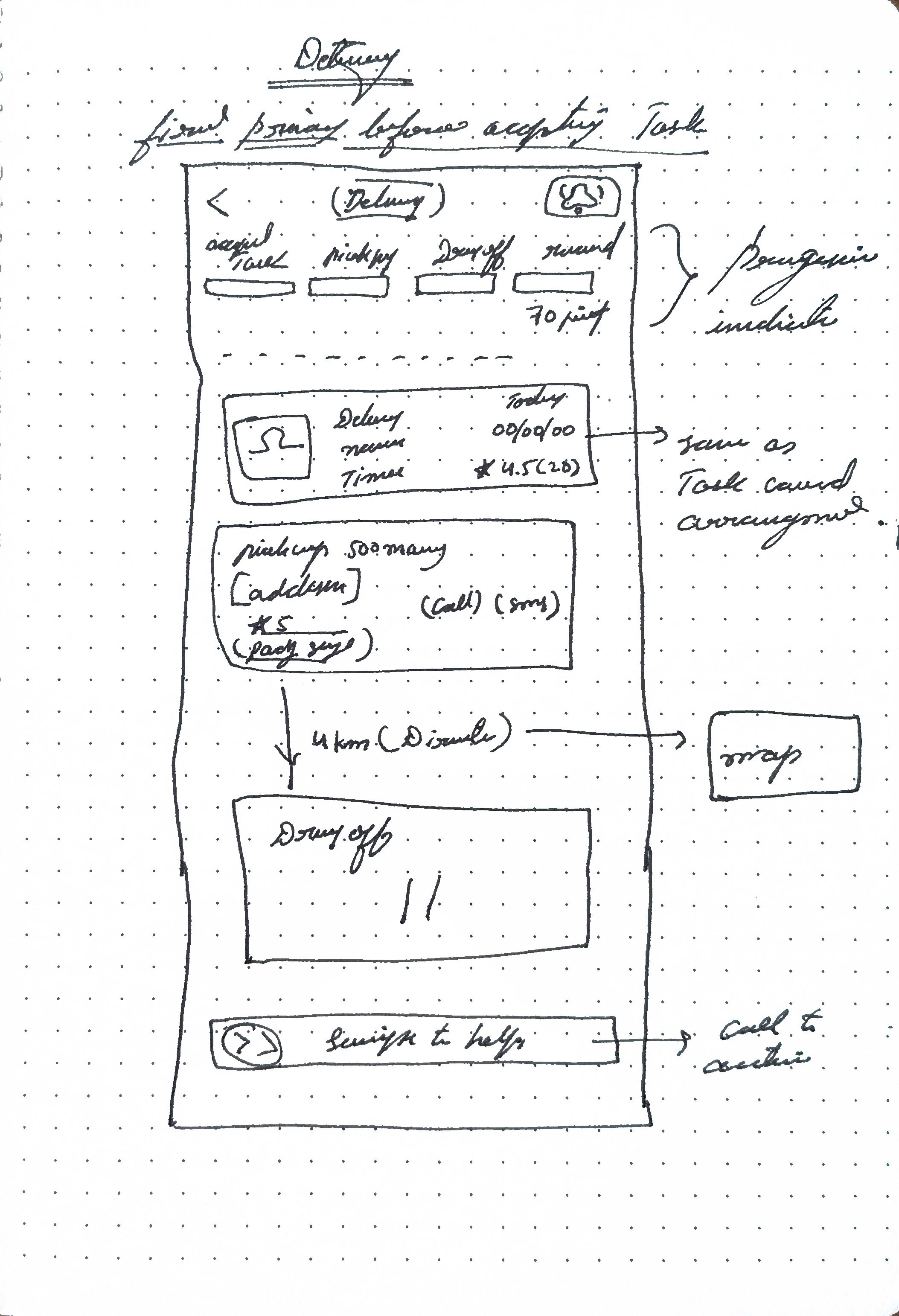
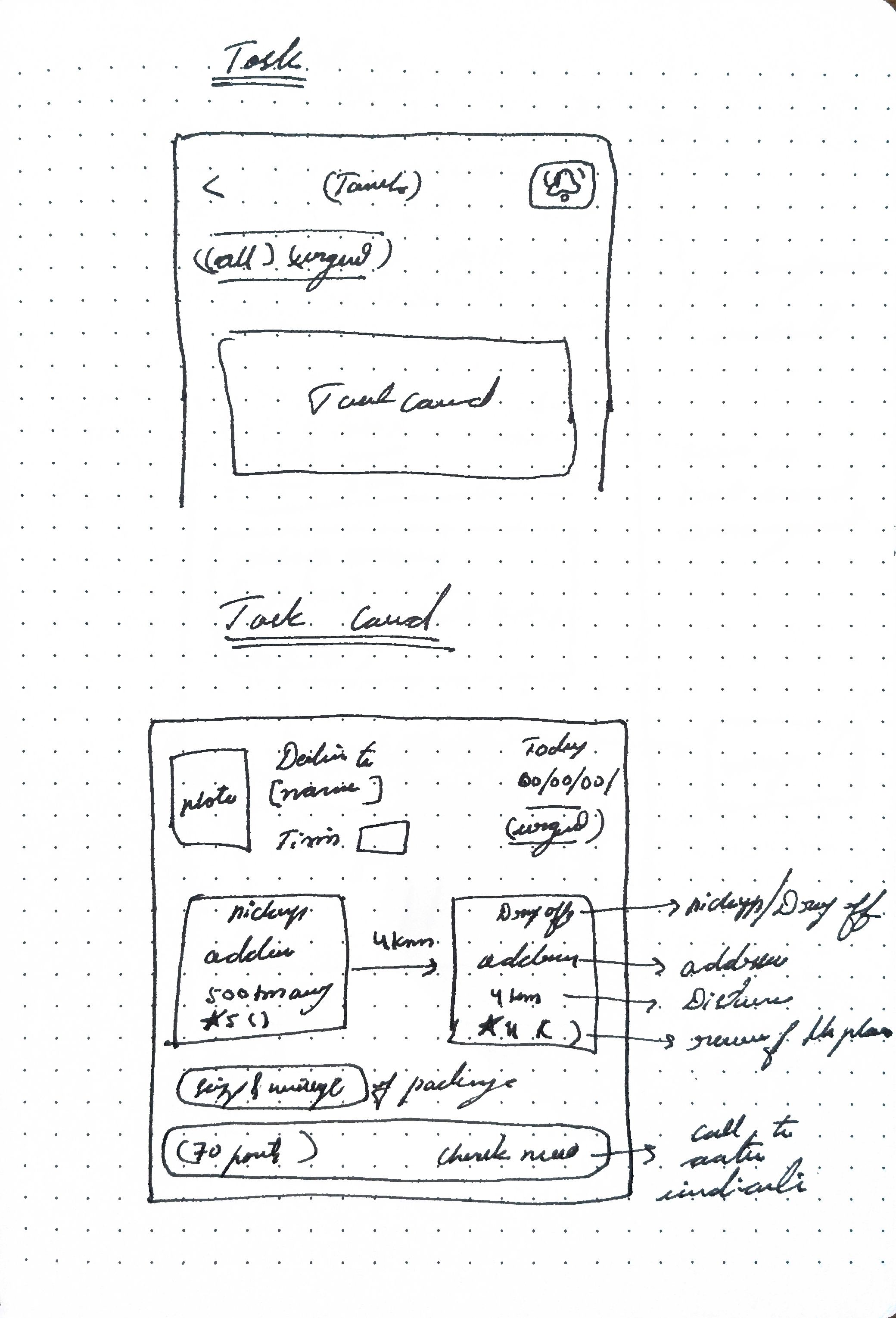
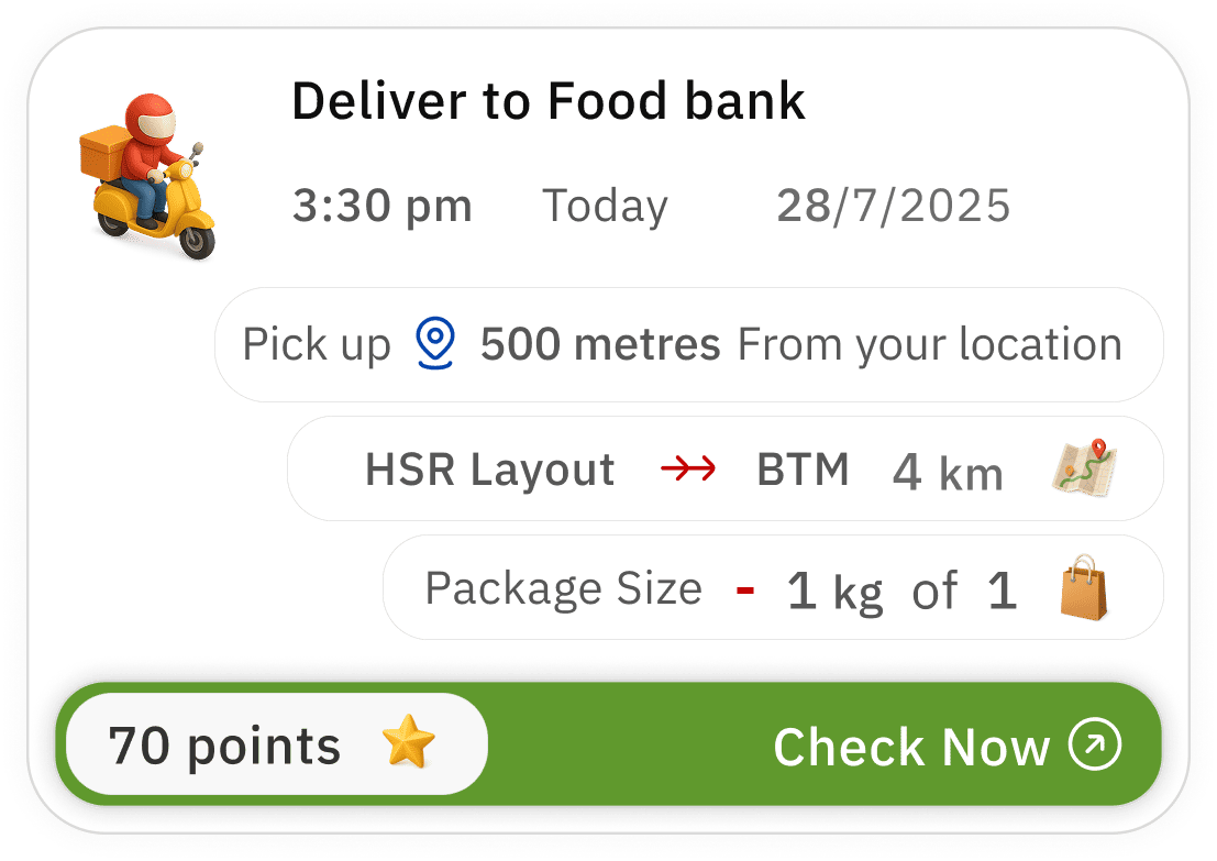
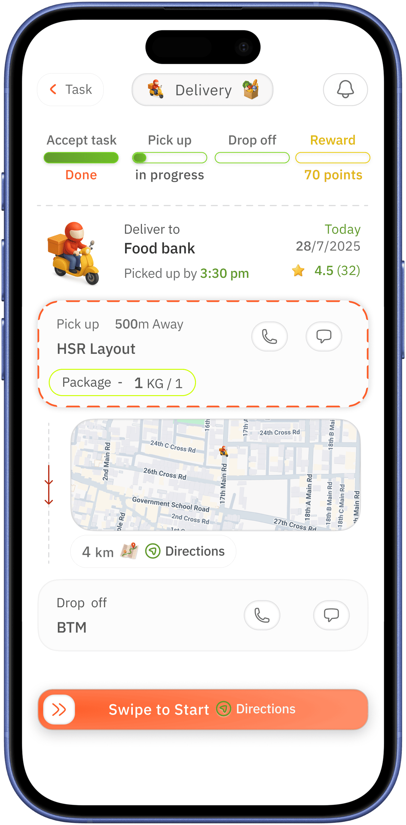
task
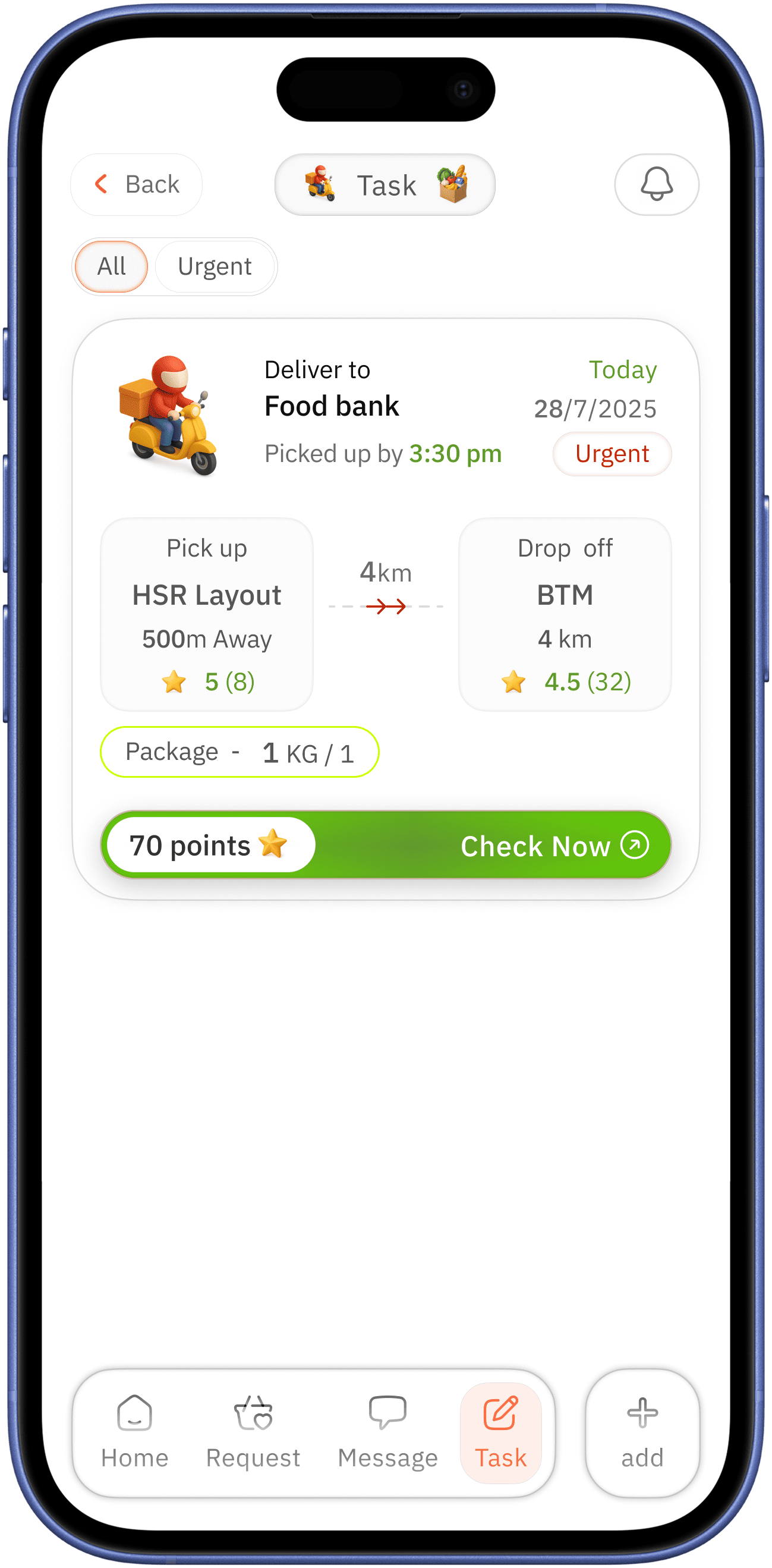
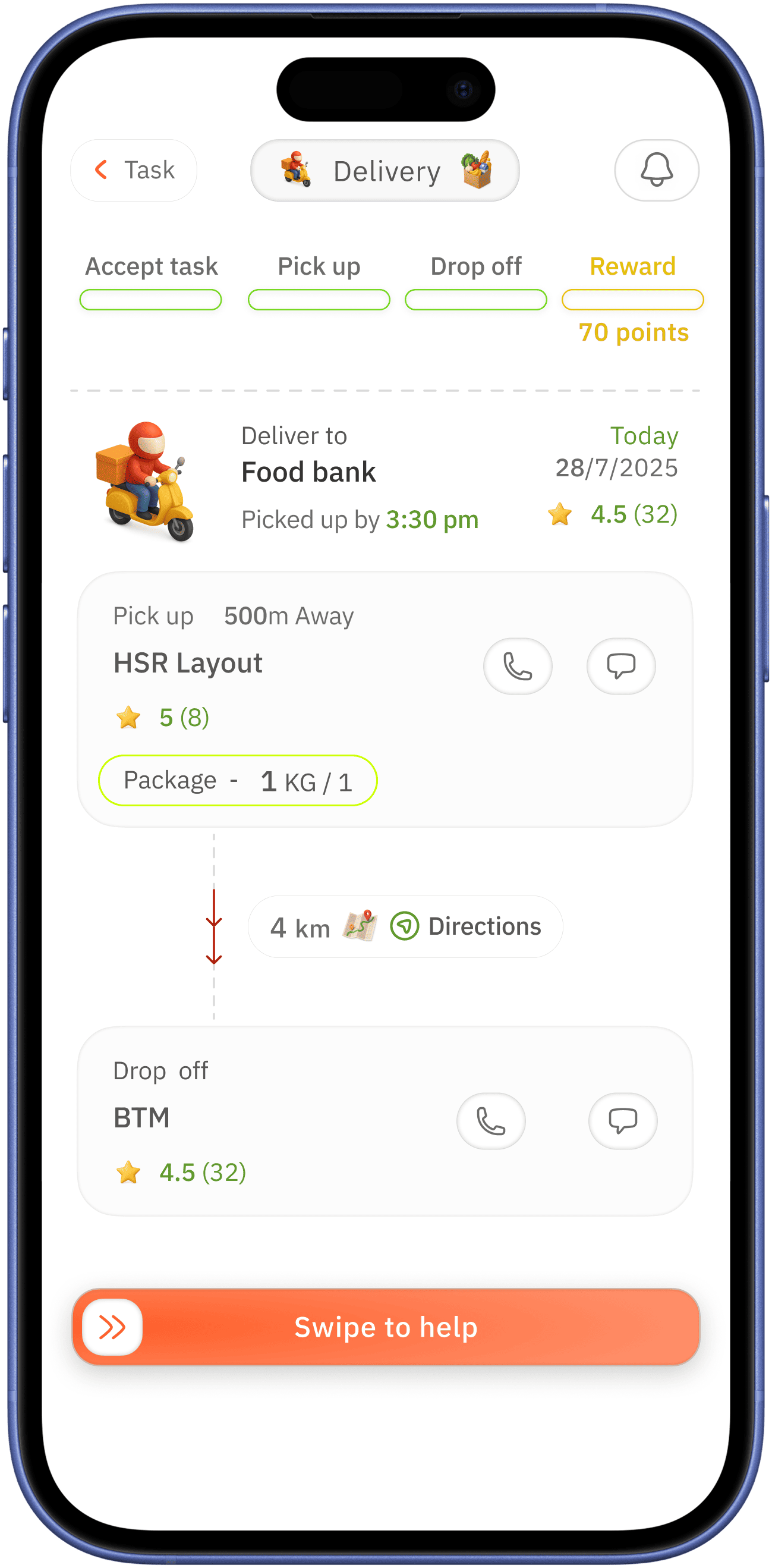
urgency with red colour for alertness
volunteering user just tapped “Check Now” but next screen shows information with progression UI on top which are incomplete in state → this incomplete state might encourage the volunteering use to proceed
showing address with distance for pick up and drop off - with clear proximity for single glace readability to easy for the volunteering user

progression UI to manage task simple way
“Swipe to help” swipe action for avoiding accidental click
doners rating for indicating behavioral trust → which can be easy on volunteer helping use on task
indication for task request lead by reward for encouragement of user


user profile
( public visible side )
tap option to make it easy to switch between
making donations / volunteering work public builds trust
also it encourages users to do so
Visuals
Styleguide
Typography
Typeface
-
IBM Plex sans
IBM Plex sans
14px
IBM Plex sans
16px
IBM Plex sans
18px
IBM Plex sans
20px
IBM Plex sans
24px
Colours
FF5E29
60992D
0645AD
DA2400
FE7D53
F8F8F8
080808
0E0E0E
333333
575757
6C6C6C
DADADA
Icons
No usability testing done
Usability testing !
If conducted, will test on
- Check how users can quickly understand the home screen
- Check how user interact with add grocery option, stress on 45+ age bracket
- How easily users can donate
- Accessibility usability test
Reflection on case study
Learnings
This project thought me
- How assumptions lead design decisions
- Need for features simplicity
What would improve
- Conduct real user interviews
- Refine accessibility for at glance
- Micro-interactions